Sepasoft MES Module Suite
SPC Selector
A component that allows selections of SPC data. As the user makes selections, this component will query the server for results. These results can be accessed through the SPC Results and SPC Data and can be linked with any of the SPC control charts.
SPC Selector
A filter can be added by selecting the  link to the right of Filter By. A window panel will open and filter categories will be displayed. Click the
  link by the filter category and specific filter items will be displayed. When selected they will be added to the filters as shown below. To minimize the number of filter options, reduce the date range defined by the Start Date and End Date properties and the associated filter values will be shown. Because values collected from different locations being shown together does not make sense, a location must be added to the Filter By section.
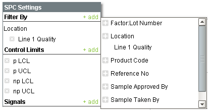
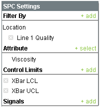
Filter By List
Sample definitions can have more than one attribute. At the time sample data is recorded, each attribute will have a value associated with it. For example, when collecting viscosity reading it may also be important to know the temperature. But, showing and making calculations on a viscosity value of 10000 with a temperature value of 75.2 does not make sense. The SPC Selector allow selecting a single attribute as shown below.
If an attribute type of sample definition is selected, then the Attribute section will not appear. This is because with attribute charts, all attributes are included as shown. For example, if a sample definition has an attribute for Torn, Discolored, Pitted, etc. then all will show in the table and is included for calculations.
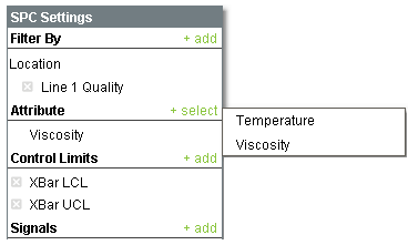
Attribute Selection
Similar to filters, control limits and signals can be added to the SPC results. Any selected control limits, and signals that depend on them, will not appear on the control chart until the control limit value has been set.
Selections can be removed by selecting the  link to the left of the selection.
To display the SPC results of this component in a control charts, bind the SPC Results property of the control chart to the SPC Results property of this component.
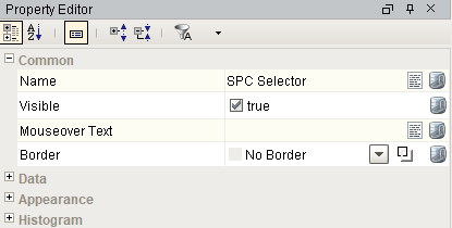
Component Properties
Properties are provided that can be set to affect the operation and look of the component. They can be set through the Property Editor in the Designer or through scripting.
Example
Code |
|
Common
| Name | Scripting | Property Type | Description |
|---|---|---|---|
| Border | settingsBorder | Border | Border for main settings panel. |
Scope: Public or Private
Synchronization: Provides analysis-set(s) across enterprise gateways.
- No Synchronization
- Child Gateways Only
- Parent Gateways Only
- Both Parent and Child Gateways
Data
| Name | Scripting | Property Type | Description | ||
|---|---|---|---|---|---|
| Start Date | startDate | DateTime | Start Date to filter SPC results. | ||
| End Date | endDate | DateTime | End Date to filter SPC results. | ||
| Snap Start and End Date | snapStartEndDate | Boolean | If true, the start time and end time in the Start Date and End Date properties are forced to 00:00:00 and 23:59:59, respectively, regardless of the times set there by the user. If false, the user's selected times remain in the Start Date and End Date properties. | ||
| Auto Refresh | autoRefresh | Boolean | If true, refresh data when sample or definition information changes. | ||
| SPC Results | sPCResults | SPCResults | SPC Results including data, measurement count and calculated value information. | ||
| SPC Data | sPCData | Dataset | The SPC data. | ||
| Measurement Count | measurementCount | int | Number of measurements in the SPC results. Note that the max number of measurements is 500. | ||
| Calculated Values | calcValues | SPCCalcValueCollection | Calculated value definitions. | ||
| Message | message | String | Error or warning message associated with the SPC results. | ||
| Suppress Warnings | suppressWarnings | Boolean | If true, hide warning message dialog popup. | ||
| Suppress Errors | suppressErrors | Boolean | If true, hide error message dialog popup. | ||
| Include Disabled Attributes | includeDisabledAttributes | Boolean | If true, sample attributes that are disabled will be included. | ||
| Filter Selection Summary | filterSummary | String | Summarizes your filter selections in a string. | ||
| Control Limit Summary | controlLimitSummary | String | Summarizes your control limit selections in a string. | ||
| Row Limit | rowLimit | Integer | The maximum number of samples to return in the results. | ||
| Signal Summary | signalSummary | String | Summarizes your signal selections in a string. | ||
| Attribute Name | attributeName | String | The name of the current sample attribute. | ||
| Attribute Units | attributeUnits | String | The units label of the current sample attribute. | ||
| Attribute Default Chart | attributeDefaultChart | String | The default chart of the current sample attribute. | ||
| Use Default Chart Type | useDefaultChartType | Boolean | If true, uses the default chart type from the attribute definition. | ||
| Definition Name | definitionName | String | The current definition name. | ||
| is Public | isPublic | Boolean | If true, the stored setting can be synchronized across Gateways based on the Synchronization Strategy. Use this property with Synchronization Strategy. Included in Sepasoft Versions:
| ||
| Synchronization Strategy | synchronizationStrategy | String | Options:
Included in Sepasoft Versions:
|

Appearance
| Name | Scripting | Property Type | Description |
|---|---|---|---|
| Slide Out Background Color | slideOutBackground | Color | The background color of the slide out pane. |
| Slide Out Border | slideOutBorder | Border | Border for slide out panel. |
| Min Slide Out Width | minSlideOutWidth | int | The minimum width of the slide out pane. |
| Max Slide Out Width | maxSlideOutWidth | int | The maximum width of the slide out pane. |
| Padding | padding | int | The amount of padding between the notes. |
| Header Background Color | headerBackground | Color | The color for the header backgrounds. |
Histogram
| Name | Scripting | Property Type | Description |
|---|---|---|---|
| Auto Bar Count | autoBarCount | boolean | If true, the number of data bars to include in the histogram results will be automatically calculated. |
| Data Bar Count | dataBarCount | Int4 | If Auto Bar Count is false, the number of data bars to include in the histogram results. |
| Padding Bar Count | paddingBarCount | Int4 | The number of bars prior to and following the data bars to include in the histogram results. |
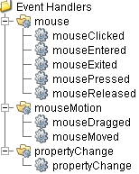
Event Handlers
Event handlers provide the ability to add custom script when a user interacts with a component such as by clicking a mouse, selecting a menu item or when a component property changes.
mouse
mouseClicked
This event signifies a mouse click on the source component. A mouse click the combination of a mouse press and a mouse release, both of which must have occurred over the source component. Note that this event fires after the pressed and released events have fired.
| Property | Description |
|---|---|
| .source | The component that fired this event. |
| .button | The code for the button that caused this event to fire. |
| .clickCount | The number of mouse clicks associated with this event. |
| .x | The x-coordinate (with respect to the source component) of this mouse event. |
| .y | The y-coordinate (with respect to the source component) of this mouse event. |
| .popupTrigger | Returns True (1) if this mouse event is a popup trigger. What constitutes a popup trigger is operating system dependent, which is why this abstraction exists. |
| .altDown | True (1) if the Alt key was held down during this event, false (0) otherwise. |
| .controlDown | True (1) if the Ctrl key was held down during this event, false (0) otherwise. |
| .shiftDown | True (1) if the Shift key was held down during this event, false (0) otherwise. |
mouseEntered
This event fires when the mouse enters the space over the source component.
| Property | Description |
|---|---|
| .source | The component that fired this event. |
| .button | The code for the button that caused this event to fire. |
| .clickCount | The number of mouse clicks associated with this event. |
| .x | The x-coordinate (with respect to the source component) of this mouse event. |
| .y | The y-coordinate (with respect to the source component) of this mouse event. |
| .popupTrigger | Returns True (1) if this mouse event is a popup trigger. What constitutes a popup trigger is operating system dependent, which is why this abstraction exists. |
| .altDown | True (1) if the Alt key was held down during this event, false (0) otherwise. |
| .controlDown | True (1) if the Ctrl key was held down during this event, false (0) otherwise. |
| .shiftDown | True (1) if the Shift key was held down during this event, false (0) otherwise. |
mouseExited
This event fires when the mouse leaves the space over the source component.
| Property | Description |
|---|---|
| .source | The component that fired this event. |
| .button | The code for the button that caused this event to fire. |
| .clickCount | The number of mouse clicks associated with this event. |
| .x | The x-coordinate (with respect to the source component) of this mouse event. |
| .y | The y-coordinate (with respect to the source component) of this mouse event. |
| .popupTrigger | Returns True (1) if this mouse event is a popup trigger. What constitutes a popup trigger is operating system dependent, which is why this abstraction exists. |
| .altDown | True (1) if the Alt key was held down during this event, false (0) otherwise. |
| .controlDown | True (1) if the Ctrl key was held down during this event, false (0) otherwise. |
| .shiftDown | True (1) if the Shift key was held down during this event, false (0) otherwise. |
mousePressed
This event fires when a mouse button is pressed down on the source component.
| Property | Description |
|---|---|
| .source | The component that fired this event. |
| .button | The code for the button that caused this event to fire. |
| .clickCount | The number of mouse clicks associated with this event. |
| .x | The x-coordinate (with respect to the source component) of this mouse event. |
| .y | The y-coordinate (with respect to the source component) of this mouse event. |
| .popupTrigger | Returns True (1) if this mouse event is a popup trigger. What constitutes a popup trigger is operating system dependent, which is why this abstraction exists. |
| .altDown | True (1) if the Alt key was held down during this event, false (0) otherwise. |
| .controlDown | True (1) if the Ctrl key was held down during this event, false (0) otherwise. |
| .shiftDown | True (1) if the Shift key was held down during this event, false (0) otherwise. |
mouseReleased
This event fires when a mouse button is released, if that mouse button's press happened over this component.
| Property | Description |
|---|---|
| .source | The component that fired this event. |
| .button | The code for the button that caused this event to fire. |
| .clickCount | The number of mouse clicks associated with this event. |
| .x | The x-coordinate (with respect to the source component) of this mouse event. |
| .y | The y-coordinate (with respect to the source component) of this mouse event. |
| .popupTrigger | Returns True (1) if this mouse event is a popup trigger. What constitutes a popup trigger is operating system dependent, which is why this abstraction exists. |
| .altDown | True (1) if the Alt key was held down during this event, false (0) otherwise. |
| .controlDown | True (1) if the Ctrl key was held down during this event, false (0) otherwise. |
| .shiftDown | True (1) if the Shift key was held down during this event, false (0) otherwise. |
mouseMotion
mouseDragged
Fires when the mouse moves over a component after a button has been pushed.
| Property | Description |
|---|---|
| .source | The component that fired this event. |
| .button | The code for the button that caused this event to fire. |
| .clickCount | The number of mouse clicks associated with this event. |
| .x | The x-coordinate (with respect to the source component) of this mouse event. |
| .y | The y-coordinate (with respect to the source component) of this mouse event. |
| .popupTrigger | Returns True (1) if this mouse event is a popup trigger. What constitutes a popup trigger is operating system dependent, which is why this abstraction exists. |
| .altDown | True (1) if the Alt key was held down during this event, false (0) otherwise. |
| .controlDown | True (1) if the Ctrl key was held down during this event, false (0) otherwise. |
| .shiftDown | True (1) if the Shift key was held down during this event, false (0) otherwise. |
mouseMoved
Fires when the mouse moves over a component, but no buttons are pushed.
| Property | Description |
|---|---|
| .source | The component that fired this event. |
| .button | The code for the button that caused this event to fire. |
| .clickCount | The number of mouse clicks associated with this event. |
| .x | The x-coordinate (with respect to the source component) of this mouse event. |
| .y | The y-coordinate (with respect to the source component) of this mouse event. |
| .popupTrigger | Returns True (1) if this mouse event is a popup trigger. What constitutes a popup trigger is operating system dependent, which is why this abstraction exists. |
| .altDown | True (1) if the Alt key was held down during this event, false (0) otherwise. |
| .controlDown | True (1) if the Ctrl key was held down during this event, false (0) otherwise. |
| .shiftDown | True (1) if the Shift key was held down during this event, false (0) otherwise. |
propertyChange
propertyChange
Fires whenever a bindable property of the source component changes. This works for standard and custom (dynamic) properties.
| Property | Description |
|---|---|
| .source | The component that fired this event. |
| .newValue | The new value that this property changed to. |
| .oldValue | The value that this property was before it changed. Note that not all components include an accurate oldValue in their events. |
| .propertyName | The name of the property that changed. NOTE: Remember to always filter out these events for the property that you are looking for! Components often have many properties that change. |
Extension Functions
This component does not have extension functions associated with it.
Custom Methods
Custom methods allow you to add your own component functions to a component that can be called through scripting. This is a useful and clean method of re-using script that is specific to the component (say you want to update a visual aspect of the component in the same way whether a user clicks on the component or a window property value changes). See Component Custom Methods in the Ignition Help Manual for more information.
Customizers
This component does not have any custom properties.
Component Functions
This component provide the following functions that can be called on it. If this component has been dropped onto the windows root container, the path and an example call would be event.source.parent.getComponent('SPC Selector').refreshInfo().
refreshInfo()
- Description
Force refresh of the SPC results.
- Parameters
None
- Return
Nothing
- Scope
Client
setSpcDataFormat(spcDataFormat)
- Description
Change to format if the SPC data to return.
- Parameters
spcDataFormat - Format of the SPC data to return.
| Data Type | int |
|---|---|
| None | 0 |
| XBarR | 1 |
| XBarS | 2 |
| Individual | 3 |
| Median | 4 |
| U | 5 |
| C | 6 |
| P | 7 |
| NP | 8 |
| Histogram | 9 |
| Pareto | 10 |
- Return
Nothing
- Scope
Client
setRowLimit(rowLimit)
- Description
Change the default number of samples to return to the value specified in the rowLimit parameter. By default only 500 samples are returned in the SPC results. This is done to unburden the database, network bandwidth and memory.
- Parameters
int rowLimit - New row limit.
- Return
Nothing
- Scope
Client
getRowLimit()
- Description
Returns the current row limit value.
- Parameters
None
- Return
Nothing
- Scope
Client
Sepasoft MES Module Suite