Sepasoft MES Module Suite
MES Object Editor | Vision
The MES Object Editor component installed with the Production module manages the relationships among MES objects. Control the look-and-feel by setting display colors and configure with drag-and-drop.
Material Definitions and Material Class
- Grouped by classes
Manifest(s)
Segment Operations and Operation Routes
Equipment
- Grouped by classes
Personnel
- Grouped by classes
Ignition Component Palette for Vision
|
|
|
Many of the relationship to MES objects is used to manage manufacturing resources, segments and operations. All considered MES Objects in the MES platform (see ISA-95 for more information about the various MES objects) within a class grouping structure: Equipment, personnel and materials for batch processing, workflows, oee, and spc control.

|
For the MES Object Editor component to find the MES Object Selector, it must be in the same container on the window. It is okay to be in a container, they just both have to be in the same container or root container. The results are at the same level or higher in MES Object Selector
When a new class, segment or operation is added, the MES Object Selector selection will change to reflect the newly added MES object. This doesn't happen when adding a new child in order to keep the primary MES object shown.
|

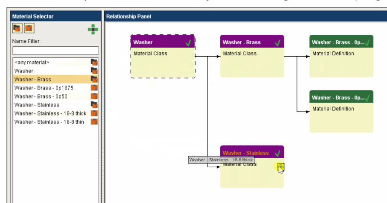
Creating Material relationships with the MES Object Editor
A Material Class can only be added as a child to another Material Class. Nesting classes multiple levels deep is allowed and can be considered a 'best practice' for organizing a large number of materials moving through a factory.
A Material Definition should only be added as a child to a Material Class. It can also be added as a child to more than one Material Class, which is helpful when a particular raw material logically belongs in several places.
To add an object as a child of another object, click and drag it onto the drop target ( ) of the intended parent object:
Look-and-Feel and Use
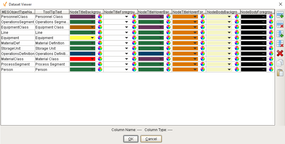
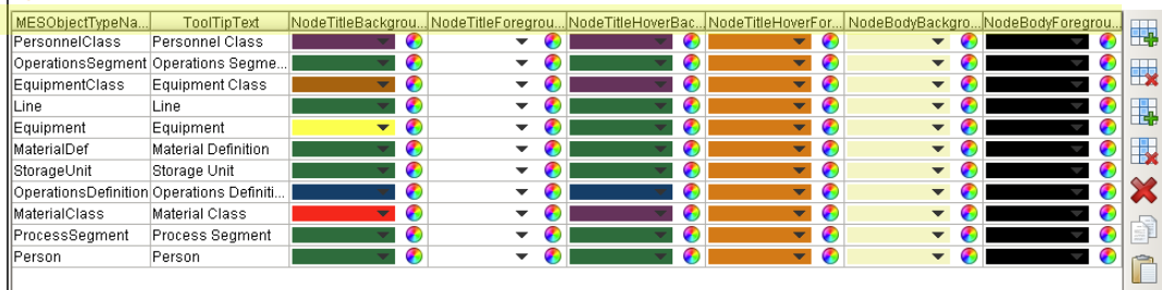
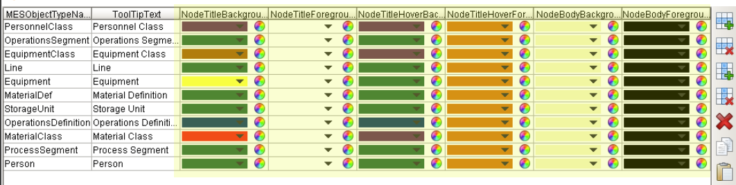
The colors of the different parts of a dataset node can be changed providing a visual deference of the different types of MES objects.
If no matches are found, the entry named Default will be used.
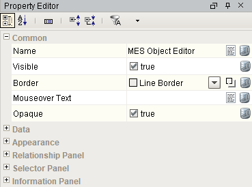
It controls the appearance of each node. Click on the Dataset Viewer icon for the Behavior property in Property Editor to set the values.
MESObjectTypeName is the name of the type of MES object that should be included as nodes.
- Default,
- MaterialClass,
- MaterialDef,
- ProcessSegment,
- EquipmentClass,
- Equipment, MES*,
- OperationsDefinition,
- OperationSegment,
- PersonnelClass,
Person are the values inbuilt on Ignition, as shown below. ToolTipText provides a hint to visual components as to what should be displayed when the user hovers their mouse cursor over the component. NodeTitleBackgroundColor is the color of the node header. NodeTitleForegroundColor is the color of the text in the node header. NodeTitleHoverBackgroundColor is the color of the node header when your mouse hovers over it. The color of the text of the node header when user hover their mouser over it is controlled by NodeTitleHoverForegroundColor. Color of the node is determined by NodeBodyBackground. NodeBodyForeground is the color of the text inside the main body of node.
DateTime Support
When creating Custom Properties and selecting DateTime as the DataType, users may set or bind in using any Ignition-supported datetime format. The Material Definition functions .setPropertyValue and .getPropertyValue will set and retrieve datetimes properly.
Ignition-supported datetime formats (refer to Dates on the Ignition website).
Code |
64-bit integer "yyyyMMdd.HHmmssSSSZ" "yyyy-MM-dd" "MM/dd/yyyy" "MM/dd/yyyy HH:mm:ss" "hh:mm:ss a" "hh:mm a" "MM/dd/yyyy hh:mm:ss a" "yyyy-MM-dd HH:mm:ss.SSS" "yyyy-MM-dd HH:mm:ss" "EEE MMM dd HH:mm:ss z yyyy" |
Component Properties
Properties are provided that can be set to affect the operation and look of the component. They can be set through the Property Editor in the Designer or through scripting.
Python |
event.source.parent.getComponent('MES Object Editor').rightSplitPaneWidth = 2 |
Data Properties
|
Data Property Name
|
scripting name
|
data type
|
Description
|
|---|---|---|---|
|
Editor Mode
|
editorModeValue
|
int
|
Set which MES objects the editor will display for editing.
0 - Material
1- Segment Operation
2 - Equipment
3 - Personnel
4 - Operation Routes
5 - Manifest
|
Appearance
|
Appearance property name in the properties palette:
|
Scripting
|
Data Type
|
Description
|
|---|---|---|---|
| Left Split Pane Width | leftSplitPaneWidth | Integer | Initial left split pane width. |
| Right Split Pane Width | rightSplitPaneWidth | Integer | Initial right split pane width. |
Relationship Panel
|
Relationship property name:
|
scripting
|
Type
|
Description
|
|---|---|---|---|
| Title Background Color | rpTitleBackground | Color | Color of the title background on the relationship panel. |
| Title Text Color | rpTitleForeground | Color | Color of the title text on the relationship panel. |
| Title Font | rpTitleFont | Font | Font to use for the title. |
| Panel Background | rpPanelBackground | Color | Background color of the relationship panel. |
| Node Configuration | nodeConfiguration | Dataset | Dataset that stores the node appearance configuration. |
Selector Panel
|
|
|
|
|
|---|---|---|---|
| Title Background Color | spTitleBackground | Color | Color of the title background on the selector panel. |
| Title Text Color | spTitleForeground | Color | Color of the title text on the selector panel. |
| Title Font | spTitleFont | Font | Font to use for the title on the selector panel. |
| Panel Background | spPanelBackground | Color | Background color of the selector panel. |
| List Normal Background | spListNormalBackground | Color | Normal background color of list items in the selector panel. |
| List Alternate Background | spListAlternateBackground | Color | Alternate background color of list items in the selector panel. |
| List Selected Background | spListSelectedBackground | Color | Selected background color of list items in the selector panel. |
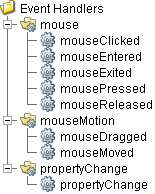
Event Handlers
Event handlers provide the ability to add custom script when a user interacts with a component such as by clicking a mouse, selecting a menu item or when a component property changes.
menu
userMenuItemClicked
This event fires when the menu item is clicked, or if the user selects the menu item using the keyboard and presses the Enter key. It can also occur if an access key or shortcut key is pressed that is associated with the MenuItem.
| Property | Description |
|---|---|
| .source | The component that fired this event. |
| .menuItemName | Name of the user menu item that triggered the event. |
| .nodeName | Name of the node. This is the same as the name of the MES object that is associated with the node. |
| .objectType | Name of the MES object type that is associated with the node. |
| .uuid | UUID of the MES object that is associated to the node. |
| .lotUUID | UUID of the material lot. |
| .lotName | Name of the material lot. |
| .lotSequence | The sequence number associated with the material lot. |
| .lotUse | The lot use type of the material. |
| .beginDateTime | Date and Time at which the event was triggered. |
| .materialUUID | UUID of the material. |
| .materialName | Name of the material. |
| .lotEquipmentUUID | UUID of the equipment lot. |
| .lotEquipmentName | Name of the equipment lot. |
| .segmentUUID | UUID of the segment. |
| .segmentName | Name of the segment. |
| .segmentEquipmentUUID | UUID of the segment equipment. |
| .segmentEquipmentName | Name of the segment equipment. |
mouse
mouseClicked
This event signifies a mouse click on the source component. A mouse click the combination of a mouse press and a mouse release, both of which must have occurred over the source component. Note that this event fires after the pressed and released events have fired.
| Property | Description |
|---|---|
| .source | The component that fired this event. |
| .button | The code for the button that caused this event to fire. |
| .clickCount | The number of mouse clicks associated with this event. |
| .x | The x-coordinate (with respect to the source component) of this mouse event. |
| .y | The y-coordinate (with respect to the source component) of this mouse event. |
| .popupTrigger | Returns True (1) if this mouse event is a popup trigger. What constitutes a popup trigger is operating system dependent, which is why this abstraction exists. |
| .altDown | True (1) if the Alt key was held down during this event, false (0) otherwise. |
| .controlDown | True (1) if the Ctrl key was held down during this event, false (0) otherwise. |
| .shiftDown | True (1) if the Shift key was held down during this event, false (0) otherwise. |
mouseEntered
This event fires when the mouse enters the space over the source component.
| Property | Description |
|---|---|
| .source | The component that fired this event. |
| .button | The code for the button that caused this event to fire. |
| .clickCount | The number of mouse clicks associated with this event. |
| .x | The x-coordinate (with respect to the source component) of this mouse event. |
| .y | The y-coordinate (with respect to the source component) of this mouse event. |
| .popupTrigger | Returns True (1) if this mouse event is a popup trigger. What constitutes a popup trigger is operating system dependent, which is why this abstraction exists. |
| .altDown | True (1) if the Alt key was held down during this event, false (0) otherwise. |
| .controlDown | True (1) if the Ctrl key was held down during this event, false (0) otherwise. |
| .shiftDown | True (1) if the Shift key was held down during this event, false (0) otherwise. |
mouseExited
This event fires when the mouse leaves the space over the source component.
| Property | Description |
|---|---|
| .source | The component that fired this event. |
| .button | The code for the button that caused this event to fire. |
| .clickCount | The number of mouse clicks associated with this event. |
| .x | The x-coordinate (with respect to the source component) of this mouse event. |
| .y | The y-coordinate (with respect to the source component) of this mouse event. |
| .popupTrigger | Returns True (1) if this mouse event is a popup trigger. What constitutes a popup trigger is operating system dependent, which is why this abstraction exists. |
| .altDown | True (1) if the Alt key was held down during this event, false (0) otherwise. |
| .controlDown | True (1) if the Ctrl key was held down during this event, false (0) otherwise. |
| .shiftDown | True (1) if the Shift key was held down during this event, false (0) otherwise. |
mousePressed
This event fires when a mouse button is pressed down on the source component.
| Property | Description |
|---|---|
| .source | The component that fired this event. |
| .button | The code for the button that caused this event to fire. |
| .clickCount | The number of mouse clicks associated with this event. |
| .x | The x-coordinate (with respect to the source component) of this mouse event. |
| .y | The y-coordinate (with respect to the source component) of this mouse event. |
| .popupTrigger | Returns True (1) if this mouse event is a popup trigger. What constitutes a popup trigger is operating system dependent, which is why this abstraction exists. |
| .altDown | True (1) if the Alt key was held down during this event, false (0) otherwise. |
| .controlDown | True (1) if the Ctrl key was held down during this event, false (0) otherwise. |
| .shiftDown | True (1) if the Shift key was held down during this event, false (0) otherwise. |
mouseReleased
This event fires when a mouse button is released, if that mouse button's press happened over this component.
| Property | Description |
|---|---|
| .source | The component that fired this event. |
| .button | The code for the button that caused this event to fire. |
| .clickCount | The number of mouse clicks associated with this event. |
| .x | The x-coordinate (with respect to the source component) of this mouse event. |
| .y | The y-coordinate (with respect to the source component) of this mouse event. |
| .popupTrigger | Returns True (1) if this mouse event is a popup trigger. What constitutes a popup trigger is operating system dependent, which is why this abstraction exists. |
| .altDown | True (1) if the Alt key was held down during this event, false (0) otherwise. |
| .controlDown | True (1) if the Ctrl key was held down during this event, false (0) otherwise. |
| .shiftDown | True (1) if the Shift key was held down during this event, false (0) otherwise. |
mouseMotion
mouseDragged
Fires when the mouse moves over a component after a button has been pushed.
| Property | Description |
|---|---|
| .source | The component that fired this event. |
| .button | The code for the button that caused this event to fire. |
| .clickCount | The number of mouse clicks associated with this event. |
| .x | The x-coordinate (with respect to the source component) of this mouse event. |
| .y | The y-coordinate (with respect to the source component) of this mouse event. |
| .popupTrigger | Returns True (1) if this mouse event is a popup trigger. What constitutes a popup trigger is operating system dependent, which is why this abstraction exists. |
| .altDown | True (1) if the Alt key was held down during this event, false (0) otherwise. |
| .controlDown | True (1) if the Ctrl key was held down during this event, false (0) otherwise. |
| .shiftDown | True (1) if the Shift key was held down during this event, false (0) otherwise. |
mouseMoved
Fires when the mouse moves over a component, but no buttons are pushed.
| Property | Description |
|---|---|
| .source | The component that fired this event. |
| .button | The code for the button that caused this event to fire. |
| .clickCount | The number of mouse clicks associated with this event. |
| .x | The x-coordinate (with respect to the source component) of this mouse event. |
| .y | The y-coordinate (with respect to the source component) of this mouse event. |
| .popupTrigger | Returns True (1) if this mouse event is a popup trigger. What constitutes a popup trigger is operating system dependent, which is why this abstraction exists. |
| .altDown | True (1) if the Alt key was held down during this event, false (0) otherwise. |
| .controlDown | True (1) if the Ctrl key was held down during this event, false (0) otherwise. |
| .shiftDown | True (1) if the Shift key was held down during this event, false (0) otherwise. |
propertyChange
propertyChange
Fires whenever a bindable property of the source component changes. This works for standard and custom (dynamic) properties.
| Property | Description |
|---|---|
| .source | The component that fired this event. |
| .newValue | The new value that this property changed to. |
| .oldValue | The value that this property was before it changed. Note that not all components include an accurate oldValue in their events. |
| .propertyName | The name of the property that changed. NOTE: Remember to always filter out these events for the property that you are looking for! Components often have many properties that change. |
Extension Functions
This component does not have extension functions associated with it.
Custom Methods
Custom methods allow you to add your own component functions to a component that can be called through scripting. This is a useful and clean method of re-using script that is specific to the component (say you want to update a visual aspect of the component in the same way whether a user clicks on the component or a window property value changes). See Component Custom Methods in the Ignition Help Manual for more information.
Customizers
This component does not have any custom properties.
Component Functions
This component provide the following functions that can be called on it.
Sepasoft MES Module Suite