Sepasoft MES Module Suite
Schedule Selector
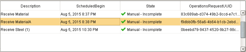
The MES Schedule Selector is a table component that can be used to view and manage production schedules. The schedule entries may be filtered by Active, Complete or Incomplete states. The nature of the schedule entry trigger - Auto or Manual - is also shown. In the example below, manually initiated schedule entries are shown.
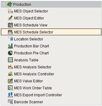
Component Palette
Schedule Selector Columns
The MES Schedule Selector has the following available columns:
| Name | Property Type | Description |
|---|---|---|
| Description | String | The operation name. |
| OriginalBegin | DateTime | The DateTime that the operation was originally scheduled to begin. This does not change, regardless of later changes to the operation's schedule or when it actually began. |
| OriginalEnd | DateTime | The DateTime that the operation was originally scheduled to end. This does not change, regardless of later changes to the operation's schedule or when it actually ended. |
| UserScheduledBegin | DateTime | The begin DateTime most recently scheduled by the user. This is the latest schedule the user has set for the operation via script or by dragging in the Schedule View component. This DateTime does not change when the system pushes the schedule out automatically. |
| UserScheduledEnd | DateTime | The end DateTime most recently scheduled by the user. This is the latest schedule the user has set for the operation via script or by dragging in the Schedule View component. This DateTime does not change when the system pushes the schedule out automatically. |
| ScheduledBegin | DateTime | The currently-scheduled begin DateTime, taking into account automatic delays by the system. This DateTime changes minute by minute if the current time causes the schedule to be pushed out (e.g. if an operation has not yet been started but was scheduled to be started at some point earlier, it will keep getting pushed out minute by minute to keep up with the current DateTime). |
| ScheduledEnd | DateTime | The currently-scheduled end DateTime, taking into account automatic delays by the system. This DateTime changes minute by minute if the current time causes the schedule to be pushed out (e.g. if an operation has not yet been started but was scheduled to be started at some point earlier, it will keep getting pushed out minute by minute to keep up with the current DateTime). |
| ActualBegin | DateTime | The DateTime that the operation actually began. This property will read back as "None" until the operation actually begins. |
| ActualEnd | DateTime | The DateTime that the operation actually ended. This property will read back as "None" until the operation actually ends. |
| State | String | The schedule state. |
| PercentComplete | Double | The operation progress. |
| OperationsRequestUUID | String | The UUID for the MESOperationsRequest object associated with the schedule entry. |
| OperationsResponseUUID | String | The UUID for the MESOperationsResponse object associated with the schedule entry. |
| WorkOrderUUID | String | The UUID for the MESWorkOrder object associated with the schedule entry. |
| WorkOrder | String | The name of the work order associated with the schedule entry. |
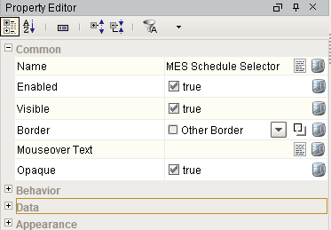
Component Properties
Properties are provided that can be set to affect the operation and look of the component. They can be set through the Property Editor in the Designer or through scripting.
Example
Python |
event.source.parent.getComponent('MES Schedule Selector').canBegin = True |
Behavior
| Name | Scripting | Property Type | Description |
|---|---|---|---|
| Run Control Menu Enabled | runControlMenuEnabled | boolean | Enables the Run Control popup menu by mouse right-click on a row in the table. |
| Sorting Enabled | sortingEnabled | boolean | Enables automatic multi-column sorting by clicking and CTRL-clicking on the table header. |
| Can Begin | canBegin | boolean | Read-only. Use in conjunction with a button's enabled property that calls event.source.parent.getComponent('MES Schedule Selector').beginSelected() |
| Can End | canEnd | boolean | Read-only. Use in conjunction with a button's enabled property that calls event.source.parent.getComponent('MES Schedule Selector').endSelected() |
| Can Abort | canAbort | boolean | Read-only. Use in conjunction with a button's enabled property that calls event.source.parent.getComponent('MES Schedule Selector').abortSelected() |
| Column Resize Menu | headerResizeMenus | boolean | Enables a right-click popup menu on the column headers with resizing options. |
| Column Chooser Menu | headerColumnChooserMenus | boolean | Enables a right-click popup menu on the column headers with options to show and hide columns. |
| Columns Re-Orderable | columnReorderingAllowed | boolean | Enables the re-ordering of columns by dragging the column headers. |
| Columns Resizable | columnResizingAllowed | boolean | Enables the resizing of columns by dragging the margins of the column headers. |
| Auto-Resize Mode | autoResizeMode | int | Determines how the table resizes the columns. Options are All Columns, Last Column, Next Column, Off, Subsequent columns. |
| Row Selection Allowed | rowSelectionAllowed | boolean | This flag is used in conjunction with the Column Selection Allowed flag to determine whether not whole-rows, whole-columns, or both. |
Data
| Name | Scripting | Property Type | Description |
|---|---|---|---|
| Equipment Path | equipmentPath | String | Path to the equipment to show the schedule. |
| Start Date | startDate | Date | Beginning of the time range to display. |
| End Date | endDate | Date | End of the time range to display. |
| Enable Simultaneous Active | enableSimultaneousActive | boolean | If true, allows multiple operations to be active at the same time. |
| Include Manual Incomplete | includeManualIncomplete | boolean | If true, include manual start incomplete schedule entries in the list. |
| Include Manual Active | includeManualActive | boolean | If true, include manual start active schedule entries in the list. |
| Include Manual Complete | includeManualComplete | boolean | If true, include manual start completed schedule entries in the list. |
| Include Auto Incomplete | includeAutoIncomplete | boolean | If true, include auto start incomplete schedule entries in the list. |
| Include Auto Active | includeAutoActive | boolean | If true, include auto start active schedule entries in the list. |
| Include Auto Complete | includeAutoComplete | boolean | If true, include auto start completed schedule entries in the list. |
Appearance
| Name | Scripting | Property Type | Description |
|---|---|---|---|
| Row Height | rowHeight | int | If row resizing is disabled, this will set the height of all rows. |
| Selection Background | selectionBackground | Color | Default background color of selected cells. |
| Selection Foreground | selectionForeground | Color | Default foreground color of selected cells. |
| Inter Cell Spacing | interCellSpacing | Dimension | The space (in pixels) between the cells |
| Show Horizontal Grid Lines? | showHorizontalLines | boolean | Displays horizontal gridlines making it easier to read. |
| Show Vertical Grid Lines? | showVerticalLines | boolean | Displays vertical gridlines making it easier to read. |
| Grid Line Color | gridColor | Color | Color used to draw grid lines. |
| Header Visible | headerVisible | boolean | Allows for hiding of the table's header. |
| Column Sizing | defaultColumnView | String | Represents column sizing and position to preserve user-selected ordering. |
| Column Attributes Data | columnAttributesData | Dataset | Dataset describing the column attributes. |
Hidden
| Name | Scripting | Property Type | Description |
|---|---|---|---|
Previous Product Indexed State | previousProductIndexed | boolean | Whether or not the previous product has been indexed to the next cell. |
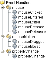
Event Handlers
Event handlers provide the ability to add custom script when a user interacts with a component such as by clicking a mouse, selecting a menu item or when a component property changes.
mouse
mouseClicked
This event signifies a mouse click on the source component. A mouse click the combination of a mouse press and a mouse release, both of which must have occurred over the source component. Note that this event fires after the pressed and released events have fired.
| Property | Description |
|---|---|
| .source | The component that fired this event. |
| .button | The code for the button that caused this event to fire. |
| .clickCount | The number of mouse clicks associated with this event. |
| .x | The x-coordinate (with respect to the source component) of this mouse event. |
| .y | The y-coordinate (with respect to the source component) of this mouse event. |
| .popupTrigger | Returns True (1) if this mouse event is a popup trigger. What constitutes a popup trigger is operating system dependent, which is why this abstraction exists. |
| .altDown | True (1) if the Alt key was held down during this event, false (0) otherwise. |
| .controlDown | True (1) if the Ctrl key was held down during this event, false (0) otherwise. |
| .shiftDown | True (1) if the Shift key was held down during this event, false (0) otherwise. |
mouseEntered
This event fires when the mouse enters the space over the source component.
| Property | Description |
|---|---|
| .source | The component that fired this event. |
| .button | The code for the button that caused this event to fire. |
| .clickCount | The number of mouse clicks associated with this event. |
| .x | The x-coordinate (with respect to the source component) of this mouse event. |
| .y | The y-coordinate (with respect to the source component) of this mouse event. |
| .popupTrigger | Returns True (1) if this mouse event is a popup trigger. What constitutes a popup trigger is operating system dependent, which is why this abstraction exists. |
| .altDown | True (1) if the Alt key was held down during this event, false (0) otherwise. |
| .controlDown | True (1) if the Ctrl key was held down during this event, false (0) otherwise. |
| .shiftDown | True (1) if the Shift key was held down during this event, false (0) otherwise. |
mouseExited
This event fires when the mouse leaves the space over the source component.
| Property | Description |
|---|---|
| .source | The component that fired this event. |
| .button | The code for the button that caused this event to fire. |
| .clickCount | The number of mouse clicks associated with this event. |
| .x | The x-coordinate (with respect to the source component) of this mouse event. |
| .y | The y-coordinate (with respect to the source component) of this mouse event. |
| .popupTrigger | Returns True (1) if this mouse event is a popup trigger. What constitutes a popup trigger is operating system dependent, which is why this abstraction exists. |
| .altDown | True (1) if the Alt key was held down during this event, false (0) otherwise. |
| .controlDown | True (1) if the Ctrl key was held down during this event, false (0) otherwise. |
| .shiftDown | True (1) if the Shift key was held down during this event, false (0) otherwise. |
mousePressed
This event fires when a mouse button is pressed down on the source component.
| Property | Description |
|---|---|
| .source | The component that fired this event. |
| .button | The code for the button that caused this event to fire. |
| .clickCount | The number of mouse clicks associated with this event. |
| .x | The x-coordinate (with respect to the source component) of this mouse event. |
| .y | The y-coordinate (with respect to the source component) of this mouse event. |
| .popupTrigger | Returns True (1) if this mouse event is a popup trigger. What constitutes a popup trigger is operating system dependent, which is why this abstraction exists. |
| .altDown | True (1) if the Alt key was held down during this event, false (0) otherwise. |
| .controlDown | True (1) if the Ctrl key was held down during this event, false (0) otherwise. |
| .shiftDown | True (1) if the Shift key was held down during this event, false (0) otherwise. |
mouseReleased
This event fires when a mouse button is released, if that mouse button's press happened over this component.
| Property | Description |
|---|---|
| .source | The component that fired this event. |
| .button | The code for the button that caused this event to fire. |
| .clickCount | The number of mouse clicks associated with this event. |
| .x | The x-coordinate (with respect to the source component) of this mouse event. |
| .y | The y-coordinate (with respect to the source component) of this mouse event. |
| .popupTrigger | Returns True (1) if this mouse event is a popup trigger. What constitutes a popup trigger is operating system dependent, which is why this abstraction exists. |
| .altDown | True (1) if the Alt key was held down during this event, false (0) otherwise. |
| .controlDown | True (1) if the Ctrl key was held down during this event, false (0) otherwise. |
| .shiftDown | True (1) if the Shift key was held down during this event, false (0) otherwise. |
mouseMotion
mouseDragged
Fires when the mouse moves over a component after a button has been pushed.
| Property | Description |
|---|---|
| .source | The component that fired this event. |
| .button | The code for the button that caused this event to fire. |
| .clickCount | The number of mouse clicks associated with this event. |
| .x | The x-coordinate (with respect to the source component) of this mouse event. |
| .y | The y-coordinate (with respect to the source component) of this mouse event. |
| .popupTrigger | Returns True (1) if this mouse event is a popup trigger. What constitutes a popup trigger is operating system dependent, which is why this abstraction exists. |
| .altDown | True (1) if the Alt key was held down during this event, false (0) otherwise. |
| .controlDown | True (1) if the Ctrl key was held down during this event, false (0) otherwise. |
| .shiftDown | True (1) if the Shift key was held down during this event, false (0) otherwise. |
mouseMoved
Fires when the mouse moves over a component, but no buttons are pushed.
| Property | Description |
|---|---|
| .source | The component that fired this event. |
| .button | The code for the button that caused this event to fire. |
| .clickCount | The number of mouse clicks associated with this event. |
| .x | The x-coordinate (with respect to the source component) of this mouse event. |
| .y | The y-coordinate (with respect to the source component) of this mouse event. |
| .popupTrigger | Returns True (1) if this mouse event is a popup trigger. What constitutes a popup trigger is operating system dependent, which is why this abstraction exists. |
| .altDown | True (1) if the Alt key was held down during this event, false (0) otherwise. |
| .controlDown | True (1) if the Ctrl key was held down during this event, false (0) otherwise. |
| .shiftDown | True (1) if the Shift key was held down during this event, false (0) otherwise. |
propertyChange
propertyChange
Fires whenever a bindable property of the source component changes. This works for standard and custom (dynamic) properties.
| Property | Description |
|---|---|
| .source | The component that fired this event. |
| .newValue | The new value that this property changed to. |
| .oldValue | The value that this property was before it changed. Note that not all components include an accurate oldValue in their events. |
| .propertyName | The name of the property that changed. NOTE: Remember to always filter out these events for the property that you are looking for! Components often have many properties that change. |
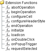
Extension Functions
configureCell
- Description
Provides a chance to configure the contents of each cell.
- Parameters
self - A reference to the component that is invoking this function.
value - The value in the dataset at this cell.
textValue - The text the table expects to display at this cell (may be overriden by including 'text' attribute in returned dictionary).
selected - A boolean indicating whether this cell is currently selected.
rowIndex - The index of the row in the underlying dataset.
colIndex - The index of the column in the underlying dataset.
colName - The name of the column in the underlying dataset.
rowIndex - The index of the row, as it appears in the table view (affected by sorting).
colView - The index of the column, as it appears in the table view (affected by column re-arranging and hiding).
- Return
Returns a dictionary of name-value pairs with the desired attributes. Availible attributes include: 'background', 'border', 'font', 'foreground', 'horizontalAlignment', 'iconPath', 'text', 'toolTipText', 'verticalAlignment'

|
You may also specify the attribute 'renderer', which is expected to be a java.swing.JComponent which will be used to render the cell. |
- Scope
Client
configureHeaderStyle
- Description
Provides a chance to configure the style of each column header. Return a dictionary of name-value pairs with the designed attributes. Availible attributes include: 'background', 'border', 'font', 'foreground', 'horizontalAlignment', 'toolTipText', 'verticalAlignment'
- Parameters
self - A reference to the component that is invoking this function.
colIndex - The index of the column in the underlying dataset.
colName - The name of the column in the underlying dataset.
- Return
Dictionary of name value pairs
- Scope
Client
initialize
- Description
Called when the window containing this table is opened, or the template containing it is loaded. Provides a change to initialize the table further, for example, selecting a specific row.
- Parameters
self - A reference to the component that is invoking this function.
- Return
Nothing
- Scope
Client
onDoubleClick
- Description
Called when the user double-clicks on a table cell.
- Parameters
self - A reference to the component that is invoking this function.
rowIndex - Index of the row, starting at 0, relative to the underlying dataset.
colIndex - Index of the column starting at 0, relative to the underlying dataset.
value - The value at the location clicked on.
event - The MouseEvent object that caused this double-click event.
- Return
Nothing
- Scope
Client
onPopupTrigger
- Description
Called when the user right-clicks on a table cell. This would be the appropriate time to create and display a popup menu.
Note: Set the Run Control Menu Enabled property to False so that the Run Control Menu won't override onPopupTrigger on right-click.
- Parameters
self - A reference to the component that is invoking this function.
rowIndex - Index of the row, starting at 0, relative to the underlying dataset.
colIndex - Index of the column starting at 0, relative to the underlying dataset.
value - The value at the location clicked on.
event - The MouseEvent object that caused this double-click event.
- Return
Nothing
- Scope
Client
beginOperation
- Description
Called before an MES Operation begins. Return false to prevent the MES Operation from being started.
- Parameters
self - A reference to the component that is invoking this function.
MESObjectList - MESObjectList containing MESOperationsPerformance and MESOperationResponse objects. Core and custom properties can be set on the object before the operation begins.
- Return
True
- Scope
Client
endOperation
- Description
Called before an MES Operaton ends. Return false to prevent the MES Operation from being ended.
- Parameters
self - A reference to the component that is invoking this function.
MESObjectList - MESObjectList containing MESOperationResponse and any MESResponseSegment objects. The MESResponseSegments objects can be ended in this extension function, which is required before the operation can end.
- Return
True
- Scope
Client
abortOperation
- Description
Called before an MES Operaton is aborted. Return false to prevent the MES Operation from being aborted.
- Parameters
self - A reference to the component that is invoking this function.
MESObjectList - MESObjectList containing MESOperationResponse and any MESResponseSegment objects.
- Return
True
- Scope
Client
requestSelected
- Description
Called after an MES Operaton Request is selected. In this function, the operation request can be started. This allows for operation to automatically start when the user selects a MES Operation Request. Returning false will prevent the new selection.
- Parameters
self - A reference to the component that is invoking this function.
mesObject - MESObject instance containing the MES Operation Request details.
- Return
True
- Scope
Client
Custom Methods
Custom methods allow you to add your own component functions to a component that can be called through scripting. This is a useful and clean method of re-using script that is specific to the component (say you want to update a visual aspect of the component in the same way whether a user clicks on the component or a window property value changes). See Component Custom Methods in the Ignition Help Manual for more information.
Customizers
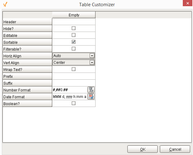
Table Customizer
Table Customizer manages the data entered into the MES Schedule Selector. It will allow you to modify the data which is stored inside the MES Schedule Selector. Thus the formatting and alignments are made easy.
Column Configuration
Header - Provide a custom name to the column header.
Hide? - Hides the column.
Editable - Allows the editing of the cell pertaining to the column.
Sortable - To make a column filter the data on user's demand.
Sortable - Allows the user to sort the table according to the selected column.
Horiz Align - Aligns the contents of the column.
Vert Align - Aligns the contents of the column.
Wrap Text? - Data in the cell wraps to fit the column width. When you change the column width, data wrapping adjusts automatically.
Prefix - A custom text that proceeds the contents of each cell.
Suffix - A custom text that follows the contents of each cell.
Number Format - A format of the cell is the contents of the cell are number types.
Date Format - Used if the contents of the cell are date types.
Boolean? - Changes the contents of the cell to reflect a 'check box' look and feel.
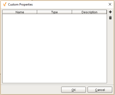
Custom Properties
The custom properties can be used to add user defined properties.
Component Functions
This component provide the following functions that can be called on it. If this component has been dropped onto the windows root container, the path and an example call would be event.source.parent.getComponent('MES Schedule Selector').beginSelected().
beginSelected()
- Description
This script function will begin the operation for the currently selected schedule entry. The schedule entries that appear in the MES Schedule Selector component reflect the operations requests that have been created for the equipment specified by the Equipment Path property. Typically, operations requests are created using the MES Schedule View component but can also be created using script functions for importing.
- Parameters
None
- Return
Nothing
- Scope
Client
abortSelected()
- Description
This script function will abort the selected operation for equipment specified by the Equipment Path property. When the operation is aborted, all active segments running underneath it will also be aborted.
- Parameters
None
- Return
Nothing
- Scope
Client
beginNext()
- Description
Based on the scheduled start time, this script function will begin the operation for the next selected schedule entry. The schedule entries that appear in the MES Schedule Selector component reflect the operations requests that have been created for the equipment specified by the Equipment Path property. Typically, operations requests are created using the MES Schedule View component but can also be created using script functions for importing.
- Parameters
None
- Return
Nothing
- Scope
Client
endSelected()
- Description
This script function will end the selected operation for equipment specified by the Equipment Path property. All segments running underneath the selected operation, must be ended prior to calling this script function.
- Parameters
None
- Return
Nothing
- Scope
Client
Sepasoft MES Module Suite