Sepasoft MES Module Suite
Analysis Table | Vision
Analysis Table component displays tabular data with drill down capabilities. This extends from the Table Component that comes with Ignition. )
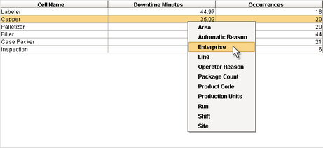
When clicking a row in the table, the drill down menu appears. When an item in the drill down menu is clicked on, the drillDown event is fired. Script in the drillDown event is responsible for updating the Data property to change the results shown in the table. The drill down menu information is set through the Drill Down Options property. The Drill Down Options can be populated from the Analysis Controller, Analysis Selector, SQL Query, scripting, or it can be manually defined in the designer.
Component Properties
Properties are provided that can be set to affect the operation and look of the component. They can be set through the Property Editor in the Designer or through scripting.
Example
Python |
event.source.parent.getComponent('Analysis Table').previousDrillDownEnabled = False |
Data Properties
| Name | Scripting | Property Type | Description |
|---|---|---|---|
| allowExport | Allow Export | Boolean | Allows the user to export the table data |
| Data | data | Dataset | Collection of data in the table |
| Drill Down Options | drillDownOptions | Dataset | Dataset containing the analysis drill down options |
| Previous Drill Down Enabled | previousDrillDownEnabled | Boolean | If true, show previous in drill down menu |
| Column Attributes Data | columnAttributesData | Dataset | The dataset describing the column attributes |
| Selected Column | selectedColumn | int | The index of the first selected column, or -1 if none |
| Selected Row | selectedRow | int | The index of the first selected row, or -1 if none |
Appearance Properties
| Name | Scripting | Property Type | Description |
|---|---|---|---|
| Auto Row Height Enabled | autoRowHeightEnabled | boolean | If true, the row height of the downtime table and the equipment list will be adjusted automatically. |
| Header Font | headerFont | Font | Font to use for the table header. |
| Header Foreground Color | headerForeground | Color | The foreground color of the table header. |
| Header Background Color | headerBackground | Color | The background color of the table header. |
| Row Height | rowHeight | int | The height of each row, in pixels. |
| Selection Background Color | selectionBackground | Color | The background color of a selected row in the table. |
| Selection Foreground Color | selectionForeground | Color | The foreground color of a selected row in the table. |
| Show Horizontal Grid Lines? | showHorizontalLines | boolean | Displays horizontal gridlines making it easier to read. |
| Show Vertical Grid Lines? | showVerticalLines | boolean | Displays vertical gridlines making it easier to read. |
| Table Background Color | tableBackground | Color | The background color of the table body. |
| Grid Line Color | gridColor | Color | The color used to draw grid lines. |
| Vertical Scrollbar Width | verticalScrollbarWidth | int | The width of a vertical scrollbar. |
Along with the component properties, custom properties can also be added to this component. See Component Customizers in the Ignition Help Manual for more information.
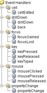
Event Handlers
Event handlers provide the ability to add custom script when a user interacts with a component such as by clicking a mouse, selecting a menu item or when a component property changes.
cell
cellEdited
This event occurs when a component that can receive input, such as a text box, receives the input focus. This usually occurs when a user clicks on the component or tabs over to it.
| Property | Description |
|---|---|
| .source | The component that fired this event. |
| .oldValue | The old value in the cell that changed. |
| .newValue | The new value in the cell that changed. |
| .row | The row of the dataset this cell represents. |
| .column | The column of the dataset this cell represents. |
drillDown
drillDown
Is fired when drill down menu item is selected. Excludes the "Back" menu item.
| Property | Description |
|---|---|
| .source | The component that fired this event. |
| .drillDownName | Text of selected drill down option menu item. |
| .category | Value of first column for the selected row. |
drillDown Event Script
Code |
|
back
| Property | Description |
|---|---|
| .source | The component that fired this event. |
| .drillDownName | Text of selected drill down option menu item. |
| .category | Value of first column for the selected row. |
back Event Script
Code |
|
focus
focusGained
This event occurs when a component that can receive input, such as a text box, receives the input focus. This usually occurs when a user clicks on the component or tabs over to it.
| Property | Description |
|---|---|
| .source | The component that fired this event. |
| .oppositeComponent | The other component involved in this focus change. That is, the component that lost focus in order for this one to gain it, or vice versa. |
focusLost
This event occurs when a component that had the input focus lost it to another component.
| Property | Description |
|---|---|
| .source | The component that fired this event. |
| .oppositeComponent | The other component involved in this focus change. That is, the component that lost focus in order for this one to gain it, or vice versa. |
key
keyPressed
An integer that indicates whether the state was changed to "Selected" (on) or "Deselected" (off). Compare this to the event object's constants to determine what the new state is.
| Property | Description |
|---|---|
| .source | The component that fired this event. |
| .keyCode | The key code for this event. Used with the keyPressed and keyReleased events. See below for the key code constants. |
| .keyChar | The character that was typed. Used with the keyTyped event. |
| .keyLocation | Returns the location of the key that originated this key event. Some keys occur more than once on a keyboard, e.g. the left and right shift keys. Additionally, some keys occur on the numeric keypad. This provides a way of distinguishing such keys. See the KEY_LOCATION constants in the documentation. The keyTyped event always has a location of KEY_LOCATION_UNKNOWN. |
| .altDown | True (1) if the Alt key was held down during this event, false (0) otherwise. |
| .controlDown | True (1) if the Control key was held down during this event, false (0) otherwise. |
| .shiftDown | True (1) if the Shift key was held down during this event, false (0) otherwise. |
keyReleased
Fires when a key is released and the source component has the input focus. Works for all characters, including non-printable ones, such as SHIFT and F3.
| Property | Description |
|---|---|
| .source | The component that fired this event. |
| .keyCode | The key code for this event. Used with the keyPressed and keyReleased events. See below for the key code constants. |
| .keyChar | The character that was typed. Used with the keyTyped event. |
| .keyLocation | Returns the location of the key that originated this key event. Some keys occur more than once on a keyboard, e.g. the left and right shift keys. Additionally, some keys occur on the numeric keypad. This provides a way of distinguishing such keys. See the KEY_LOCATION constants in the documentation. The keyTyped event always has a location of KEY_LOCATION_UNKNOWN. |
| .altDown | True (1) if the Alt key was held down during this event, false (0) otherwise. |
| .controlDown | True (1) if the Control key was held down during this event, false (0) otherwise. |
| .shiftDown | True (1) if the Shift key was held down during this event, false (0) otherwise. |
keyTyped
Fires whenever a bindable property of the source component changes. This works for standard and custom (dynamic) properties.
| Property | Description |
|---|---|
| .source | The component that fired this event. |
| .keyCode | The key code for this event. Used with the keyPressed and keyReleased events. See below for the key code constants. |
| .keyChar | The character that was typed. Used with the keyTyped event. |
| .keyLocation | Returns the location of the key that originated this key event. Some keys occur more than once on a keyboard, e.g. the left and right shift keys. Additionally, some keys occur on the numeric keypad. This provides a way of distinguishing such keys. See the KEY_LOCATION constants in the documentation. The keyTyped event always has a location of KEY_LOCATION_UNKNOWN. |
| .altDown | True (1) if the Alt key was held down during this event, false (0) otherwise. |
| .controlDown | True (1) if the Control key was held down during this event, false (0) otherwise. |
| .shiftDown | True (1) if the Shift key was held down during this event, false (0) otherwise. |
propertyChange
propertyChange
Fires whenever a bindable property of the source component changes. This works for standard and custom (dynamic) properties.
| Property | Description |
|---|---|
| .source | The component that fired this event. |
| .newValue | The new value that this property changed to. |
| .oldValue | The value that this property was before it changed. Note that not all components include an accurate oldValue in their events. |
| .propertyName | The name of the property that changed. NOTE: Remember to always filter out these events for the property that you are looking for! Components often have many properties that change. |
Extension Functions
Extension functions allow the operation of a component to be altered. Extension functions cannot be called, they are event driven. See Component Extension Functions in the Ignition Help Manual for more information.
configureHeaderStyle
- Description
Provides a chance to configure the style of each column header. Return a dictionary of name-value pairs with the desired attributes. Available attributes include: 'font', 'foreground', 'background', 'border', 'toolTipText'.
- Parameters
self - A reference to the component that is invoking this function.
colIndex - The index of the column in the underlying dataset.
colName - Name of the column in the underlying dataset.
- Return
Nothing
- Scope
Client
Code Example
Python |
from java.awt import Font from java.awt import Color from javax.swing.border import MatteBorder return { 'font': Font('Dialog', Font.PLAIN, 12), 'foreground': Color.BLUE, 'background': Color.YELLOW, 'border': MatteBorder(1, 1, 1, 1, Color(238, 236, 232)), 'toolTipText': colName } |
Custom Methods
Custom methods allow you to add your own component functions to a component that can be called through scripting. This is a useful and clean method of re-using script that is specific to the component (say you want to update a visual aspect of the component in the same way whether a user clicks on the component or a window property value changes). See Component Custom Methods in the Ignition Help Manual for more information.
Customizers
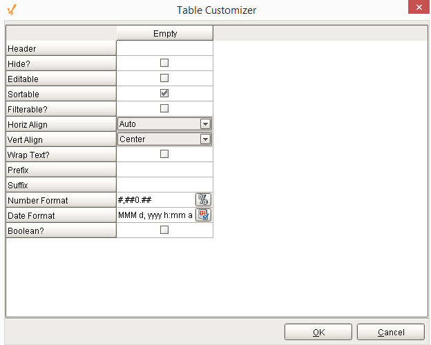
Table Customizer shown below manages the data entered into the Analysis Table. It will allow you to modify the data which is stored inside the Analysis Table. Thus the formatting and alignments are made easy.
Column Configuration
Header - Provide a custom name to the column header.
Hide? - Hides the column.
Editable - Allows the editing of the cell pertaining to the column.
Sortable - Allows the user to sort the table according to the selected column.
Filterable? - To make a column filter the data on user's demand.
Horiz Align - Aligns the contents of the column.
Vert Align - Aligns the contents of the column.
Wrap Text? - Data in the cell wraps to fit the column width. When you change the column width, data wrapping adjusts automatically.
Prefix - A custom text that proceeds the contents of each cell.
Suffix - A custom text that follows the contents of each cell.
Number Format - A format of the cell is the contents of the cell are number types.
Date Format - Used if the contents of the cell are date types.
Boolean? - Changes the contents of the cell to reflect a 'check box' look and feel.
Component Functions
This component does not have functions associated with it.
Sepasoft MES Module Suite