Sepasoft MES Module Suite
Median and Range Chart
The Median Moving Range (MR) control chart is used to display SPC results that have multiple measurements for each sample. It does not retrieve SPC results from the SPC module so it must be used with either the SPC Selector or the SPC Controller components that do. Only SPC results with Median and MR SPC Data Format specified will be displayed.
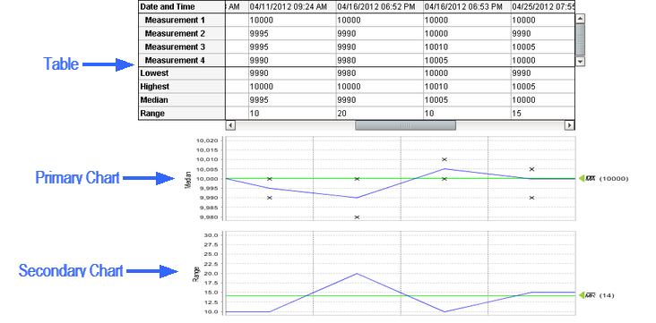
Median Moving Range Control Chart
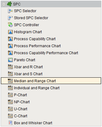
Component Palette
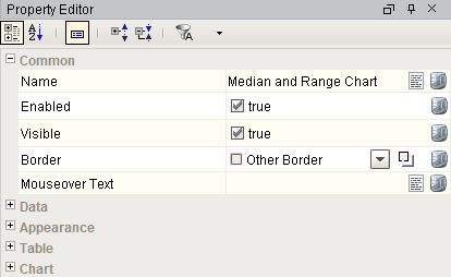
Component Properties
Properties are provided that can be set to affect the operation and look of the component. They can be set through the Property Editor in the Designer or through scripting.
Example
Code |
|
Data
| Name | Scripting | Property Type | Description |
|---|---|---|---|
| Calculated Values | calcValues | String | Calculated value definitions. |
| Measurement Count | measurementCount | int | Number of measurements in the SPC results. Note that the max number of measurements is 500. |
| SPC Data | sPCData | String | SPC Data. |
| SPC Results | sPCResults | String | SPC results containing data, measurement count and calculated value information. |
| User | user | String | Current user. If this property is not set, then the currently logged in user will be used. |
Appearance
| Name | Scripting | Property Type | Description |
|---|---|---|---|
| No Data Font | noDataFont | Font | The font to use for the no data message. |
| No Data Foreground | noDataForeground | Color | The foreground color of the no data message. |
| No Data Message | noDataMessage | String | The message to show when there is no data. |
Table
| Name | Scripting | Property Type | Description |
|---|---|---|---|
| Calc Background | calcBackground | Color | The background color of the calculated values. |
| CalcFont | calcFont | Font | The font to use for the calculated values. |
| Calc Foreground | calcForeground | Color | The foreground color of the calculated values. |
| Column Width | columnWidth | int | The width of the table columns. |
| Data Background | dataBackground | Color | The background color of the data values. |
| Data Font | dataFont | Font | The font to use for the data values. |
| Data Foreground | dataForeground | Color | The foreground color of the data values. |
| Date Background | dateBackground | Color | The background color of the date row. |
| Date Font | dateFont | Font | The font to use for the date row. |
| Date Foreground | dateForeground | Color | The foreground color of the date row. |
| Date Format | dateFormat | String | The date formatting pattern used to display the date. |
| Enable Highlights | enableHighlights | String | Enables highlighting of signals and control limits in the table. |
| Label Background | labelBackground | Color | The background color of the labels. |
| Label Font | labelFont | Font | The font to use for the labels. |
| Label Foreground | labelForeground | Color | The foreground color of the labels. |
| Min Visible Samples | minVisibleSamples | String | The minimum number of sample to show in the table. |
| Row Height | rowHeight | int | The height of the table rows. |
| Scroll X | scrollX | String | The scroll bar x position. |
| Show Table | showTable | boolean | Set to true to display the sample values table. |
| Visible Measurements | visibleMeasurements | String | The number of measurements to show in the table. |
Chart
| Name | Scripting | Property Type | Description |
|---|---|---|---|
| Edit Control Limit Image | editControlLimitImagePath | String | Image to show for editing control limits. |
| Enable Control Limit Editing | enableControlLimitEditing | boolean | If true, allow users to change control limit values. |
| Enable Note Editing | enableNoteEditing | boolean | If true, allow users to add and edit notes. |
| Enable Point Deletion | enablePointDeletion | boolean | If true, allow users to delete points. |
| Enable Sample Deletion | enableSampleDeletion | boolean | If true, allow users to delete samples. |
| Horizontal Grid Line Color | horzGridLineColor | Color | The color of horizontal grid lines. |
| Limit Dialog Horizontal Offset | limitDialogOffsetX | String | The horizontal offset to display the control limit dialog box. |
| Limit Dialog Vertical Offset | limitDialogOffsetY | String | The vertical offset to display the control limit dialog box. |
| Marker Image Path | markerImagePath | String | The relative path of an image to display for markers. |
| Marker Label Font | markerLabelFont | Font | The font to use for the markers. |
| Note Image | noteImagePath | String | Image to show on the the charts when notes exist for a sample. |
| Primary Chart Axis Title | primaryChartAxisTitle | String | Title to show for the primary chart axis. |
| Primary Chart Background | primaryChartBackground | Color | The background color of the primary chart. |
| Right Axis Width | rightAxisWidth | int | The width of the right chart axis. |
| Secondary Chart Axis Title | secondaryChartAxisTitle | String | Title to show for the secondary chart axis. |
| Secondary Chart Background | secondaryChartBackground | Color | The background color of the secondary chart. |
| Show Horizontal Grid Lines | showHorzGridLines | boolean | If true, show horizontal grid lines on charts. |
| Show Notes | showNotes | boolean | If true, show notes on the chart. |
| Show Primary Average | showPrimaryAverage | boolean | Set to true to display the average line on the primary chart. |
| Show Primary Chart | showPrimaryChart | boolean | Set to true to display the primary chart. |
| Show Secondary Average | showSecondaryAverage | boolean | Set to true to display the average line on the secondary chart. |
| Show Seconday Chart | showSecondaryChart | boolean | Set to true to display the secondary chart. |
| Show Vertical Grid Lines | showVertGridLines | boolean | If true, show vertical grid lines on charts. |
| Vertical Grid Line Color | vertGridLineColor | Color | The color of vertical grid lines. |
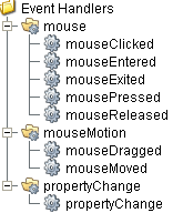
Event Handlers
Event handlers provide the ability to add custom script when a user interacts with a component such as by clicking a mouse, selecting a menu item or when a component property changes.
mouse
mouseClicked
This event signifies a mouse click on the source component. A mouse click the combination of a mouse press and a mouse release, both of which must have occurred over the source component. Note that this event fires after the pressed and released events have fired.
| Property | Description |
|---|---|
| .source | The component that fired this event. |
| .button | The code for the button that caused this event to fire. |
| .clickCount | The number of mouse clicks associated with this event. |
| .x | The x-coordinate (with respect to the source component) of this mouse event. |
| .y | The y-coordinate (with respect to the source component) of this mouse event. |
| .popupTrigger | Returns True (1) if this mouse event is a popup trigger. What constitutes a popup trigger is operating system dependent, which is why this abstraction exists. |
| .altDown | True (1) if the Alt key was held down during this event, false (0) otherwise. |
| .controlDown | True (1) if the Ctrl key was held down during this event, false (0) otherwise. |
| .shiftDown | True (1) if the Shift key was held down during this event, false (0) otherwise. |
mouseEntered
This event fires when the mouse enters the space over the source component.
| Property | Description |
|---|---|
| .source | The component that fired this event. |
| .button | The code for the button that caused this event to fire. |
| .clickCount | The number of mouse clicks associated with this event. |
| .x | The x-coordinate (with respect to the source component) of this mouse event. |
| .y | The y-coordinate (with respect to the source component) of this mouse event. |
| .popupTrigger | Returns True (1) if this mouse event is a popup trigger. What constitutes a popup trigger is operating system dependent, which is why this abstraction exists. |
| .altDown | True (1) if the Alt key was held down during this event, false (0) otherwise. |
| .controlDown | True (1) if the Ctrl key was held down during this event, false (0) otherwise. |
| .shiftDown | True (1) if the Shift key was held down during this event, false (0) otherwise. |
mouseExited
This event fires when the mouse leaves the space over the source component.
| Property | Description |
|---|---|
| .source | The component that fired this event. |
| .button | The code for the button that caused this event to fire. |
| .clickCount | The number of mouse clicks associated with this event. |
| .x | The x-coordinate (with respect to the source component) of this mouse event. |
| .y | The y-coordinate (with respect to the source component) of this mouse event. |
| .popupTrigger | Returns True (1) if this mouse event is a popup trigger. What constitutes a popup trigger is operating system dependent, which is why this abstraction exists. |
| .altDown | True (1) if the Alt key was held down during this event, false (0) otherwise. |
| .controlDown | True (1) if the Ctrl key was held down during this event, false (0) otherwise. |
| .shiftDown | True (1) if the Shift key was held down during this event, false (0) otherwise. |
mousePressed
This event fires when a mouse button is pressed down on the source component.
| Property | Description |
|---|---|
| .source | The component that fired this event. |
| .button | The code for the button that caused this event to fire. |
| .clickCount | The number of mouse clicks associated with this event. |
| .x | The x-coordinate (with respect to the source component) of this mouse event. |
| .y | The y-coordinate (with respect to the source component) of this mouse event. |
| .popupTrigger | Returns True (1) if this mouse event is a popup trigger. What constitutes a popup trigger is operating system dependent, which is why this abstraction exists. |
| .altDown | True (1) if the Alt key was held down during this event, false (0) otherwise. |
| .controlDown | True (1) if the Ctrl key was held down during this event, false (0) otherwise. |
| .shiftDown | True (1) if the Shift key was held down during this event, false (0) otherwise. |
mouseReleased
This event fires when a mouse button is released, if that mouse button's press happened over this component.
| Property | Description |
|---|---|
| .source | The component that fired this event. |
| .button | The code for the button that caused this event to fire. |
| .clickCount | The number of mouse clicks associated with this event. |
| .x | The x-coordinate (with respect to the source component) of this mouse event. |
| .y | The y-coordinate (with respect to the source component) of this mouse event. |
| .popupTrigger | Returns True (1) if this mouse event is a popup trigger. What constitutes a popup trigger is operating system dependent, which is why this abstraction exists. |
| .altDown | True (1) if the Alt key was held down during this event, false (0) otherwise. |
| .controlDown | True (1) if the Ctrl key was held down during this event, false (0) otherwise. |
| .shiftDown | True (1) if the Shift key was held down during this event, false (0) otherwise. |
mouseMotion
mouseDragged
Fires when the mouse moves over a component after a button has been pushed.
| Property | Description |
|---|---|
| .source | The component that fired this event. |
| .button | The code for the button that caused this event to fire. |
| .clickCount | The number of mouse clicks associated with this event. |
| .x | The x-coordinate (with respect to the source component) of this mouse event. |
| .y | The y-coordinate (with respect to the source component) of this mouse event. |
| .popupTrigger | Returns True (1) if this mouse event is a popup trigger. What constitutes a popup trigger is operating system dependent, which is why this abstraction exists. |
| .altDown | True (1) if the Alt key was held down during this event, false (0) otherwise. |
| .controlDown | True (1) if the Ctrl key was held down during this event, false (0) otherwise. |
| .shiftDown | True (1) if the Shift key was held down during this event, false (0) otherwise. |
mouseMoved
Fires when the mouse moves over a component, but no buttons are pushed.
| Property | Description |
|---|---|
| .source | The component that fired this event. |
| .button | The code for the button that caused this event to fire. |
| .clickCount | The number of mouse clicks associated with this event. |
| .x | The x-coordinate (with respect to the source component) of this mouse event. |
| .y | The y-coordinate (with respect to the source component) of this mouse event. |
| .popupTrigger | Returns True (1) if this mouse event is a popup trigger. What constitutes a popup trigger is operating system dependent, which is why this abstraction exists. |
| .altDown | True (1) if the Alt key was held down during this event, false (0) otherwise. |
| .controlDown | True (1) if the Ctrl key was held down during this event, false (0) otherwise. |
| .shiftDown | True (1) if the Shift key was held down during this event, false (0) otherwise. |
propertyChange
propertyChange
Fires whenever a bindable property of the source component changes. This works for standard and custom (dynamic) properties.
| Property | Description |
|---|---|
| .source | The component that fired this event. |
| .newValue | The new value that this property changed to. |
| .oldValue | The value that this property was before it changed. Note that not all components include an accurate oldValue in their events. |
| .propertyName | The name of the property that changed. NOTE: Remember to always filter out these events for the property that you are looking for! Components often have many properties that change. |
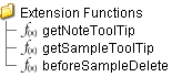
Extension Functions
getNoteToolTip
- Description
Called when tool tip content is generated for a note symbol. The default tool tip is passed and can be modified or replaced.
- Parameters
self - A reference to the component that is invoking this function.
sampleUUID - The UUID of the sample that the tool tip is being generated for.
defaultToolTip - The default tool tip that can be modified or replaced.
- Return
The defaultToolTip.
- Scope
Client
getSampleToolTip
- Description
Called when tool tip content is generated for a sample. The default tool tip is passed and can be modified or replaced.
- Parameters
self - A reference to the component that is invoking this function.
sampleUUID - The UUID of the sample that the tool tip is being generated for.
valueInfo - The SPCCalcValueInfo object that holds information about the value.
defaultToolTip - The default tool tip that can be modified or replaced.
- Return
The defaultToolTip.
- Scope
Client
beforeSampleDelete
- Description
Called before the sample be deleted. If return value is True, then the sample be deleted.
- Parameters
self - A reference to the component that is invoking this function.
sampleUUID - The UUID of the sample to be deleted.
- Return
True
- Scope
Client
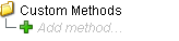
Custom Methods
Custom methods allow you to add your own component functions to a component that can be called through scripting. This is a useful and clean method of re-using script that is specific to the component (say you want to update a visual aspect of the component in the same way whether a user clicks on the component or a window property value changes). See Component Custom Methods in the Ignition Help Manual for more information.
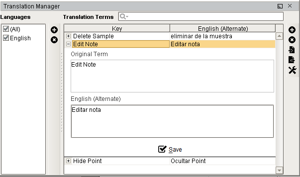
Translation Manager
Right clicking the control chart will give the pop up menu items like Delete Sample, Edit Note, Hide Point and Restore Hidden Points. SPC chart popup panel menu strings are localizable. The alternate strings can be added through the Ignition translation manager (not the component translation manager). Reopen the control chart page and right click on a point to manifest the changes.
Customizers
This component does not have any custom properties.
Component Functions
Control Chart Script Functions
Helper functions for the Vision control charts:
Export Values
Exports the control chart values.
Syntax
export(locale, csvSeparator)
- Parameters
String locale - Locale used for parsing.
String csvSeparator - The csv delimiter used.
- Returns
A XML string value representing the SPC control chart values.
- Scope
Client
Export and Filter Values
Exports the control charts values.
Syntax
export(locale, csvSeparator, filter)
- Parameters
String locale - Locale used for parsing.
String csvSeparator - The csv delimiter used.
String filter - The string value to filter results.
- Returns
A XML string value representing the SPC control chart values.
- Scope
Client
Export and Save to File
Exports and saves the results to file.
Syntax
exportWithSave(locale, csvSeparator)
- Parameters
String locale - Locale used for parsing.
String csvSeparator - The csv delimiter used.
- Returns
A XML string value representing the SPC control chart values.
- Scope
Client
Export, Filter and Save to File
Exports and saves the results to a file.
Syntax
exportWithSave(locale, csvSeparator, filter)
- Parameters
String locale - Locale used for parsing.
String csvSeparator - The csv delimiter used.
String filter - The string value to filter results.
- Returns
A XML string value representing the SPC control chart values.
- Scope
Client
Sepasoft MES Module Suite