Sepasoft MES Module Suite
OEE Time Chart Component
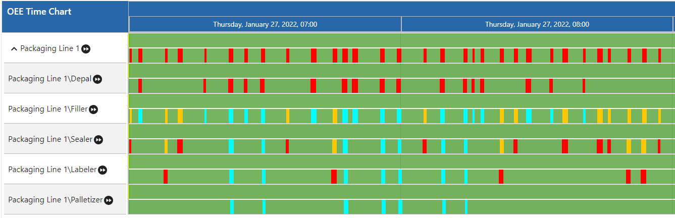
The OEE Time Chart component displays a single Line and its cell(s) downtime events of a production run.
To interact and navigate within the timeline there are the following options for the user:
- shift - mousewheel = move timeline left/right
- alt - mousewheel = zoom in/out
- ctrl - mousewheel = zoom in/out 10× faster
- meta - mousewheel = zoom in/out 3x faster (win or cmd - mousewheel)
- Plus there is a handling for pinch-in and pinch-out zoom gestures (two touch points). The pinch gesture on a trackpad (not a touch device) works in Chrome and Firefox (v55-) because these browsers map the gesture to ctrl - mousewheel.
Component Properties
Properties are provided that can be set to affect the operation and look of the component. They can be set through the Perspective Property Editor in the Designer or through scripting. Note that the section prefix is included before the property name (props, position, custom or meta).
Python |
self.getSibling("oeeTimeChart").props.showEquipmentMode = True |
| Property Name | Scripting Name | Data Type | Description | |||||
|---|---|---|---|---|---|---|---|---|
| End Date | endDate | DateTime | End date to get schedules for the production line as UNIX timestamps (in milliseconds or a date object). | |||||
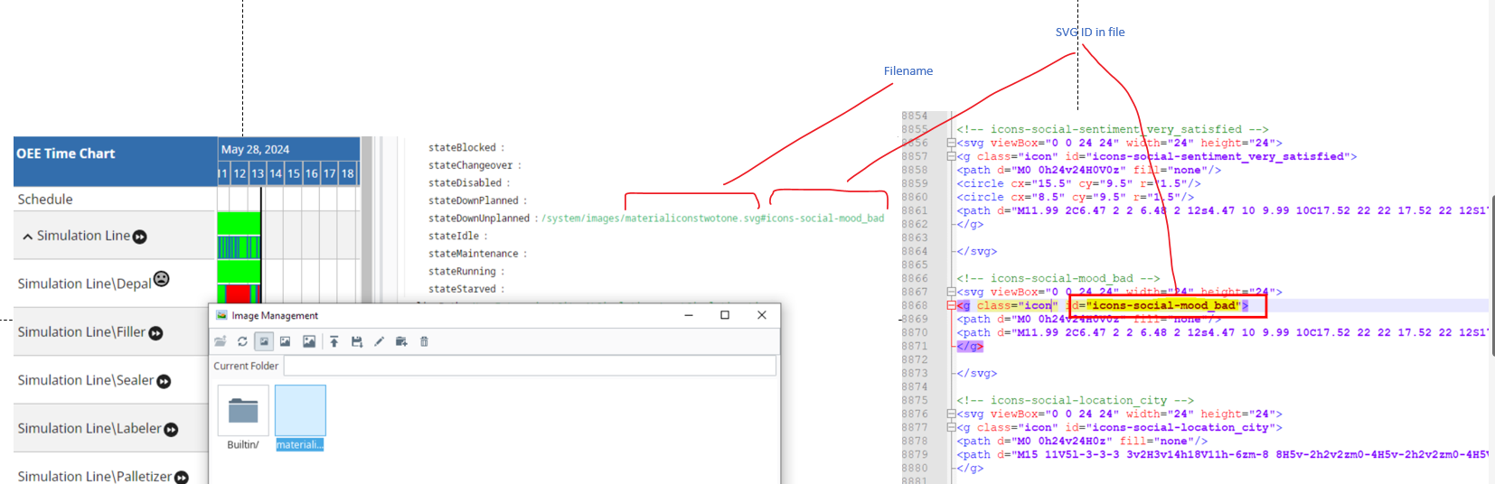
| Icons | icons | String | Available parameters for icons: stateStarved. Image source URL can be a URL to an image on the Internet or Gateway, or an embedded image. If you use images in the Image Management tool, use this format /system/images/<imagepath>. For example, the Builtin/icons/16/about.png image path would be /system/images/Builtin/icons/16/about.png. (the source can be set to a Base64 encoded image.)
Example Below: Material icons from Material Symbols and Icons - Google Fonts and uploaded to the Image Management Tool in Ignition Designer.
| |||||
| Is Aggregate View Mode | isAggregateViewMode | Boolean | If True, the aggregate view mode is turned on. This allows the system to aggregate state data into blocks, each block summarizes equipment states for a day.
In the aggregate view, each state type color is either grouped as a stack bottom to top, or horizontally from left to right. Use the "horizontalGradient" (in property tree) to choose the direction. | |||||
| Line Path | linePath | String | Production line path to show schedules for. | |||||
| Load Expanded | loadExpanded | Boolean | Allows the equipment to show expanded or collapsed.
| |||||
| Lookback Hours | lookbackHours | Integer | Number of hours to look back from the analysis begin date to consider for downtime cause.
| |||||
| Run Look Back Count | runLookBackCount | Integer | Number of runs to show schedules, equipment modes and equipment states for. Set to '0' to see all runs within the selected date range. Set to '1' to see only the current run. | |||||
| Show Date Range Header | showDateRangeHeader | Boolean | When true, show the Date Range Header. | |||||
| Show Equipment Mode | showEquipmentMode | Boolean | When true, true, show Equipment Modes. | |||||
| Show Equipment State | showEquipmentState | Boolean | If true, show Equipment States. | |||||
| Show Ignition Schedule | showIgnitionSchedule | Boolean | If true, show Ignition schedules. | |||||
| Show Production Schedule | showProductionSchedule | Boolean | If true, show production schedules. | |||||
| Sidebar Width | sidebarWidth | Integer | Width of groups. | |||||
| Start Date | startDate | date time | Start date to get schedules for the production line as UNIX timestamps (in milliseconds or a date object). | |||||
| Title | title | String | Title to appear on the component. | |||||
| Unknown State As Unplanned Downtime | unknownStateAsUnplannedDowntime | Boolean | If true, treat unknown Equipment States as unplanned downtime. | |||||
| Update Interval | updateInterval | date time | Date update frequency, in milliseconds. | |||||


Styles
The OEE Time Chart's State, Mode, Schedule Operations, and Restriction segments are now customizable via the TimelineItemStyles.

|
MES 3.81.1 SP7 and later |
| restrictionStyle | Use this property to customize restriction segments. |
| operationStyle | All of these styles come with uniform default "color" and" border" properties that affect the text-color and border respectively. Each one has a unique default color.
|
| modeStyle | Each pertaining to a type of Equipment Mode.
|
| stateStyle | Each pertaining to a type of Equipment State.
|
Each property above can be edited for text, background, margins and padding, border, shape, as well as opacity, cursor and overflow characteristics.
Ignition Style Editor Refer to the Ignition docs page Style Reference for information on modifying the properties listed below.
| Timeline Style | timelineStyle |
| Timeline Header Style | timelineHeaderStyle |
| Tooltip Style | tooltipStyle |
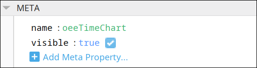
Meta Properties
This section contains the name and visibility properties for the component.
New user-defined meta properties can be created in this section.
User-defined Properties

|
Best practice: If user-defined properties are required, create them in the CUSTOM section instead of here. |
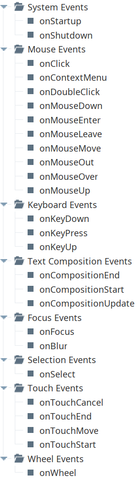
Event Handlers
Event handlers provide the ability to add custom script when a user interacts with a component.
Refer to the Ignition 8.1 User Manual for details on using the available event handlers:
- Ignition: Component Events and Actions
- Ignition: Perspective Event Types Reference
Component Functions
This component has no Component Functions.
Sepasoft MES Module Suite