Sepasoft MES Module Suite
Bar Chart

A component that displays a pie chart with drill down capabilities. This extends from the Bar Chart Component that comes with Ignition.
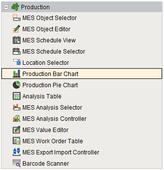
Component Palette
Features
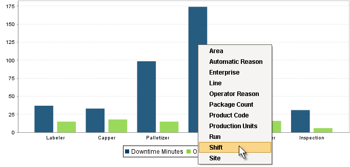
The Drill Down Options property allows custom menu items to be added. When the user clicks on a bar of the bar chart, the drill down menu will appear. When an item in the drill down menu is clicked on, the drillDown event is fired. Script in the drillDown event is responsible for updating the Data property to change the results shown in the bar chart. The drill down menu information is set through the Drill Down Options property. The Drill Down Options can be populated from the Analysis Controller, Analysis Selector, SQL Query, scripting or it can be manually defined in the designer.
Production Bar Chart
Component Properties
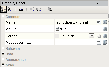
Properties are provided that can be set to affect the operation and look of the component. They can be set through the Property Editor in the Designer or through scripting.
Example
Code |
|
Behavior
| Name | Scripting | Property Type | Description |
|---|---|---|---|
| Tooltips? | tooltips | boolean | Should tooltips be displayed when the mouse hovers over sections? |
Data
| Name | Scripting | Property Type | Description |
|---|---|---|---|
| Data | data | Dataset | Data driving the chart. |
| Drill Down Options | drillDownOptions | Dataset | Dataset with drill down options. |
| Previous Drill Down Enabled | previousDrillDownEnabled | boolean | If true, show previous in drill down menu. |
| Data Quality | dataQuality | int | The data quality code for any tag bindings on this component. |
| Extract Order | extractOrder | int | Controls whether the first row defines the categories or the series. 0 = By Column |
| Category Date Format | categoryDateFormat | String | Format the category if it is a date. |
Appearance
| Name | Scripting | Property Type | Description |
|---|---|---|---|
| Chart Title | title | String | An optional title that will appear at the top of the chart. |
| Chart Type | rendererType | int | Controls how the bar chart is displayed. 0 = Bar |
| Plot Background | plotBackground | Color | Background color for the plot. |
| Plot Border Color | plotBorderColor | Color | Border color for the plot. |
| Shadow Color | shadowColor | Color | Shadow color for the plot. |
| Series Colors | seriesColors | Color | The sequence of colors used for series in the bar chart. |
| Legend? | legend | boolean | Should there be an item legend below the chart? |
| Gradient bars? | gradient | boolean | If true, bars will be painted with a gradient 'shine'. |
| Foreground Transparency | foregroundAlpha | Float4 | Transparency of the pie. |
| Vertical | vertical | boolean | Sets the orientation of the chart to vertical (true) or horizontal(false) |
| Category Margin | categoryMargin | Float8 | Marigin between categories as a fraction of the total space. |
| Item Margin | itemMargin | Float8 | Margin between bars in a category as a fraction. |
Bar Labels
| Name | Scripting | Property Type | Description |
|---|---|---|---|
| Maximum Bar Width | barMaxWidth | double | Maximum width any single bar can be on the chart. |
| Show Labels? | showLabels | boolean | Set to True to always display labels. |
| Bar Label Font | barLabelFont | Font | Font for the bar labels. |
| Label Format Style | barLabelFormatStyle | int | Automatically updates the Label Format property to predetermined settings based on the provided Dataset and selected Extraction Order. 0 = Property Titles |
| Label Format | barLabelFormat | String | If Extract Order is set to Row: If Extract Order is set to Column: Regardless of Extract Order setting: |
| Bar Label Adjustment | barLabelAdjustment | int | Sets the behavior of bar labels if it does not fit inside a bar. 0 = None (labels will be drawn as is) |
| Include Offsets When Truncating? | truncateWithOffset | boolean | Set to True if Bar Label Offsets should be considered when truncating labels on the chart. |
| Bar Label X-Offset | barLabelOffsetX | double | X offset between the bar and the bar label. |
| Bar Label Y-Offset | barLabelOffsetY | double | Y offset between the bar and the bar label. |
| Bar Label Angle | barLabelAngle | double | Degrees to rotate bar labels. |
Axes
| Name | Scripting | Property Type | Description |
|---|---|---|---|
| Show Category Axis Labels | showCategoryAxisLabels | boolean | Set to True to show the labels for each category axis. |
| Show Value Axis Labels | showValueAxisLabels | boolean | Set to True to show the labels for each value axis. |
| Value Axis Label | valueLabel | String | Label for the value axis. |
| Value Axis Label Format | valueLabelFormat | String | Label format for the value axis. |
| Category Axis Label | categoryLabel | String | Label for the category axis. |
| Value Axis Auto-Range | valAxisAutoRange | boolean | If true, the value axis range will be determined automatically. If false, the specified upper and lower bounds will be used. |
| Value Axis Lower Bound | valAxisLowerBound | double | Lower bound of the value axis. Used only when auto-range is false. |
| Value Axis Upper Bound | valAxisUpperBound | double | Upper bound of the value axis. Used only when auto-range is false. |
| Category Axis Label Angle | |||
| Title Font | titleFont | Font | Font for the chart's title. |
| Legend Font | legendFont | Font | Font for the legend items. |
| Value Axis Label Font | valAxisLabelFont | Font | Font for the value axis label. |
| Category Axis Label Font | catAxisLabelFont | Font | Font for the category axis label. |
| Value Axis Tick Font | valAxisTickFont | Font | Font for the value axis' ticks. |
| Category Axis Tick Font | catAxisTickFont | Font | Font for the category axis' ticks. |
| Bar Label Color | barLabelColor | Color | Color for the bar labels. |
| Value Axis Label Color | valAxisLabelColor | Color | Color for the value axis label. |
| Category Axis Label Color | catAxisLabelColor | Color | Color for the category axis label. |
| Value Axis Tick Color | valAxisTickColor | Color | Color for the value axis' ticks. |
| Category Axis Tick Color | catAxisTickColor | Color | Color for the category axis' ticks. |
| Value Axis Upper Margin | valAxisUpperMargin | double | Upper margin, as a percentage, of the value axis. Only used when auto-range is true. |
| Category Axis Upper Margin | catAxisUpperMargin | double | Upper margin, as a percentage, of the category axis. |
| Category Axis Lower Margin | catAxisLowerMargin | double | Lower margin, as a percentage, of the category axis. |
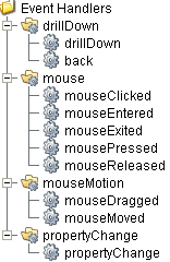
Event Handlers
Event handlers provide the ability to add custom script when a user interacts with a component such as by clicking a mouse, selecting drill down menu or when a component property changes.
drillDown
drillDown
Is fired when drill down menu item is selected. Excludes the "Back" menu item.
| Property | Description |
|---|---|
| .source | The component that fired this event. |
| .drillDownName | Text of selected drill down option menu item. |
| .category | Value of first column for the selected row. |
back
| Property | Description |
|---|---|
| .source | The component that fired this event. |
| .drillDownName | Text of selected drill down option menu item. |
| .category | Value of first column for the selected row. |
mouse
mouseClicked
This event signifies a mouse click on the source component. A mouse click the combination of a mouse press and a mouse release, both of which must have occurred over the source component. Note that this event fires after the pressed and released events have fired.
| Property | Description |
|---|---|
| .source | The component that fired this event. |
| .button | The code for the button that caused this event to fire. |
| .clickCount | The number of mouse clicks associated with this event. |
| .x | The x-coordinate (with respect to the source component) of this mouse event. |
| .y | The y-coordinate (with respect to the source component) of this mouse event. |
| .popupTrigger | Returns True (1) if this mouse event is a popup trigger. What constitutes a popup trigger is operating system dependent, which is why this abstraction exists. |
| .altDown | True (1) if the Alt key was held down during this event, false (0) otherwise. |
| .controlDown | True (1) if the Ctrl key was held down during this event, false (0) otherwise. |
| .shiftDown | True (1) if the Shift key was held down during this event, false (0) otherwise. |
mouseEntered
This event fires when the mouse enters the space over the source component.
| Property | Description |
|---|---|
| .source | The component that fired this event. |
| .button | The code for the button that caused this event to fire. |
| .clickCount | The number of mouse clicks associated with this event. |
| .x | The x-coordinate (with respect to the source component) of this mouse event. |
| .y | The y-coordinate (with respect to the source component) of this mouse event. |
| .popupTrigger | Returns True (1) if this mouse event is a popup trigger. What constitutes a popup trigger is operating system dependent, which is why this abstraction exists. |
| .altDown | True (1) if the Alt key was held down during this event, false (0) otherwise. |
| .controlDown | True (1) if the Ctrl key was held down during this event, false (0) otherwise. |
| .shiftDown | True (1) if the Shift key was held down during this event, false (0) otherwise. |
mouseExited
This event fires when the mouse leaves the space over the source component.
| Property | Description |
|---|---|
| .source | The component that fired this event. |
| .button | The code for the button that caused this event to fire. |
| .clickCount | The number of mouse clicks associated with this event. |
| .x | The x-coordinate (with respect to the source component) of this mouse event. |
| .y | The y-coordinate (with respect to the source component) of this mouse event. |
| .popupTrigger | Returns True (1) if this mouse event is a popup trigger. What constitutes a popup trigger is operating system dependent, which is why this abstraction exists. |
| .altDown | True (1) if the Alt key was held down during this event, false (0) otherwise. |
| .controlDown | True (1) if the Ctrl key was held down during this event, false (0) otherwise. |
| .shiftDown | True (1) if the Shift key was held down during this event, false (0) otherwise. |
mousePressed
This event fires when a mouse button is pressed down on the source component.
| Property | Description |
|---|---|
| .source | The component that fired this event. |
| .button | The code for the button that caused this event to fire. |
| .clickCount | The number of mouse clicks associated with this event. |
| .x | The x-coordinate (with respect to the source component) of this mouse event. |
| .y | The y-coordinate (with respect to the source component) of this mouse event. |
| .popupTrigger | Returns True (1) if this mouse event is a popup trigger. What constitutes a popup trigger is operating system dependent, which is why this abstraction exists. |
| .altDown | True (1) if the Alt key was held down during this event, false (0) otherwise. |
| .controlDown | True (1) if the Ctrl key was held down during this event, false (0) otherwise. |
| .shiftDown | True (1) if the Shift key was held down during this event, false (0) otherwise. |
mouseReleased
This event fires when a mouse button is released, if that mouse button's press happened over this component.
| Property | Description |
|---|---|
| .source | The component that fired this event. |
| .button | The code for the button that caused this event to fire. |
| .clickCount | The number of mouse clicks associated with this event. |
| .x | The x-coordinate (with respect to the source component) of this mouse event. |
| .y | The y-coordinate (with respect to the source component) of this mouse event. |
| .popupTrigger | Returns True (1) if this mouse event is a popup trigger. What constitutes a popup trigger is operating system dependent, which is why this abstraction exists. |
| .altDown | True (1) if the Alt key was held down during this event, false (0) otherwise. |
| .controlDown | True (1) if the Ctrl key was held down during this event, false (0) otherwise. |
| .shiftDown | True (1) if the Shift key was held down during this event, false (0) otherwise. |
mouseMotion
mouseDragged
Fires when the mouse moves over a component after a button has been pushed.
| Property | Description |
|---|---|
| .source | The component that fired this event. |
| .button | The code for the button that caused this event to fire. |
| .clickCount | The number of mouse clicks associated with this event. |
| .x | The x-coordinate (with respect to the source component) of this mouse event. |
| .y | The y-coordinate (with respect to the source component) of this mouse event. |
| .popupTrigger | Returns True (1) if this mouse event is a popup trigger. What constitutes a popup trigger is operating system dependent, which is why this abstraction exists. |
| .altDown | True (1) if the Alt key was held down during this event, false (0) otherwise. |
| .controlDown | True (1) if the Ctrl key was held down during this event, false (0) otherwise. |
| .shiftDown | True (1) if the Shift key was held down during this event, false (0) otherwise. |
mouseMoved
Fires when the mouse moves over a component, but no buttons are pushed.
| Property | Description |
|---|---|
| .source | The component that fired this event. |
| .button | The code for the button that caused this event to fire. |
| .clickCount | The number of mouse clicks associated with this event. |
| .x | The x-coordinate (with respect to the source component) of this mouse event. |
| .y | The y-coordinate (with respect to the source component) of this mouse event. |
| .popupTrigger | Returns True (1) if this mouse event is a popup trigger. What constitutes a popup trigger is operating system dependent, which is why this abstraction exists. |
| .altDown | True (1) if the Alt key was held down during this event, false (0) otherwise. |
| .controlDown | True (1) if the Ctrl key was held down during this event, false (0) otherwise. |
| .shiftDown | True (1) if the Shift key was held down during this event, false (0) otherwise. |
propertyChange
propertyChange
Fires whenever a bindable property of the source component changes. This works for standard and custom (dynamic) properties.
| Property | Description |
|---|---|
| .source | The component that fired this event. |
| .newValue | The new value that this property changed to. |
| .oldValue | The value that this property was before it changed. Note that not all components include an accurate oldValue in their events. |
| .propertyName | The name of the property that changed. NOTE: Remember to always filter out these events for the property that you are looking for! Components often have many properties that change. |
Extension Functions
.configureChart()
Included in Sepasoft Versions:

|
Stable Release Versions: MES 3.81.1 SP9 and later |
configureChart()
- Description
Provides an opportunity to perform further chart configuration via scripting. Doesn't return anything.
- Parameters
Component chart-A JFreeChart object. Refer to the JFreeChart documentation for API details.
- Return
Nothing
- Scope
Client
Custom Methods
Custom methods allow you to add your own component functions to a component that can be called through scripting. This is a useful and clean method of re-using script that is specific to the component (say you want to update a visual aspect of the component in the same way whether a user clicks on the component or a window property value changes). See Component Custom Methods in the Ignition Help Manual for more information.
Customizers
This component does not have any custom properties.
Component Functions
This component does not have functions associated with it.
Sepasoft MES Module Suite