Sepasoft MES Module Suite
Perspective SPC Charts | Individual Chart
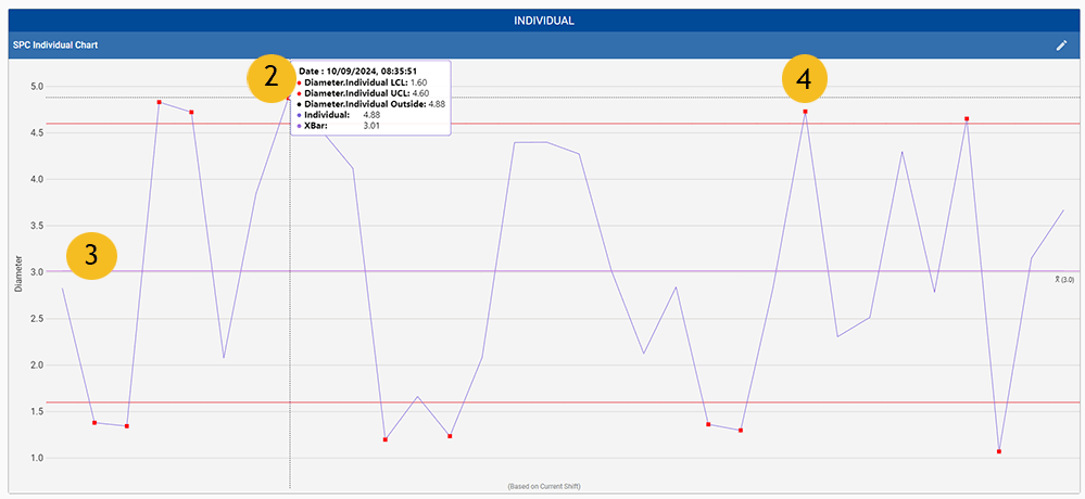
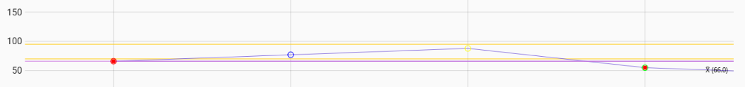
The Individual Chart presents the absolute difference between two consecutive values.
For SPC data analysis when:
- grouping measurements into rational subgroups is not possible,
- monitoring actual observations is preferred to viewing subgroup averages
- the process distribution is very skewed or bounded.
The Perspective Chart component is in Ignition Designer | Perspective Component Palette.

|
Available in MES 3.81.7 RC1 and later Installed with SPC Module |
Viewing SPC Chart
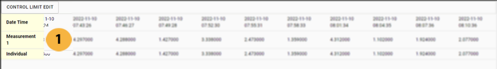
| Sample Data | Table of samples showing data points. You can show or hide the table by setting the showTable property. |
| Sample Details | Mouse-over a data point to display the statistical information configured for the chart and a timestamp. |
| Primary Average Line Lower Control Limit | The purple line above shows the primary average by enabling showPrimaryAverage property, see below. The red lines above and below the midline depict the upper and lower control limits. Data points that land in between the upper and lower lines are known as common-cause variation. |
| Data points outside of limits | Points outside of the limits, called special-cause variation. For information about configuration Signals and Rules, see SPC Signals. |


Table Chart Scroll Locking
 |
This feature is available in versions: MES 3.81.11 SP7 and later MES 4.83.0 RC2 and later |
State | Detailed Description |
Locked | UI: The lock icon in the taskbar appears closed and filled. Behavior: The chart view is locked to the right, automatically jumping to the end of the table whenever new data is received. Tooltip: Hovering over the icon displays the text: "Allow Free Scrolling". |
Free Scrolling | UI: The lock icon in the taskbar appears open and unfilled. Behavior: The chart maintains its current scroll position, even when new data is received. Tooltip: Hovering over the icon displays the text: "Lock Scrolling". |
SPC Individual Chart in Ignition Designer
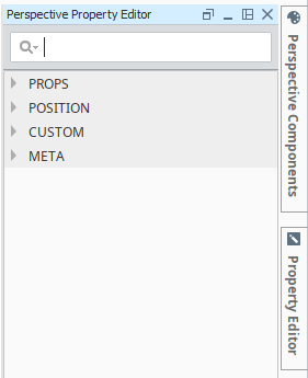
The Designer Perspective Component lists the chart. Once you add the chart to the design area, it displays and you have access to its properties in the Perspective Property Editor.
Component Properties
Properties affect the operation and look of the component. They can be set through the Perspective Property Editor in the Designer or through scripting.
META Name
spcIndividualChart
Code Example
Code |
|
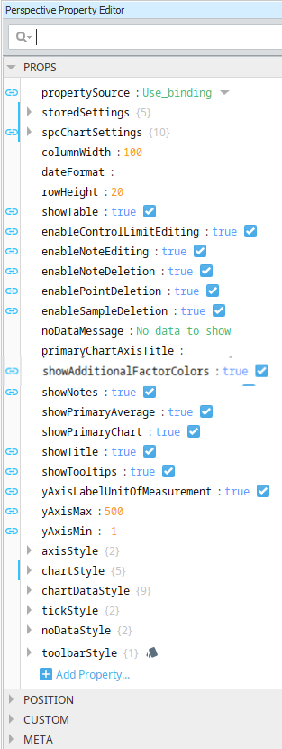
The editor displays a tree of properties. The PROPS node organizes the Dataset properties.
SPC Perspective Chart Dataset Properties
These properties are available in the Ignition Properties Palette for SPC Charts.
| Property Source | |
Sets the datasource mode. Toggle two options: Use_stored_settings | Use_binding Included in Sepasoft Versions:
Use_stored_settings: Sets the chart to receive data from Stored Settings. To use this, enter property values under storedSettings, see below.
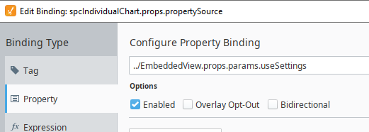
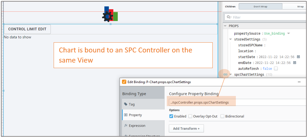
Use_binding: Sets the chart to receive data from an SPC Controller. To use this, bind to an SPC Controller under spcChartSettings, see below. When clicking the binding icon on the left side of the propertySource, the Configure Property Binding dialog appears.
|
||||||||||||||||||||||||||||||||||||||||
| Stored Settings | storedSettings |
Set property values here when propertySource is set to Use_stored_settings |
||||||||||||||||||||||||||||||||||||||||
|
|
|
|||||||||||||||||||||||||||||||||||||||||
| SPC Chart Settings |
spcChartSettings
Set property values here when propertySource is set to Use_Binding
Bind to the SPC Controller |
|||||||||||||||||||||||||||||||||||||||||
|
|
|
|||||||||||||||||||||||||||||||||||||||||
|
|
settings
|
|||||||||||||||||||||||||||||||||||||||||
|
|
histogram
|
|||||||||||||||||||||||||||||||||||||||||
|
|
dynamic When using an SPC Controller to populate a Perspective SPC Chart, these dynamic filters can be used to filter the data for display in a chart.
|
|||||||||||||||||||||||||||||||||||||||||
|
|
spcResults SPC Results including data, measurement count, messages and calculated value information. definitionUUI
measurementCount
spcData: dataset - The SPC data.
|
|
||||||||||||||||||||||||||||||||||||||||
| showTable | Boolean | Enable to display the data table. The table is updated as new data comes in. Table Chart Scroll LockingThe table chart scroll locking feature provides a user-controlled mechanism to either automatically navigate to the most recent data upon its arrival or maintain the current scroll position. The scroll lock feature operates in two distinct modes, each with specific UI indicators and behavioral responses to new data.
| ||||||||||||||||||||||||||||||||||||||||


Properties Common to SPC Charts with Measurable Values
These properties are available in the Ignition Properties Palette for SPC Charts that have values that are measurable with datatypes such as floats and integers.
Name Scripting Reference | Data Type | Description | ||||||||||
|---|---|---|---|---|---|---|---|---|---|---|---|---|
| columnWidth | Integer - The width of the table columns. | |||||||||||
| dateFormat | The date formatting pattern used to display the date MM/dd/yyyy dd-M-yyyy hh:mm:ss dd MMMM yyyy | |||||||||||
| rowHeight | The height of the table rows. | |||||||||||
| scrollX | The scroll bar x position. | |||||||||||
| showTable | Boolean - Toggle to show or hide the sample data table. When showTable is set to True: Table Chart Scroll LockingThe table chart scroll locking feature provides a user-controlled mechanism to either automatically navigate to the most recent data upon its arrival or maintain the current scroll position. The scroll lock feature operates in two distinct modes, each with specific UI indicators and behavioral responses to new data.
| |||||||||||
| editControlLimitImagePath | Boolean - Image icon to show to edit control limits. | |||||||||||
| enableControlLimitEditing | Toggle show/hide When enabled, an edit button is displayed. Once a control-limit type is selected and Calculate is checked, a limit value is calculated and displayed. If the value box is populated and date is selected, you can choose to set the limit value. A message displays:
| |||||||||||
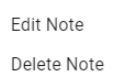
| enableNoteEditing | Boolean - If true, you can add and edit notes on the chart. |
| ||||||||||
| enableNoteDeletion | Boolean -If true, you can delete notes on the chart. | |||||||||||
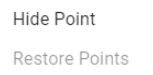
| enablePointDeletion | Boolean -If true, you can hide/restore data points on the chart. |
| ||||||||||
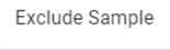
| enableSampleDeletion | Boolean -If true, you can exclude samples on the chart. |
| ||||||||||
| limitDialogOffsetX | Integer - The horizontal offset to display the control limit dialog box. Works in conjunction with enableControlLimitEditing | |||||||||||
| limitDialogOffsetY | Integer -The vertical offset to display the control limit dialog box. Works in conjunction with enableControlLimitEditing | |||||||||||
| markerImagePath | String - The relative path of an image to display for markers. | |||||||||||
| noteImagePath | String -The relative path of an image to display for notes when showNotes is enabled. | |||||||||||
| primaryChartAxisTitle | String -Title to show for the primary axis. The color attribution is based on the sequence in which the additional factors are added to the SELECT statement in the FilterBy clause. | |||||||||||
| showAdditionalFactorColors | Boolean - Defaults to True. In 3.81.11 SP1 and later The color attribution of the points on a chart is based on the sequence in which you add additional factors to the FilterBy clause of the Select statement. When a point on a chart is outside a Control Limit the circled is filled-in as a solid circle. When inside the limits, the circle is an outline.
| |||||||||||
| showAttributeNameAsTitle | Boolean - Defaults to False. In 3.81.10 SP8 and later. When true the first attribute on the chart is used as the chart title. If there is more than one attribute displayed on the chart, then the first attribute name is used. If the attribute displayed on the chart is changed, then the title changes to match the attribute. Supersede the Chart Title. | |||||||||||
| showNotes | Boolean -If true, notes display on the chart. | |||||||||||
| showPrimaryAverage | Boolean -Set to true to display the average line on the primary chart. | |||||||||||
| yAxisMax | String and Integer -Plots all the values up to and including the maximum value. | |||||||||||
| yAxisMin | String and Integer -Plots all the values down to and including the minimum value. | |||||||||||
| axisStyle | ||||||||||||
| rightAxisWidth | Integer | Width of the right chart axis | ||||||||||
| chartStyle | ||||||||||||
| horzGridLineColor | Boolean | If true, show horizontal grid lines on charts. | ||||||||||
| primaryChartBackground | Color, picker available | The background color of the primary chart. | ||||||||||
| showHorizontalGridLines | Boolean | f true, show horizontal grid lines on charts. | ||||||||||
| vertGridLineColor | Color, picker available | The color of vertical grid lines. | ||||||||||
| chartDataStyle | ||||||||||||
| calcBackground | Color | Sets the background color. | ||||||||||
| calcFont | Font family | Sets the font family | ||||||||||
| calcForeground | Color, picker available | Sets the foreground color | ||||||||||
| dataBackground | Color | Sets the background color. | ||||||||||
| dataFont | Font family | Sets the font family | ||||||||||
| dataForeground | Font family | Sets the foreground color | ||||||||||
| dateBackground | Color | Sets the background color. | ||||||||||
| dateFont | Font family | Sets the background color. | ||||||||||
| dateForeground | Color, picker available | Sets the foreground color | ||||||||||
| visibleMeasurements | int | The number of measurements to show in the table. | ||||||||||
| chartMarkerStyle | ||||||||||||
| markerLabelFont | Font family | The font family to use for markers. | ||||||||||
Meta Properties in the Perspective Property Editor
Name Scripting Reference | Data Type | Description | ||
|---|---|---|---|---|
| name | String | Name of the component. Used in scripting and component tree paths by name, such as during Property Binding. | ||
| visible | Boolean | Whether or not this component should display. | ||
| tooltip | ||||
enable | Boolean | Whether the tooltip on hover | ||
width | Integer | The height of the table rows. | ||
text | String | The scroll bar x position. | ||
| style | Boolean | Toggle to show or hide the sample data table. | ||
| delay | Boolean | Image icon to show to edit control limits. | ||
| sustain | Integer | Time, in milliseconds, to display tooltip before removing it. A value of 0 results in the tooltip displaying until the mouse exits the components. | ||
| location | Boolean | The location where the tooltip displays. | ||
| tail | Boolean | Enables a decorative triangle on the tooltip that points to the tooltip owner. Ignored when location uses a value of 'mouse'. | ||
Event Handlers
Refer to the Ignition User Manual for details on using the available event handlers:
Sepasoft MES Module Suite