---
title: "SPC NP-Chart - Perspective"
id: "spc-np-chart-perspective"
project: "MES User Manual"
url: "https://docs.sepasoft.com/articles/user-manual/spc-np-chart-perspective"
updated: 2026-07-31T14:56:57Z
---
# SPC NP\-Chart \- Perspective
**Sepasoft MES Module Suite**
An NP chart is a data analysis technique for determining if a measurement process has gone out of statistical control. It is sensitive to changes in the number of defective items in the measurement process. The “NP” in NP charts stands for the np (the mean number of successes) of a binomial distribution.

Included in Sepasoft Versions:
|  | MES 3.81.7 RC1 and later |
| --- | --- |

**Ignition DesignerPerspective Component Palette**
* * *
## SPC Perspective Chart Dataset Properties
These properties are available in the Ignition Properties Palette for SPC Charts.
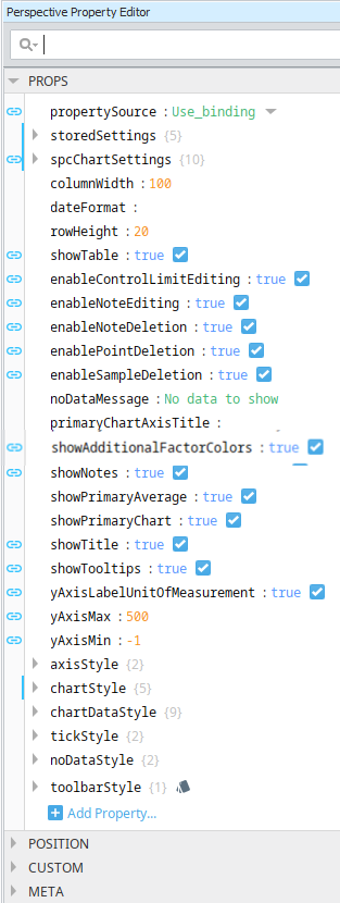
| **Property Source** |
```
propertySource
```
| Sets the datasource mode. Toggle two options: **Use\_stored\_settings** | **Use\_binding**
Included in Sepasoft Versions:
|  | MES 3.81.7 RC1 and later |
| --- | --- |
**Use\_stored\_settings:** Sets the chart to receive data from Stored Settings. **To use this, enter property values under storedSettings, see below**.
**Use\_binding:**Sets the chart to receive data from an SPC Controller. **To use this, bind to an SPC Controller under spcChartSettings, see below.**
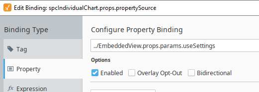
When clicking the binding icon on the left side of the propertySource, the Configure Property Binding dialog appears.
 |
| --- | --- | --- |
| **Stored Settings** | storedSettings | Set property values here when **propertySource** is set to **Use\_stored\_settings** |
| | | | **Property Name** | **Data Type** | **Property Value Description** |
| --- | --- | --- |
| storedSPCName | String | **Required when propertySource = 'Use\_stored\_settings':** Sets name of the Stored SPC Setting. The name must match exactly to the name you enter in Stored SPC Selector.
|  | Stored SPC Selector component only offered in VISION.
See [Stored SPC Selector | Vision](/articles/user-manual/stored-spc-selector-vision) |
| --- | --- | |
| location | String | **Optional:** Filter on a Location that is defined in Equipment Manager. Enter the Equipment Path to the Location. |
| startDate | Date | **Required:** Sets start date to filter SPC data on
|  | Bind to form fields on the view to make dates selectable in runtime. |
| --- | --- |
**Required:** Sets end date to filter SPC filter on |
| endDate | Date |
| autoRefresh | Boolean | True/False **Required**: True, refreshes data when sample or definition information changes. **Set to True to use real-time data.** | |
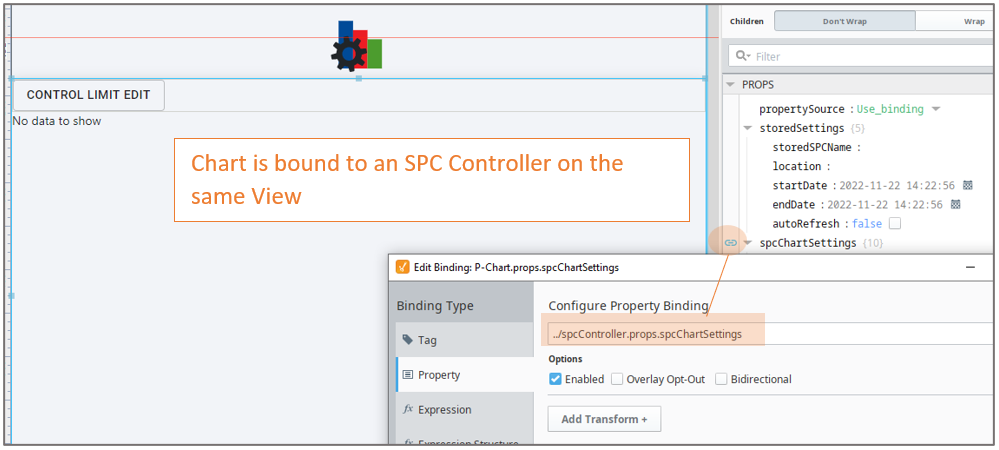
| **SPC Chart Settings** | | spcChartSettings
**** Set property values here when **propertySource** is set to **Use\_Binding**
**Bind to the SPC Controller** |
| | | | **Property Name** | **Data Type** | **Information** |
| --- | --- | --- |
| storedSPCName | String | Incoming property value from the SPC Controller > Stored Setting. |
| startDate | Date | Sets start date to start filtering data on |
| endDate | Date | Sets end date to filter data on |
| autoUpdate | Boolean | Required True/False: True, updates data when a sample is taken. Use for realtime data. |
| autoRefresh | Boolean | Required True/False: True, refreshes data when sample or definition information changes. Use for realtime data. |
 |
| | | **settings**
| **additionalFactors**: | String - Additional factors to include in the SPC chart. |
| --- | --- |
| **attributeName:** | String - Name of the sample attribute |
| **attributeUnits**: | String - Adds a label for the unit of measure for the sample |
| **boxAndWhiskerFilter**
Chart Specific | String - Box and whisker filter items to filter on. |
| **controlLimits:** | String - Summarizes control limits to add to the chart |
| **definitionName:** | String - Name of the sample definition. |
| **filters:** | String -
**location:** The Location Path defined in the Equipment Manager to filter on.
**factors:** Properties >Additional Factor
Filter on existing additional factors |
| **measurement:** | String - Measure number to filter on |
| **nonconformingFilter**
Chart Specific | String - Nonconforming items to filters on |
| **nonconformityFilter**
Chart Specific | String - Nonconformity items to filters on |
| **paretoFilter**
Chart Specific | String - Items to include in a Pareto chart. |
| **rowLimit:** | ****String - The maximum number of samples to return in the results. |
| **signals** | String - Summarizes your signal selections in a string. |
| **spcDataFormat:** | String - SPC Data
|  | Each chart type has specific settings. Select the correct chart from the dropdown menu. |
| --- | --- | |
| **useDefaultChartTyp** **e:** | String - If true, uses the default chart type from the attribute definition. |
| **useDefaultChartTyp** **e:** | String - If true, uses the default chart type . |
| **enableFutureLimitEditing:** | String -If true, you can set limits for future (non-existing) samples. | |
| | | **histogram**
| **autoBarCount**: | Boolean - If true, the number of data bars that are displayed is calculated automatically. |
| --- | --- |
| **dataBarCount** | int - The number of data bars to display when **autoBarCount** is False. |
| **paddingBarCount** | int - The number of bars prior to and following the data bars to include in the histogram results. | |
| | | **dynamic**
When using an SPC Controller to populate a Perspective SPC Chart, these dynamic filters can be used to filter the data for display in a chart.
| **factor** | String - Additional factors that were recorded along with the sample. |
| --- | --- |
| **location** | String - The location path where the samples were collected. |
| **productCode** | String - Samples returned should have this Product Code if present. |
| **referenceNo** | String - Samples returned should have this Reference Number if present. |
| **sampleApprovedBy** | String - The username of the user that approved the samples. |
| **sampleTakenBy** | String - The username of the user that recorded the samples. |
| **shift** | String - A schedule shift during which the samples were taken. | |
| | | **spcResults**
SPC Results including data, measurement count, messages and calculated value information.
**definitionUUI**
- calcValueList
- defaultChart
- measureFormat
- unit
**measurementCount**
- messages
- errormessage
- warningMessage
**spcData: dataset - The SPC data.** | |
| **showTable** | Boolean | Enable to display the data table. The table is updated as new data comes in. | |
## Properties Common to SPC Charts with Measurable Values
These properties are available in the Ignition Properties Palette for SPC Charts that have values that are measurable with datatypes such as floats and integers.
| Name
Scripting Reference | Data Type | Description | Description | Description |
| --- | --- | --- | --- | --- |
| **columnWidth** | Integer - The width of the table columns. |
| **dateFormat** | The date formatting pattern used to display the date
MM/dd/yyyy
dd-M-yyyy hh:mm:ss
dd MMMM yyyy |
| **rowHeight** | The height of the table rows. |
| **scrollX** | The scroll bar x position. |
| **showTable** | Boolean - Toggle to show or hide the sample data table. |
| **editControlLimitImagePath** | Boolean - Image icon to show to edit control limits. |
| **enableControlLimitEditing** | **Toggle show/hide**
When enabled, an edit button is displayed.
Once a control-limit type is selected and Calculate is checked, a limit value is calculated and displayed.
If the value box is populated and date is selected, you can choose to set the limit value.
A message displays:
- operation (set or calculate) executed successfully.
- Error message detail
|
| **enableNoteEditing** | Boolean - If true, you can add and edit notes on the chart. | 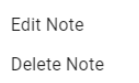 |
| **enableNoteDeletion** | Boolean -If true, you can delete notes on the chart. |
| **enablePointDeletion** | Boolean -If true, you can hide/restore data points on the chart. |  |
| **enableSampleDeletion** | Boolean -If true, you can exclude samples on the chart. |  |
| **limitDialogOffsetX** | Integer - The horizontal offset to display the control limit dialog box.
Works in conjunction with enableControlLimitEditing |
| **limitDialogOffsetY** | Integer -The vertical offset to display the control limit dialog box.
Works in conjunction with enableControlLimitEditing |
| **markerImagePath** | String - The relative path of an image to display for markers. |
| **noteImagePath** | String -The relative path of an image to display for notes when showNotes is enabled. |
| **primaryChartAxisTitle** | String -Title to show for the primary axis. The color attribution is based on the sequence in which the additional factors are added to the SELECT statement in the FilterBy clause. |
| **showAdditionalFactorColors** | Boolean - Defaults to True. In **3.81.11 SP1 and later**
The color attribution of the points on a chart is based on the sequence in which you add additional factors to the FilterBy clause of the Select statement.
When a point on a chart is outside a Control Limit the circled is filled-in as a solid circle. When inside the limits, the circle is an outline.
 |
| **showAttributeNameAsTitle** | Boolean - Defaults to False. In **3.81.10 SP8 and later**.
When true the first attribute on the chart is used as the chart title. If there is more than one attribute displayed on the chart, then the first attribute name is used.
If the attribute displayed on the chart is changed, then the title changes to match the attribute. Supersede the Chart Title. |
| **showNotes** | Boolean -If true, notes display on the chart. |
| **showPrimaryAverage** | Boolean -Set to true to display the average line on the primary chart. |
| **yAxisMax** | String and Integer -Plots all the values up to and including the maximum value. |
| **yAxisMin** | String and Integer -Plots all the values down to and including the minimum value. |
| **axisStyle** | |
| | **rightAxisWidth** | Integer | Width of the right chart axis |
| **chartStyle** | | | | |
| | **horzGridLineColor** | Boolean | If true, show horizontal grid lines on charts. |
| | **primaryChartBackground** | Color, picker available | The background color of the primary chart. |
| | **showHorizontalGridLines** | Boolean | f true, show horizontal grid lines on charts. |
| | **vertGridLineColor** | Color, picker available | The color of vertical grid lines. |
| **chartDataStyle** | |
| | **calcBackground** | Color | Sets the background color. |
| | **calcFont** | Font family | Sets the font family |
| | **calcForeground** | Color, picker available | Sets the foreground color |
| | **dataBackground** | Color | Sets the background color. |
| | **dataFont** | Font family | Sets the font family |
| | **dataForeground** | Font family | Sets the foreground color |
| | **dateBackground** | Color | Sets the background color. |
| | **dateFont** | Font family | Sets the background color. |
| | **dateForeground** | Color, picker available | Sets the foreground color |
| | **visibleMeasurements** | int | The number of measurements to show in the table. |
| **chartMarkerStyle** | | | | |
| | **markerLabelFont** | Font family | The font family to use for markers. |
## Additional Chart Formatting Properties for NP Chart
| Scripting Reference | | | | |
| --- | --- | --- | --- | --- |
| **chartStyle** | |
| **** | **showVerticalGridLines** | Boolean | When set to True, vertical grid lines show on the chart. |
| **noDataStyle** | **noDataForeground** | |
| **** | **noDataFont** | |
****
### Meta Properties in the Perspective Property Editor
| Name
Scripting Reference | Data Type | Description | Description | Description |
| --- | --- | --- | --- | --- |
| **name** | String | Name of the component. Used in scripting and component tree paths by name, such as during Property Binding. |
| **visible** | Boolean | Whether or not this component should display. |
| **tooltip** | | |
| **enable** | Boolean | Whether the tooltip on hover |
| **width** | Integer | The height of the table rows. |
| **text** | String | The scroll bar x position. |
| **style** | Boolean | Toggle to show or hide the sample data table. |
| **delay** | Boolean | Image icon to show to edit control limits. |
| **sustain** | Integer | Time, in milliseconds, to display tooltip before removing it. A value of 0 results in the tooltip displaying until the mouse exits the components. |
| **location** | Boolean | The location where the tooltip displays. |
| **tail** | Boolean | Enables a decorative triangle on the tooltip that points to the tooltip owner. Ignored when location uses a value of 'mouse'. |
****
## Extension Functions
Example of the component on the page root container:
**event.source.parent.getComponent('Box and Whisker Chart').showSetLimitPanel** **(True)**.
showSetLimitPanel
* Description
Causes the calculate and set control limit dialog to be shown.
* Parameters
Boolean - True/False
* Return
Nothing
* Scope
Client
* * *
Custom Methods
Custom methods allow you to add your own component functions to a component that can be called through scripting. This is a useful and clean method of re-using script that is specific to the component (say you want to update a visual aspect of the component in the same way whether a user clicks on the component or a window property value changes). See [Component Custom Methods](https://docs.inductiveautomation.com/display/DOC79/Custom-Component-Methods) in the Ignition Help Manual for more information.
**Sepasoft MES Module Suite**