Sepasoft MES Module Suite
Value Editor
MES Value Editor component is used to change values that were automatically captured by the system but need to be modified, for example machine said it was in production mode, but it was actually in maintenance mode, or production counts are off.

|
See Adjusting Production Run Data page for various MES Value Editor settings. |
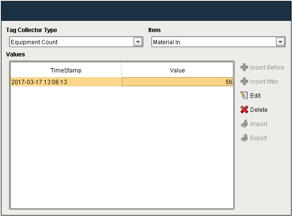
Overridden Values

|
When an Equipment State is overridden via the OEE Downtime Table, or if overridden via scripting, then the value shown in the MES Value Editor will be displayed as a negative number. |
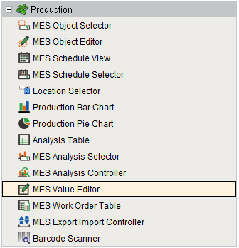
Component Palette
Component Properties
Properties are provided that can be set to affect the operation and look of the component. They can be set through the Property Editor in the Designer or through scripting.
Example
Code |
|
Data
| Name | Scripting | Property Type | Description | ||||
|---|---|---|---|---|---|---|---|
| Equipment Path | equipmentPath | String | Path to the equipment to show or edit MES values.
| ||||
| Start Date | startDate | Date | Beginning of the time range to display. | ||||
| End Date | endDate | Date | End of the time range to display. | ||||
| Data | data | Dataset | Data for this table. | ||||
| Quality | quality | String | The quality setting for the data on the table. | ||||
| Selected Row | selectedRow | int | Index of the first selected row, or -1 if none. |

Appearance
| Name | Scripting | Property Type | Description |
|---|---|---|---|
| Column Attributes Data | columnAttributesData | Dataset | Dataset describing the column attributes. |
| Title Font | titleFont | Font | Font to use for the title bar. |
| Title Foreground Color | titleForeground | Color | Foreground color of the title bar. |
| Title Background Color | titleBackground | Color | Background color of the title bar. |
| Header Font | headerFont | Font | Font to use for the table header. |
| Header Foreground Color | headerForeground | Color | Foreground color of the table header. |
| Header Background Color | headerBackground | Color | Background color of the table header. |
| Table Background Color | tableBackground | Color | Background color of the table body. |
| Row Font | rowFont | Font | Font to use for the table header. |
| Row Foreground Color | rowForeground | Color | Foreground color of rows in the table. |
| Row Background Color | rowBackground | Color | Background color of rows in the table. |
| Row Selection Foreground Color | selectionForeground | Color | Default foreground color of selected cells. |
| Row Selection Background Color | selectionBackground | Color | Default background color of selected cells. |
| Auto Row Height Enabled | autoRowHeightEnabled | boolean | If true, row height of the table will be adjusted automatically. |
| Row Height | rowHeight | int | If row resizing is disabled, this will set the height of all rows. |
| Show Horizontal Grid Lines? | showHorizontalLines | boolean | Displays horizontal gridlines making it easier to read. |
| Show Vertical Grid Lines? | showVerticalLines | boolean | Displays vertical gridlines making it easier to read. |
| Grid Line Color | gridColor | Color | Color of grid lines in the table. |
Event Handlers
Event handlers provide the ability to add custom script when a user interacts with a component when a component property changes.
propertyChange
propertyChange
Fires whenever a bindable property of the source component changes. This works for standard and custom (dynamic) properties.
| Property | Description |
|---|---|
| .source | The component that fired this event. |
| .newValue | The new value that this property changed to. |
| .oldValue | The value that this property was before it changed. Note that not all components include an accurate oldValue in their events. |
| .propertyName | The name of the property that changed. NOTE: Remember to always filter out these events for the property that you are looking for! Components often have many properties that change. |
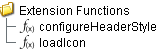
Extension Functions
configureHeaderStyle
- Description
Provides a chance to configure the style of each column header. Return a dictionary of name-value pairs with the desired attributes. Available attributes include: 'font', 'foreground', 'background', 'border', 'toolTipText'.
- Parameters
self - A reference to the component that is invoking this function.
colIndex - The index of the column in the underlying dataset.
colName - Name of the column in the underlying dataset.
- Return
Nothing
- Scope
Client
Code Example
Code |
|
Custom Methods
Custom methods allow you to add your own component functions to a component that can be called through scripting. This is a useful and clean method of re-using script that is specific to the component (say you want to update a visual aspect of the component in the same way whether a user clicks on the component or a window property value changes). See Component Custom Methods in the Ignition Help Manual for more information.

Customizers
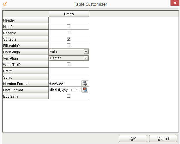
Table Customizer
Table Customizer manages the data entered into the MES Value Editor. It will allow you to modify the data which is stored inside the MES Value Editor. Thus the formatting and alignments are made easy.
Column Configuration
Header - Provide a custom name to the column header.
Hide? - Hides the column.
Editable - Allows the editing of the cell pertaining to the column.
Sortable - Allows the user to sort the table according to the selected column.
Filterable? - To make a column filter the data on user's demand.
Horiz Align - Aligns the contents of the column.
Vert Align - Aligns the contents of the column.
Wrap Text? - Data in the cell wraps to fit the column width. When you change the column width, data wrapping adjusts automatically.
Prefix - A custom text that proceeds the contents of each cell.
Suffix - A custom text that follows the contents of each cell.
Number Format - A format of the cell is the contents of the cell are number types.
Date Format - Used if the contents of the cell are date types.
Boolean? - Changes the contents of the cell to reflect a 'check box' look and feel.
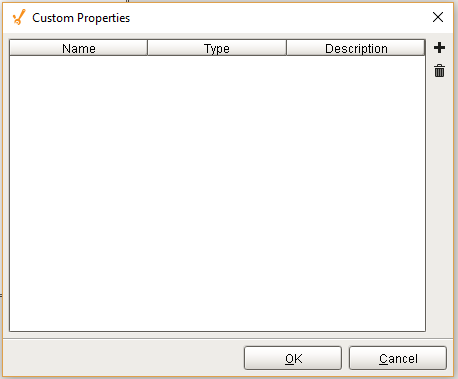
Custom Properties
The custom properties can be used to add user defined properties.
Component Functions
This component does not have functions associated with it.
Sepasoft MES Module Suite