Sepasoft MES Module Suite
Quality Vision Component | Definition List
A component that provides a list of sample definitions. A sample definition defines the attributes (measurements), locations, control limits and out of control signals to use for samples. It allows for adding, editing and deleting samples and works with the Definition Attribute List, Definition Location List, Definition Control Limit List and Definition Signals List components.
There is no need for SQL queries or scripting to display sample definitions. The SPC Module will send notifications to each client with a Definition List component being displayed when there is a change to any sample definitions made by another user. This event-based functionality optimizes updates, reducing database updates and network bandwidth.
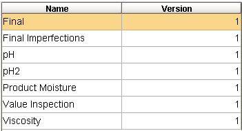
Sample Definition List
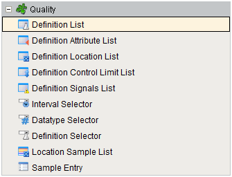
Component Palette
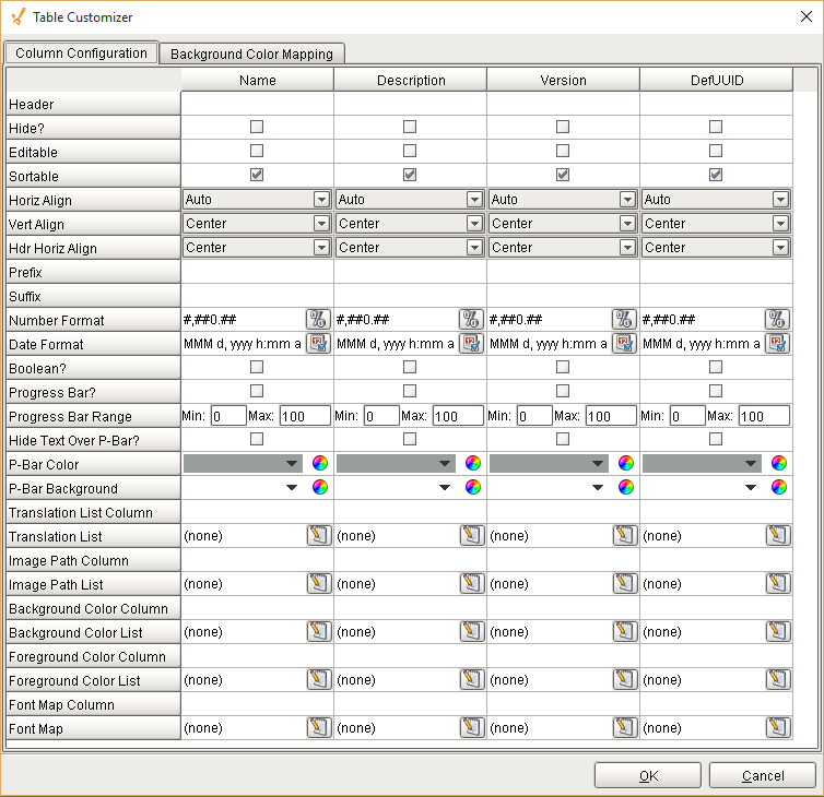
The Ignition table customizer is used to change the appearance of the table. To access the customizer, right-click on the Definition List component and select the Cutomizers->Table Customizer menu item. Using the customizer, you can hide columns, change colors, and change formatting to make the Definition List appear as desired.
Component Properties
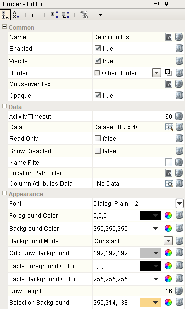
Properties are provided that can be set to affect the operation and look of the component. They can be set through the Property Editor in the Designer or through scripting.
Example
Code |
|
Data
| Name | Scripting | Property Type | Description |
|---|---|---|---|
| Activity Timeout | activityTimeout | Int4 | Number of seconds to wait after user activity before update. |
| Column Attributes Data | columnAttributesData | Dataset | Dataset describing the column attributes. |
| Data | data | Dataset | Data for the table. |
| Location Path Filter | locationPathFilter | String | Optional location path to filter the results by. |
| Name Filter | nameFilter | String | Definition name filter value, including * and ? wildcard characters, to filter results by. |
| Read Only | readOnly | Boolean | No editing is possible. |
| Show Disabled | showDisabled | Boolean | Shows the disabled test definitions. |
Appearance
| Name | Scripting | Property Type | Description |
|---|---|---|---|
| Background Mode | backgroundColorMode | int | This mode determines the color that this table's cell's backgrounds will be. |
| Odd Row Background | oddBackground | Color | Color which odd rows will be colored if background mode is 'Alternating'. |
| Table Foreground Color | tableFg | Color | Color of the foreground for the table. |
| Table Background Color | tableBg | Color | Color of the background for the table. |
| Row Height | rowHeight | int | Height of each row, in pixels. |
| Selection Background | selectionBackground | Color | Background color of a selected cell in the dropdown list. |
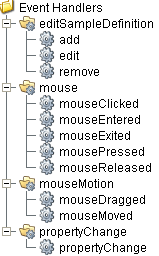
Event Handlers
Event handlers provide the ability to add custom script when a user interacts with a component such as by clicking a mouse, selecting a menu item or when a component property changes.
editSampleDefinition
This event fires when the mouse enters the space over the source component.
add
| Property | Description |
|---|---|
| .source | The component that fired this event. |
| .sampleDefinitionName | Name of the sample definition of this event. |
edit
| Property | Description |
|---|---|
| .source | The component that fired this event. |
| .sampleDefinitionName | Name of the sample definition of this event. |
remove
| Property | Description |
|---|---|
| .source | The component that fired this event. |
| .removeDefinition | Removes the sample definition. |
mouse
mouseClicked
This event signifies a mouse click on the source component. A mouse click the combination of a mouse press and a mouse release, both of which must have occurred over the source component. Note that this event fires after the pressed and released events have fired.
| Property | Description |
|---|---|
| .source | The component that fired this event. |
| .button | The code for the button that caused this event to fire. |
| .clickCount | The number of mouse clicks associated with this event. |
| .x | The x-coordinate (with respect to the source component) of this mouse event. |
| .y | The y-coordinate (with respect to the source component) of this mouse event. |
| .popupTrigger | Returns True (1) if this mouse event is a popup trigger. What constitutes a popup trigger is operating system dependent, which is why this abstraction exists. |
| .altDown | True (1) if the Alt key was held down during this event, false (0) otherwise. |
| .controlDown | True (1) if the Ctrl key was held down during this event, false (0) otherwise. |
| .shiftDown | True (1) if the Shift key was held down during this event, false (0) otherwise. |
mouseEntered
This event fires when the mouse enters the space over the source component.
| Property | Description |
|---|---|
| .source | The component that fired this event. |
| .button | The code for the button that caused this event to fire. |
| .clickCount | The number of mouse clicks associated with this event. |
| .x | The x-coordinate (with respect to the source component) of this mouse event. |
| .y | The y-coordinate (with respect to the source component) of this mouse event. |
| .popupTrigger | Returns True (1) if this mouse event is a popup trigger. What constitutes a popup trigger is operating system dependent, which is why this abstraction exists. |
| .altDown | True (1) if the Alt key was held down during this event, false (0) otherwise. |
| .controlDown | True (1) if the Ctrl key was held down during this event, false (0) otherwise. |
| .shiftDown | True (1) if the Shift key was held down during this event, false (0) otherwise. |
mouseExited
This event fires when the mouse leaves the space over the source component.
| Property | Description |
|---|---|
| .source | The component that fired this event. |
| .button | The code for the button that caused this event to fire. |
| .clickCount | The number of mouse clicks associated with this event. |
| .x | The x-coordinate (with respect to the source component) of this mouse event. |
| .y | The y-coordinate (with respect to the source component) of this mouse event. |
| .popupTrigger | Returns True (1) if this mouse event is a popup trigger. What constitutes a popup trigger is operating system dependent, which is why this abstraction exists. |
| .altDown | True (1) if the Alt key was held down during this event, false (0) otherwise. |
| .controlDown | True (1) if the Ctrl key was held down during this event, false (0) otherwise. |
| .shiftDown | True (1) if the Shift key was held down during this event, false (0) otherwise. |
mousePressed
This event fires when a mouse button is pressed down on the source component.
| Property | Description |
|---|---|
| .source | The component that fired this event. |
| .button | The code for the button that caused this event to fire. |
| .clickCount | The number of mouse clicks associated with this event. |
| .x | The x-coordinate (with respect to the source component) of this mouse event. |
| .y | The y-coordinate (with respect to the source component) of this mouse event. |
| .popupTrigger | Returns True (1) if this mouse event is a popup trigger. What constitutes a popup trigger is operating system dependent, which is why this abstraction exists. |
| .altDown | True (1) if the Alt key was held down during this event, false (0) otherwise. |
| .controlDown | True (1) if the Ctrl key was held down during this event, false (0) otherwise. |
| .shiftDown | True (1) if the Shift key was held down during this event, false (0) otherwise. |
mouseReleased
This event fires when a mouse button is released, if that mouse button's press happened over this component.
| Property | Description |
|---|---|
| .source | The component that fired this event. |
| .button | The code for the button that caused this event to fire. |
| .clickCount | The number of mouse clicks associated with this event. |
| .x | The x-coordinate (with respect to the source component) of this mouse event. |
| .y | The y-coordinate (with respect to the source component) of this mouse event. |
| .popupTrigger | Returns True (1) if this mouse event is a popup trigger. What constitutes a popup trigger is operating system dependent, which is why this abstraction exists. |
| .altDown | True (1) if the Alt key was held down during this event, false (0) otherwise. |
| .controlDown | True (1) if the Ctrl key was held down during this event, false (0) otherwise. |
| .shiftDown | True (1) if the Shift key was held down during this event, false (0) otherwise. |
mouseMotion
mouseDragged
Fires when the mouse moves over a component after a button has been pushed.
| Property | Description |
|---|---|
| .source | The component that fired this event. |
| .button | The code for the button that caused this event to fire. |
| .clickCount | The number of mouse clicks associated with this event. |
| .x | The x-coordinate (with respect to the source component) of this mouse event. |
| .y | The y-coordinate (with respect to the source component) of this mouse event. |
| .popupTrigger | Returns True (1) if this mouse event is a popup trigger. What constitutes a popup trigger is operating system dependent, which is why this abstraction exists. |
| .altDown | True (1) if the Alt key was held down during this event, false (0) otherwise. |
| .controlDown | True (1) if the Ctrl key was held down during this event, false (0) otherwise. |
| .shiftDown | True (1) if the Shift key was held down during this event, false (0) otherwise. |
mouseMoved
Fires when the mouse moves over a component, but no buttons are pushed.
| Property | Description |
|---|---|
| .source | The component that fired this event. |
| .button | The code for the button that caused this event to fire. |
| .clickCount | The number of mouse clicks associated with this event. |
| .x | The x-coordinate (with respect to the source component) of this mouse event. |
| .y | The y-coordinate (with respect to the source component) of this mouse event. |
| .popupTrigger | Returns True (1) if this mouse event is a popup trigger. What constitutes a popup trigger is operating system dependent, which is why this abstraction exists. |
| .altDown | True (1) if the Alt key was held down during this event, false (0) otherwise. |
| .controlDown | True (1) if the Ctrl key was held down during this event, false (0) otherwise. |
| .shiftDown | True (1) if the Shift key was held down during this event, false (0) otherwise. |
propertyChange
propertyChange
Fires whenever a bindable property of the source component changes. This works for standard and custom (dynamic) properties.
| Property | Description |
|---|---|
| .source | The component that fired this event. |
| .newValue | The new value that this property changed to. |
| .oldValue | The value that this property was before it changed. Note that not all components include an accurate oldValue in their events. |
| .propertyName | The name of the property that changed. NOTE: Remember to always filter out these events for the property that you are looking for! Components often have many properties that change. |
Extension Functions
.configureChart()
Included in Sepasoft Versions:

|
Stable Release Versions: MES 3.81.1 SP9 and later |
configureChart()
- Description
Provides an opportunity to perform further chart configuration via scripting. Doesn't return anything.
- Parameters
Component chart-A JFreeChart object. Refer to the JFreeChart documentation for API details.
- Return
Nothing
- Scope
Client
.getBackgroundAt()
Included in Sepasoft Versions:
|
|
Stable Release Versions: MES 3.81.1 SP9 and later |
getBackgroundAt()
Description
Called for each cell, returns the appropriate background color. Do not block, sleep, or execute any I/O; called on painting thread.
Parameters
- Component self - A reference to the component that is invoking this function.
- int row -The row index of the cell.
- int col -The column index of the cell.
- boolean isSelected - A boolean representing if the cell is currently selected.
- Object value -The value in the table's dataset at index [row, col].
- Color defaultColor -The color the table would have chosen if this function was not implemented.
- Component self - A reference to the component that is invoking this function.
Return
Color
Scope
Client
.getDisplayTextAt()
Included in Sepasoft Versions:
|
|
Stable Release Versions: MES 3.81.1 SP9 and later |
getDisplayTextAt()
Description
Called for each cell, returns a String which will be used as the text of the cell. Do not block, sleep or execute any I/O; called on the painting thread.
Parameters
- Component self - A reference to the component that is invoking this function.
- int row -The row index of the cell.
- int col -The column index of the cell.
- boolean isSelected - A boolean representing if the cell is currently selected.
- Object value -The value in the table's dataset at index [row, col].
- String defaultText -The string the table would have chosen if this function was not implemented.
- Component self - A reference to the component that is invoking this function.
Return
String
Scope
Client
.getForegroundAt()
Included in Sepasoft Versions:
|
|
Stable Release Versions: MES 3.81.1 SP9 and later |
getForegroundAt()
Description
Called for each cell, returns the appropriate foreground (text) color. Do not block, sleep, or execute any I/O; called on painting thread.
Parameters
- Component self - A reference to the component that is invoking this function.
- int row -The row index of the cell.
- int col -The column index of the cell.
- boolean isSelected - A boolean representing if the cell is currently selected.
- Object value -The value in the table's dataset at index [row, col].
- Color defaultColor -The color the table would have chosen if this function was not implemented.
- Component self - A reference to the component that is invoking this function.
Return
Color
Scope
Client
Custom Methods
Custom methods allow you to add your own component functions to a component that can be called through scripting. This is a useful and clean method of re-using script that is specific to the component (say you want to update a visual aspect of the component in the same way whether a user clicks on the component or a window property value changes). See Component Custom Methods in the Ignition Help Manual for more information.
Customizers
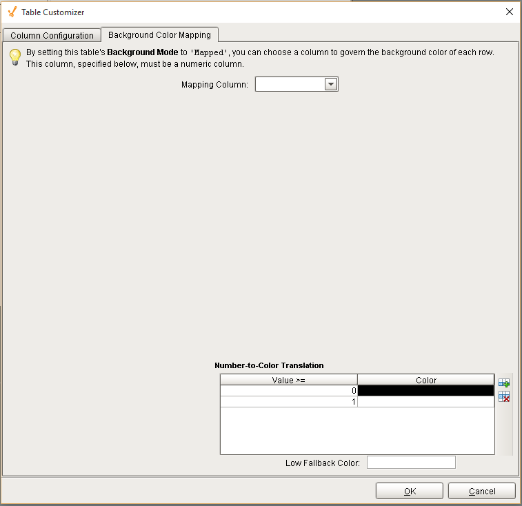
Table Customizer
Table Customizer manages the data entered into the Definition List component. It will allow you to modify the data which is stored inside the Definition List. Thus the formatting and alignments are made easy.
Column Configuration
Header - Provide a custom name to the column header.
Hide? - Hides the column.
Editable - Allows the editing of the cell pertaining to the column.
Sortable - To make a column filter the data on user's demand.
Sortable - Allows the user to sort the table according to the selected column.
Horiz Align - Aligns the contents of the column.
Vert Align - Aligns the contents of the column.
Wrap Text? - Data in the cell wraps to fit the column width. When you change the column width, data wrapping adjusts automatically.
Prefix - A custom text that proceeds the contents of each cell.
Suffix - A custom text that follows the contents of each cell.
Number Format - A format of the cell is the contents of the cell are number types.
Date Format - Used if the contents of the cell are date types.
Boolean? - Changes the contents of the cell to reflect a 'check box' look and feel.
Component Functions
This component provide the following functions that can be called on it. If this component has been dropped onto the windows root container, the path and an example call would be event.source.parent.getComponent('Definition List').save().
save()
- Description
Save changes to the currently selected sample definition.
- Parameters
None
- Return
Nothing
- Scope
Client
cancel()
- Description
Undo the changes to the currently selected sample definition.
- Parameters
None
- Return
Nothing
- Scope
Client
getSampleDefinition()
- Description
Return the currently selected sample definition.
- Parameters
None
- Return
The currently selected sample definition.
- Scope
Client
addSampleDefinition()
- Description
Add the sample definition specified in the parameter.
- Parameters
None
- Return
Nothing
- Scope
Client
updateSampleDefinition()
- Description
Update the sample definition specified in the parameter.
- Parameters
None
- Return
Nothing
- Scope
Client
refresh()
- Description
Refresh the currently selected sample definition. This causes any associated components such as the Definition Attribute List to also be refreshed.
- Parameters
None
- Return
Nothing
- Scope
Client
Sepasoft MES Module Suite