Sepasoft MES Module Suite
Quality Vision Component | Location Sample List
A component that displays samples for a location and optionally by sample ownership. Through configuration properties, it can show samples that are scheduled to be coming due, due, overdue, or waiting approval or approved. There is no need for SQL queries or scripting to display the samples.

|
Available in 3.81.10 RC3 and later The second column returned in Perspective/Vision Location Sample List components and getSampleList script call is named "Definition" and contains the name of the Sample Definition attached to a sample entry. |
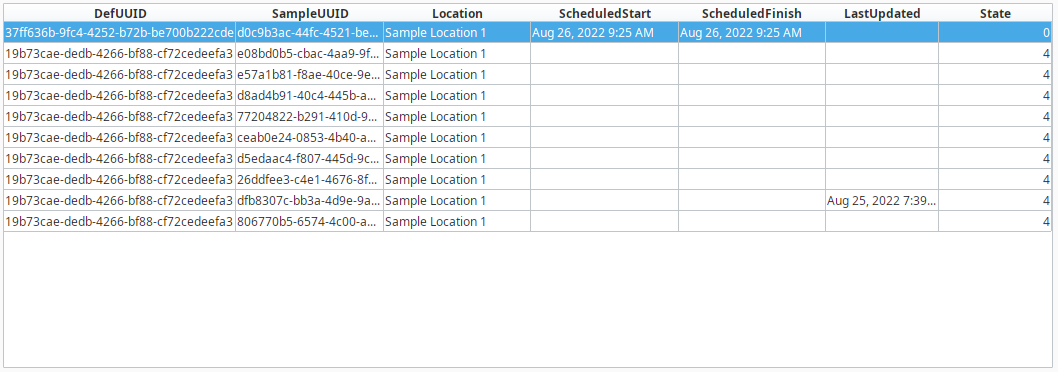
When an allowable location is added to a sample definition, a tag value can be set. This component can limit the samples that appear by entering in matching tag values. It is typically used for defining who has ownership for collecting sample data. For example, the lab takes samples at packaging line 1 every 2 hours. The operator also takes samples at packaging line 1 every 1 hour. The lab does not want to see samples that the operator has ownership for and vice versa. To accomplish this, set the tag value to "Lab" for sample definitions that the lab has ownership for and to "Operator" for sample definitions that the operator has ownership for.
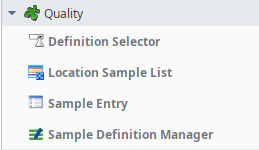
Ignition Designer Component Palette
The Ignition table customizer is used to change the appearance of the table. To access the customizer, right-click on the Location Sample List component and select the Cutomizers->Table Customizer menu item. Using the customizer, you can hide columns, change colors, change formatting to make the Location Sample List appear as desired.
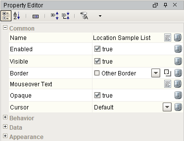
Component Properties
Properties are provided that can be set to affect the operation and look of the component. They can be set through the Property Editor in the Designer or through scripting.
Example
Code |
|
Data
| Name | Scripting | Property Type | Description |
|---|---|---|---|
| Column Attributes Data | columnAttributesData | Dataset | Dataset describing the column attributes. |
| Selected Row | selectedRow | int | Index of the first selected row, or -1 if none. |
| Data | data | Dataset | Raw sample data. |
| Read Only | readOnly | boolean | No editing is possible. |
| Show Waiting Approval | showWaitingApproval | boolean | Show samples waiting for approval. |
| Show Approved Samples | showApprovedSamples | boolean | Show samples that have been approved. |
| Show Due Samples | showDueSamples | boolean | Show samples that are due. |
| Show Coming Due Samples | showComingDueSamples | boolean | Show samples that are coming due. |
| Show Overdue Samples | showOverdueSamples | boolean | Show samples that are overdue. |
| Show Removed Samples | showRemovedSamples | boolean | Show samples that are flagged for removal. |
| Enable Note Editing | enableNoteEditing | boolean | Set to true, to allow users to add or edit sample notes. |
| Start Date | startDate | DateTime | Start date of range to show sample for. |
| End Date | endDate | DateTime | End date of range to show sample for. |
| Location Path | locationPath | String | Path of the location to show samples for. |
| Product Code | productCode | String | Product code to show samples for. |
| Reference No | referenceNo | String | The reference number to show samples for. |
| Sort Type | sortType | int | Sort items using this sort type. |
| Tag | tag | String | The tag to show samples for. |
Behavior
| Name | Scripting | Property Type | Description |
|---|---|---|---|
| Row Selection Allowed | rowSelectionAllowed | boolean | This flag is used in conjunction with the Column Selection Allowed flag to determine whether not whole-rows, whole-columns, or both (single-cells) are selectable. |
| Resizing Allowed | resizingAllowed | boolean | Whether or not the user is allowed to resize table headers or not. |
Appearance
| Name | Scripting | Property Type | Description |
|---|---|---|---|
| Background Mode | backgroundColorMode | int | This mode determines the color that this table's cell's backgrounds will be. |
| Header Font | headerFont | Font | Font of the table's header text. |
| Header Foreground Color | headerForeground | Color | Foreground color of the table's header. |
| Header Visible | headerVisible | boolean | Whether or not the table header is visible. |
| Row Height | rowHeight | int | Height of each row, in pixels. |
| Odd Row Background | oddBackground | Color | Color which odd rows will be colored if background mode is 'Alternating'. |
| Selection Background | selectionBackground | Color | Background color of a selected cell. |
| Selection Foreground | selectionForeground | Color | Foreground color of a selected cell. |
| Show Horizontal Grid Lines? | showHorizontalLines | boolean | Displays horizontal gridlines making it easier to read. |
| Show Vertical Grid Lines? | showVerticalLines | boolean | Displays vertical gridlines making it easier to read. |
| Grid Line Color | gridColor | Color | Color used to draw grid lines. |
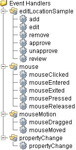
Event Handlers
Event handlers provide the ability to add custom script when a user interacts with a component such as by clicking a mouse, selecting a menu item or when a component property changes.
editSampleLocation
add
| Property | Description |
|---|---|
| .source | The component that fired this event. |
| .sampleUUID | UUID of the sample. |
edit
| Property | Description |
|---|---|
| .source | The component that fired this event. |
| .sampleUUID | UUID of the sample. |
remove
| Property | Description |
|---|---|
| .source | The component that fired this event. |
| .sampleUUID | UUID of the sample. |
approve
| Property | Description |
|---|---|
| .source | The component that fired this event. |
| .sampleUUID | UUID of the sample. |
unapprove
| Property | Description |
|---|---|
| .source | The component that fired this event. |
| .sampleUUID | UUID of the sample. |
review
| Property | Description |
|---|---|
| .source | The component that fired this event. |
| .sampleUUID | UUID of the sample. |
mouse
mouseClicked
This event signifies a mouse click on the source component. A mouse click the combination of a mouse press and a mouse release, both of which must have occurred over the source component. Note that this event fires after the pressed and released events have fired.
| Property | Description |
|---|---|
| .source | The component that fired this event. |
| .button | The code for the button that caused this event to fire. |
| .clickCount | The number of mouse clicks associated with this event. |
| .x | The x-coordinate (with respect to the source component) of this mouse event. |
| .y | The y-coordinate (with respect to the source component) of this mouse event. |
| .popupTrigger | Returns True (1) if this mouse event is a popup trigger. What constitutes a popup trigger is operating system dependent, which is why this abstraction exists. |
| .altDown | True (1) if the Alt key was held down during this event, false (0) otherwise. |
| .controlDown | True (1) if the Ctrl key was held down during this event, false (0) otherwise. |
| .shiftDown | True (1) if the Shift key was held down during this event, false (0) otherwise. |
mouseEntered
This event fires when the mouse enters the space over the source component.
| Property | Description |
|---|---|
| .source | The component that fired this event. |
| .button | The code for the button that caused this event to fire. |
| .clickCount | The number of mouse clicks associated with this event. |
| .x | The x-coordinate (with respect to the source component) of this mouse event. |
| .y | The y-coordinate (with respect to the source component) of this mouse event. |
| .popupTrigger | Returns True (1) if this mouse event is a popup trigger. What constitutes a popup trigger is operating system dependent, which is why this abstraction exists. |
| .altDown | True (1) if the Alt key was held down during this event, false (0) otherwise. |
| .controlDown | True (1) if the Ctrl key was held down during this event, false (0) otherwise. |
| .shiftDown | True (1) if the Shift key was held down during this event, false (0) otherwise. |
mouseExited
This event fires when the mouse leaves the space over the source component.
| Property | Description |
|---|---|
| .source | The component that fired this event. |
| .button | The code for the button that caused this event to fire. |
| .clickCount | The number of mouse clicks associated with this event. |
| .x | The x-coordinate (with respect to the source component) of this mouse event. |
| .y | The y-coordinate (with respect to the source component) of this mouse event. |
| .popupTrigger | Returns True (1) if this mouse event is a popup trigger. What constitutes a popup trigger is operating system dependent, which is why this abstraction exists. |
| .altDown | True (1) if the Alt key was held down during this event, false (0) otherwise. |
| .controlDown | True (1) if the Ctrl key was held down during this event, false (0) otherwise. |
| .shiftDown | True (1) if the Shift key was held down during this event, false (0) otherwise. |
mousePressed
This event fires when a mouse button is pressed down on the source component.
| Property | Description |
|---|---|
| .source | The component that fired this event. |
| .button | The code for the button that caused this event to fire. |
| .clickCount | The number of mouse clicks associated with this event. |
| .x | The x-coordinate (with respect to the source component) of this mouse event. |
| .y | The y-coordinate (with respect to the source component) of this mouse event. |
| .popupTrigger | Returns True (1) if this mouse event is a popup trigger. What constitutes a popup trigger is operating system dependent, which is why this abstraction exists. |
| .altDown | True (1) if the Alt key was held down during this event, false (0) otherwise. |
| .controlDown | True (1) if the Ctrl key was held down during this event, false (0) otherwise. |
| .shiftDown | True (1) if the Shift key was held down during this event, false (0) otherwise. |
mouseReleased
This event fires when a mouse button is released, if that mouse button's press happened over this component.
| Property | Description |
|---|---|
| .source | The component that fired this event. |
| .button | The code for the button that caused this event to fire. |
| .clickCount | The number of mouse clicks associated with this event. |
| .x | The x-coordinate (with respect to the source component) of this mouse event. |
| .y | The y-coordinate (with respect to the source component) of this mouse event. |
| .popupTrigger | Returns True (1) if this mouse event is a popup trigger. What constitutes a popup trigger is operating system dependent, which is why this abstraction exists. |
| .altDown | True (1) if the Alt key was held down during this event, false (0) otherwise. |
| .controlDown | True (1) if the Ctrl key was held down during this event, false (0) otherwise. |
| .shiftDown | True (1) if the Shift key was held down during this event, false (0) otherwise. |
mouseMotion
mouseDragged
Fires when the mouse moves over a component after a button has been pushed.
| Property | Description |
|---|---|
| .source | The component that fired this event. |
| .button | The code for the button that caused this event to fire. |
| .clickCount | The number of mouse clicks associated with this event. |
| .x | The x-coordinate (with respect to the source component) of this mouse event. |
| .y | The y-coordinate (with respect to the source component) of this mouse event. |
| .popupTrigger | Returns True (1) if this mouse event is a popup trigger. What constitutes a popup trigger is operating system dependent, which is why this abstraction exists. |
| .altDown | True (1) if the Alt key was held down during this event, false (0) otherwise. |
| .controlDown | True (1) if the Ctrl key was held down during this event, false (0) otherwise. |
| .shiftDown | True (1) if the Shift key was held down during this event, false (0) otherwise. |
mouseMoved
Fires when the mouse moves over a component, but no buttons are pushed.
| Property | Description |
|---|---|
| .source | The component that fired this event. |
| .button | The code for the button that caused this event to fire. |
| .clickCount | The number of mouse clicks associated with this event. |
| .x | The x-coordinate (with respect to the source component) of this mouse event. |
| .y | The y-coordinate (with respect to the source component) of this mouse event. |
| .popupTrigger | Returns True (1) if this mouse event is a popup trigger. What constitutes a popup trigger is operating system dependent, which is why this abstraction exists. |
| .altDown | True (1) if the Alt key was held down during this event, false (0) otherwise. |
| .controlDown | True (1) if the Ctrl key was held down during this event, false (0) otherwise. |
| .shiftDown | True (1) if the Shift key was held down during this event, false (0) otherwise. |
propertyChange
propertyChange
Fires whenever a bindable property of the source component changes. This works for standard and custom (dynamic) properties.
| Property | Description |
|---|---|
| .source | The component that fired this event. |
| .newValue | The new value that this property changed to. |
| .oldValue | The value that this property was before it changed. Note that not all components include an accurate oldValue in their events. |
| .propertyName | The name of the property that changed. NOTE: Remember to always filter out these events for the property that you are looking for! Components often have many properties that change. |
Extension Functions
.configureChart()
Included in Sepasoft Versions:

|
Stable Release Versions: MES 3.81.1 SP9 and later |
configureChart()
- Description
Provides an opportunity to perform further chart configuration via scripting. Doesn't return anything.
- Parameters
Component chart-A JFreeChart object. Refer to the JFreeChart documentation for API details.
- Return
Nothing
- Scope
Client
.getBackgroundAt()
Included in Sepasoft Versions:
|
|
Stable Release Versions: MES 3.81.1 SP9 and later |
getBackgroundAt()
Description
Called for each cell, returns the appropriate background color. Do not block, sleep, or execute any I/O; called on painting thread.
Parameters
- Component self - A reference to the component that is invoking this function.
- int row -The row index of the cell.
- int col -The column index of the cell.
- boolean isSelected - A boolean representing if the cell is currently selected.
- Object value -The value in the table's dataset at index [row, col].
- Color defaultColor -The color the table would have chosen if this function was not implemented.
- Component self - A reference to the component that is invoking this function.
Return
Color
Scope
Client
.getDisplayTextAt()
Included in Sepasoft Versions:
|
|
Stable Release Versions: MES 3.81.1 SP9 and later |
getDisplayTextAt()
Description
Called for each cell, returns a String which will be used as the text of the cell. Do not block, sleep or execute any I/O; called on the painting thread.
Parameters
- Component self - A reference to the component that is invoking this function.
- int row -The row index of the cell.
- int col -The column index of the cell.
- boolean isSelected - A boolean representing if the cell is currently selected.
- Object value -The value in the table's dataset at index [row, col].
- String defaultText -The string the table would have chosen if this function was not implemented.
- Component self - A reference to the component that is invoking this function.
Return
String
Scope
Client
.getForegroundAt()
Included in Sepasoft Versions:
|
|
Stable Release Versions: MES 3.81.1 SP9 and later |
getForegroundAt()
Description
Called for each cell, returns the appropriate foreground (text) color. Do not block, sleep, or execute any I/O; called on painting thread.
Parameters
- Component self - A reference to the component that is invoking this function.
- int row -The row index of the cell.
- int col -The column index of the cell.
- boolean isSelected - A boolean representing if the cell is currently selected.
- Object value -The value in the table's dataset at index [row, col].
- Color defaultColor -The color the table would have chosen if this function was not implemented.
- Component self - A reference to the component that is invoking this function.
Return
Color
Scope
Client
Custom Methods
Custom methods allow you to add your own component functions to a component that can be called through scripting. This is a useful and clean method of re-using script that is specific to the component (say you want to update a visual aspect of the component in the same way whether a user clicks on the component or a window property value changes). See Component Custom Methods in the Ignition Help Manual for more information.
Customizers
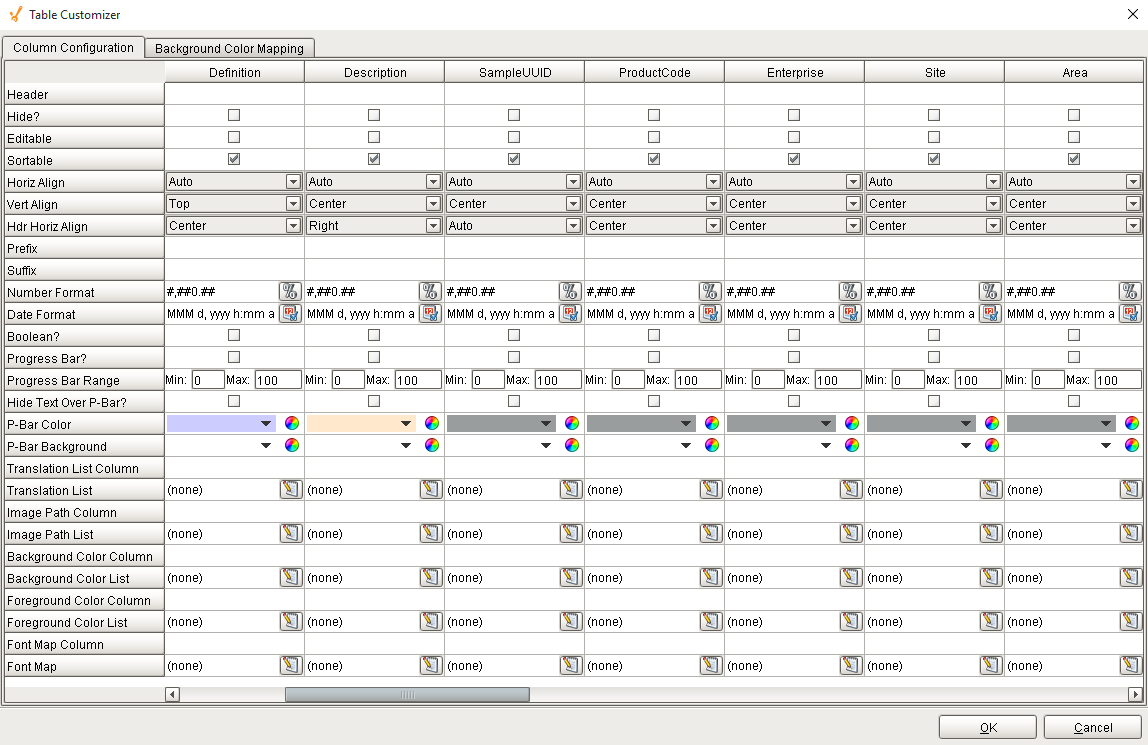
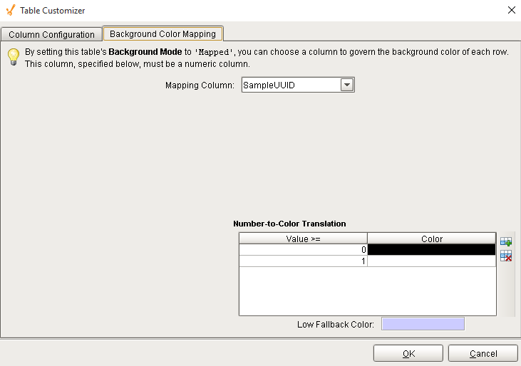
Table Customizer
Table Customizer manages the data entered into the Location Sample List component. It will allow you to modify the data which is stored inside the Location Sample List. Thus the formatting and alignments are made easy.
Column Configuration
Header - Provide a custom name to the column header.
Hide? - Hides the column.
Editable - Allows the editing of the cell pertaining to the column.
Sortable - To make a column filter the data on user's demand.
Sortable - Allows the user to sort the table according to the selected column.
Horiz Align - Aligns the contents of the column.
Vert Align - Aligns the contents of the column.
Wrap Text? - Data in the cell wraps to fit the column width. When you change the column width, data wrapping adjusts automatically.
Prefix - A custom text that proceeds the contents of each cell.
Suffix - A custom text that follows the contents of each cell.
Number Format - A format of the cell is the contents of the cell are number types.
Date Format - Used if the contents of the cell are date types.
Boolean? - Changes the contents of the cell to reflect a 'check box' look and feel.
Component Functions
This component provides the following functions that can be called on it. If this component has been dropped onto the windows root container, the path and an example call would be event.source.parent.getComponent('Location Sample List').update().
createByDefUUID(defUUID)
- Description
Create a new sample based on the sample definition specified by the defUUID parameter.
- Parameters
String defUUID - Sample definition UUID to base the new sample on. A UUID is a universally unique identifier that, once assigned to a sample definition, will never change. It is automatically generated when a sample definition is created and is unique in that no two samples definitions will have the same UUID.
- Return
Sample Object - An instance of a new sample.
- Scope
Client
createByDefName(defName)
- Description
Create a new sample based on the sample definition specified by the defName parameter.
- Parameters
String defName - Sample definition name to base the new sample on.
- Return
Sample Object - An instance of a new sample.
- Scope
Client
update()
- Description
Create a new sample based on the sample definition specified by the defName parameter.
- Parameters
This is the sample to either update, if it already exists, or add, if it does not already exist.
- Return
String Message of any errors that may have occurred during the update operation.
- Scope
Client
exclude(sampleUUID)
- Description
Excludes the sample specified by uuid parameter.
- Parameters
String sampleUUID - The UUID to an existing sample to exclude.
- Return
String Message of any errors that may have occurred during the operation.
- Scope
Client
include(sampleUUID)
- Description
Includes the sample specified by uuid parameter.
- Parameters
String sampleUUID - The UUID to an existing sample to include.
- Return
String Message of any errors that may have occurred during the operation.
- Scope
Client
approve(sample)
- Description
Approve the sample specified by the sample parameter.
- Parameters
Sample Object - This is the sample to approve.
- Return
String Message of any errors that may have occurred during the approve operation.
- Scope
Client
unapprove(sample)
- Description
Unapprove the sample specified by the sample parameter.
- Parameters
Sample Object - This is the sample to unapprove.
- Return
String Message of any errors that may have occurred during the unapprove operation.
- Scope
Client
showEditNotePopup()
- Description
Show the note popup to allow the user to add or edit the note tied to the currently selected sample.
- Parameters
None
- Return
Nothing
- Scope
Client
Sepasoft MES Module Suite