Sepasoft MES Module Suite
Quality Vision Component | Location Selector
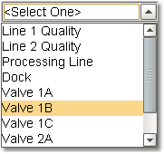
A component that allows selection of production locations. Production locations are defined in the production model using the Ignition Designer. There is no need for SQL queries or scripting to display locations. The selected location is reflected in Selected Location Name, Path and Location ID properties.
Location Selector
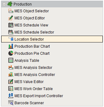
Component Palette
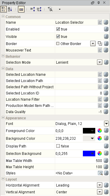
Component Properties
Properties are provided that can be set to affect the operation and look of the component. They can be set through the Property Editor in the Designer or through scripting.
Example
Code |
|
Behavior
| Name | Scripting | Property Type | Description |
|---|---|---|---|
| Selection Mode | selectionMode | int | The selection mode determines the behavior of the dropdown: whether its selected value must strictly be in the underlying set of choices, whether it is flexible, or even user-editable. 0 corresponds to Strict and 1 corresponds to Lenient. |
Data
| Name | Scripting | Property Type | Description |
|---|---|---|---|
| Location Name Filter | locationNameFilter | String | Comma separated list of location names to display. Leave blank for all lines. |
| Production Model Item Path Filter | itemPathFilter | String | The top level Production Model Item path to filter the lines to display. Leave blank to include all Production Model items. |
| Selected Location Name | selectedLocationName | String | The name of the selected location. |
| Selected Location Path | selectedLocationPath | String | The path of the currently selected location. |
| Selected Path Without Project | selectedPathWithoutProject | String | The path of the currently selected location without the leading project name. |
| Selected Location ID | selectedLocationID | int | The ID of the currently selected location. |
Appearance
| Name | Scripting | Property Type | Description |
|---|---|---|---|
| Display Path | displayPath | Boolean | Displays the full path of the location. |
| Selection Background | selectionBackground | Color | The background color of a selected cell in the dropdown list. |
| Max Table Width | maxTableWidth | int | The maximum width allowed for the dropdown table (only used in table mode). |
| Max Table Height | maxTableHeight | int | The maximum height allowed for the dropdown table (only used in table mode). |
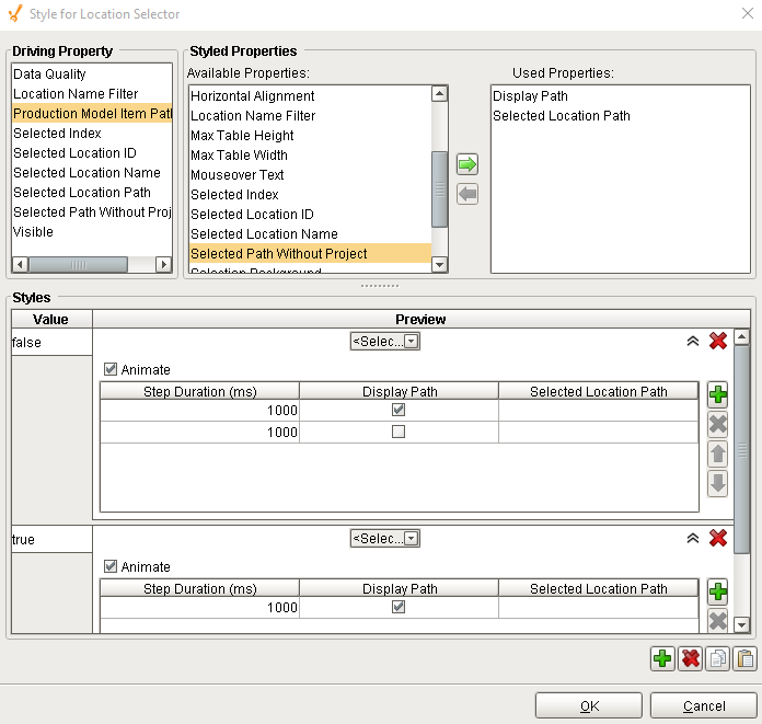
| Styles | styles | Dataset | Contains the component's styles. |
Layout
| Name | Scripting | Property Type | Description |
|---|---|---|---|
| Horizontal Alignment | horizontalAlignment | int | Determines the alignment of the contents along the X axis |
| Vertical Alignment | verticalAlignment | int | Determines the alignment of the contents along the Y axis |
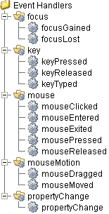
Event Handlers
Event handlers provide the ability to add custom script when a user interacts with a component such as by clicking a mouse, selecting a menu item or when a component property changes.
focus
focusGained
This event occurs when a component that can receive input, such as a text box, receives the input focus. This usually occurs when a user clicks on the component or tabs over to it.
| Property | Description |
|---|---|
| .source | The component that fired this event. |
| .oppositeComponent | The other component involved in this focus change. That is, the component that lost focus in order for this one to gain it, or vice versa. |
focusLost
This event occurs when a component that had the input focus lost it to another component.
| Property | Description |
|---|---|
| .source | The component that fired this event. |
| .oppositeComponent | The other component involved in this focus change. That is, the component that lost focus in order for this one to gain it, or vice versa. |
key
keyPressed
An integer that indicates whether the state was changed to "Selected" (on) or "Deselected" (off). Compare this to the event object's constants to determine what the new state is.
| Property | Description |
|---|---|
| .source | The component that fired this event. |
| .keyCode | The key code for this event. Used with the keyPressed and keyReleased events. See below for the key code constants. |
| .keyChar | The character that was typed. Used with the keyTyped event. |
| .keyLocation | Returns the location of the key that originated this key event. Some keys occur more than once on a keyboard, e.g. the left and right shift keys. Additionally, some keys occur on the numeric keypad. This provides a way of distinguishing such keys. See the KEY_LOCATION constants in the documentation. The keyTyped event always has a location of KEY_LOCATION_UNKNOWN. |
| .altDown | True (1) if the Alt key was held down during this event, false (0) otherwise. |
| .controlDown | True (1) if the Ctrl key was held down during this event, false (0) otherwise. |
| .shiftDown | True (1) if the Shift key was held down during this event, false (0) otherwise. |
keyReleased
Fires when a key is released and the source component has the input focus. Works for all characters, including non-printable ones, such as SHIFT and F3.
| Property | Description |
|---|---|
| .source | The component that fired this event. |
| .keyCode | The key code for this event. Used with the keyPressed and keyReleased events. See below for the key code constants. |
| .keyChar | The character that was typed. Used with the keyTyped event. |
| .keyLocation | Returns the location of the key that originated this key event. Some keys occur more than once on a keyboard, e.g. the left and right shift keys. Additionally, some keys occur on the numeric keypad. This provides a way of distinguishing such keys. See the KEY_LOCATION constants in the documentation. The keyTyped event always has a location of KEY_LOCATION_UNKNOWN. |
| .altDown | True (1) if the Alt key was held down during this event, false (0) otherwise. |
| .controlDown | True (1) if the Ctrl key was held down during this event, false (0) otherwise. |
| .shiftDown | True (1) if the Shift key was held down during this event, false (0) otherwise. |
keyTyped
Fires whenever a bindable property of the source component changes. This works for standard and custom (dynamic) properties.
| Property | Description |
|---|---|
| .source | The component that fired this event. |
| .keyCode | The key code for this event. Used with the keyPressed and keyReleased events. See below for the key code constants. |
| .keyChar | The character that was typed. Used with the keyTyped event. |
| .keyLocation | Returns the location of the key that originated this key event. Some keys occur more than once on a keyboard, e.g. the left and right shift keys. Additionally, some keys occur on the numeric keypad. This provides a way of distinguishing such keys. See the KEY_LOCATION constants in the documentation. The keyTyped event always has a location of KEY_LOCATION_UNKNOWN. |
| .altDown | True (1) if the Alt key was held down during this event, false (0) otherwise. |
| .controlDown | True (1) if the Ctrl key was held down during this event, false (0) otherwise. |
| .shiftDown | True (1) if the Shift key was held down during this event, false (0) otherwise. |
mouse
mouseClicked
This event signifies a mouse click on the source component. A mouse click the combination of a mouse press and a mouse release, both of which must have occurred over the source component. Note that this event fires after the pressed and released events have fired.
| Property | Description |
|---|---|
| .source | The component that fired this event. |
| .button | The code for the button that caused this event to fire. |
| .clickCount | The number of mouse clicks associated with this event. |
| .x | The x-coordinate (with respect to the source component) of this mouse event. |
| .y | The y-coordinate (with respect to the source component) of this mouse event. |
| .popupTrigger | Returns True (1) if this mouse event is a popup trigger. What constitutes a popup trigger is operating system dependent, which is why this abstraction exists. |
| .altDown | True (1) if the Alt key was held down during this event, false (0) otherwise. |
| .controlDown | True (1) if the Ctrl key was held down during this event, false (0) otherwise. |
| .shiftDown | True (1) if the Shift key was held down during this event, false (0) otherwise. |
mouseEntered
This event fires when the mouse enters the space over the source component.
| Property | Description |
|---|---|
| .source | The component that fired this event. |
| .button | The code for the button that caused this event to fire. |
| .clickCount | The number of mouse clicks associated with this event. |
| .x | The x-coordinate (with respect to the source component) of this mouse event. |
| .y | The y-coordinate (with respect to the source component) of this mouse event. |
| .popupTrigger | Returns True (1) if this mouse event is a popup trigger. What constitutes a popup trigger is operating system dependent, which is why this abstraction exists. |
| .altDown | True (1) if the Alt key was held down during this event, false (0) otherwise. |
| .controlDown | True (1) if the Ctrl key was held down during this event, false (0) otherwise. |
| .shiftDown | True (1) if the Shift key was held down during this event, false (0) otherwise. |
mouseExited
This event fires when the mouse leaves the space over the source component.
| Property | Description |
|---|---|
| .source | The component that fired this event. |
| .button | The code for the button that caused this event to fire. |
| .clickCount | The number of mouse clicks associated with this event. |
| .x | The x-coordinate (with respect to the source component) of this mouse event. |
| .y | The y-coordinate (with respect to the source component) of this mouse event. |
| .popupTrigger | Returns True (1) if this mouse event is a popup trigger. What constitutes a popup trigger is operating system dependent, which is why this abstraction exists. |
| .altDown | True (1) if the Alt key was held down during this event, false (0) otherwise. |
| .controlDown | True (1) if the Ctrl key was held down during this event, false (0) otherwise. |
| .shiftDown | True (1) if the Shift key was held down during this event, false (0) otherwise. |
mousePressed
This event fires when a mouse button is pressed down on the source component.
| Property | Description |
|---|---|
| .source | The component that fired this event. |
| .button | The code for the button that caused this event to fire. |
| .clickCount | The number of mouse clicks associated with this event. |
| .x | The x-coordinate (with respect to the source component) of this mouse event. |
| .y | The y-coordinate (with respect to the source component) of this mouse event. |
| .popupTrigger | Returns True (1) if this mouse event is a popup trigger. What constitutes a popup trigger is operating system dependent, which is why this abstraction exists. |
| .altDown | True (1) if the Alt key was held down during this event, false (0) otherwise. |
| .controlDown | True (1) if the Ctrl key was held down during this event, false (0) otherwise. |
| .shiftDown | True (1) if the Shift key was held down during this event, false (0) otherwise. |
mouseReleased
This event fires when a mouse button is released, if that mouse button's press happened over this component.
| Property | Description |
|---|---|
| .source | The component that fired this event. |
| .button | The code for the button that caused this event to fire. |
| .clickCount | The number of mouse clicks associated with this event. |
| .x | The x-coordinate (with respect to the source component) of this mouse event. |
| .y | The y-coordinate (with respect to the source component) of this mouse event. |
| .popupTrigger | Returns True (1) if this mouse event is a popup trigger. What constitutes a popup trigger is operating system dependent, which is why this abstraction exists. |
| .altDown | True (1) if the Alt key was held down during this event, false (0) otherwise. |
| .controlDown | True (1) if the Ctrl key was held down during this event, false (0) otherwise. |
| .shiftDown | True (1) if the Shift key was held down during this event, false (0) otherwise. |
propertyChange
propertyChange
Fires whenever a bindable property of the source component changes. This works for standard and custom (dynamic) properties.
| Property | Description |
|---|---|
| .source | The component that fired this event. |
| .newValue | The new value that this property changed to. |
| .oldValue | The value that this property was before it changed. Note that not all components include an accurate oldValue in their events. |
| .propertyName | The name of the property that changed. NOTE: Remember to always filter out these events for the property that you are looking for! Components often have many properties that change. |
Extension Functions
This component does not have extension functions associated with it.
Custom Methods
Custom methods allow you to add your own component functions to a component that can be called through scripting. This is a useful and clean method of re-using script that is specific to the component (say you want to update a visual aspect of the component in the same way whether a user clicks on the component or a window property value changes).
Customizers
This component does not have a customizer however this component relies on custom styles.
Custom Properties
The custom properties can be used to add user defined properties.
Component Functions
This component does not have functions associated with it.
Sepasoft MES Module Suite