Sepasoft MES Module Suite
Changelog Viewer | Vision
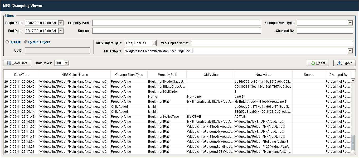
This component displays the historical record of all property-value changes made to any MES Object. It provides a variety of filtering properties, to allow for creating specific results that can be reviewed in the table or exported as a .csv file for off-line analysis or reporting.
This component can be found on the Production component palette and is installed with the production-module.modl which is licensed with either the OEE Downtime or Track & Trace modules.
Features
| Name | Description | ||||||||||||||||||||||||||||||||||||||||
|---|---|---|---|---|---|---|---|---|---|---|---|---|---|---|---|---|---|---|---|---|---|---|---|---|---|---|---|---|---|---|---|---|---|---|---|---|---|---|---|---|---|
Filters | |||||||||||||||||||||||||||||||||||||||||
| Begin Date | Omit changelog entries prior to this date and time. | ||||||||||||||||||||||||||||||||||||||||
| End Date | Omit changelog entries after this date and time. | ||||||||||||||||||||||||||||||||||||||||
| Property Path | Filter changelog entries for the specified equipment path. | ||||||||||||||||||||||||||||||||||||||||
| Source | Filter changelog entries for changes that happened at a specific server by providing the equipment path of that server. Requires setting an Equipment Name in the MES Enterprise Settings page on the gateway. | ||||||||||||||||||||||||||||||||||||||||
| Change Event Type | Change Event Types
| ||||||||||||||||||||||||||||||||||||||||
| Changed By | Filter to see only changes by a user that matches the provided pattern. Search by the first and last name of the user that made a change. * matches 0 or more of any character, ? matches a single character. | ||||||||||||||||||||||||||||||||||||||||
| By UUID / By MES Object | Radio buttons (exactly one selected at all times) to choose whether to filter results by a UUID or by an MES Object. | ||||||||||||||||||||||||||||||||||||||||
| UUID | Filter to see only changes to a specific MESObject by UUID. | ||||||||||||||||||||||||||||||||||||||||
| MES Object Type | Filter to see only changes to a specific type of MESObject. | ||||||||||||||||||||||||||||||||||||||||
| MES Object Name | Filter to see only changes to objects that match the given name pattern. * matches 0 or more of any character, ? matches a single character. | ||||||||||||||||||||||||||||||||||||||||
| MES Object | A dropdown that is populated with the objects of the type that match the MESObjectType filter to select a specific object. | ||||||||||||||||||||||||||||||||||||||||
Data Functions | |||||||||||||||||||||||||||||||||||||||||
| Load Data | Loads the table with changelog entries based on the filter parameters above. | ||||||||||||||||||||||||||||||||||||||||
| Max Rows | Limits the number of entries in the table to the selected number. This is a drop-down menu that includes the following selections: 5, 25, 50, 100, 250, 500, 1000, 2000 | ||||||||||||||||||||||||||||||||||||||||
| Reset | Resets all filter fields to their default (blank) states. | ||||||||||||||||||||||||||||||||||||||||
| Export | Exports the results displayed in the table as a comma-separated values file (.csv). A pop-up dialog box appears to browse to the desired destination folder for the file. If no entries are currently in the table, an error message will indicate that there is no data to export, so no file was created. | ||||||||||||||||||||||||||||||||||||||||
Table Features | |||||||||||||||||||||||||||||||||||||||||
Changelog entries displayed in the table can be sorted (if enabled), edited (if enabled) and filtered (if enabled), as well as formatted visually (text alignment and formatting). Refer to the Table Customizer section below for details on configuring the table display, editing and sorting features for each column. | |||||||||||||||||||||||||||||||||||||||||
Component Properties
Properties are provided that can be set to affect the operation and look of the component. They can be set through the Property Editor in the Designer or through scripting.
Example
Code |
|
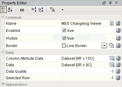
Common
| Name | Scripting | Property Type | Description |
|---|---|---|---|
| Name | name | String | Name of the component. |
| Enabled | componentEnabled | Boolean | If true, component is enabled. |
| Visible | visible | Boolean | If true, component is visible. |
| Border | border | Border | Type of border around the component. |
Data
| Name | Scripting | Property Type | Description |
|---|---|---|---|
| Column Attribute Data | columnAttributesData | Dataset | Dataset describing the data attributes. |
| Data | data | Dataset | Data for this table. |
| Data Quality | dataQuality | Integer | The data code for any tag bindings on this component. |
| Selected Row | selectedRow | Integer | Index of the first selected row, or -1 if none. |
Appearance
| Name | Scripting | Property Type | Description |
|---|---|---|---|
| Header Font | headerFont | Font | Font to use for the table header. |
| Header Foreground Color | headerForeground | Color | Foreground color of the table header. |
| Header Background Color | headerBackground | Color | Background color of the table header. |
| Table Background Color | tableBackground | Color | Background color of the table body. |
| Row Font | rowFont | Font | Font to use for the table header. |
| Row Foreground Color | rowForeground | Color | Foreground color of rows in the table. |
| Row Background Color | rowBackground | Color | Background color of rows in the table. |
| Row Selection Foreground Color | selectionForeground | Color | Default foreground color of selected cells. |
| Row Selection Background Color | selectionBackground | Color | Default background color of selected cells. |
| Auto Row Height Enabled | autoRowHeightEnabled | boolean | If true, row height of the table will be adjusted automatically. |
| Row Height | rowHeight | int | If row resizing is disabled, this will set the height of all rows. |
| Grid Line Color | gridColor | Color | Color of grid lines in the table. |
| Show Horizontal Grid Lines? | showHorizontalLines | boolean | Displays horizontal gridlines making it easier to read. |
| Show Vertical Grid Lines? | showVerticalLines | boolean | Displays vertical gridlines making it easier to read. |
Along with the component properties, custom properties can also be added to this component. See Component Customizers in the Ignition Help Manual for more information.
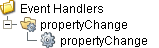
Event Handlers
Event handlers provide the ability to add custom script when a user interacts with a component such as by clicking a mouse, selecting a menu item or when a component property changes.
propertyChange
propertyChange
Fires whenever a bindable property of the source component changes. This works for standard and custom properties of the component.
Property | Description |
|---|---|
.source | The component that fired this event. |
.newValue | The new value that this property changed to. |
.oldValue | The value that this property was before it changed. Note that not all components include an accurate oldValue in their events. |
.propertyName | The name of the property that changed. NOTE: Remember to always filter out these events for the property that you are looking for! Components often have many properties that change. |
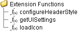
Extension Functions
Extension functions allow the operation of a component to be altered. Extension functions cannot be called, they are event driven. See Component Extension Functions in the Ignition Help Manual for more information.
configureHeaderStyle
Description
Provides a change to configure the style of each column header. Returns a dictionary of name-value pairs with the desired attributes. Available attributes include: 'font', 'foreground', 'background', 'border', 'toolTipText'..
Parameters
self - A reference to the component that is invoking this function.
colIndex - The index of the column in the underlying dataset.
colName - The name of the column in the underlying dataset.
Return
Returns a dictionary of name-value pairs with the desired attributes.
Scope
Client
Example: Configure Header Style
Code |
|
getUISettings
Description
<<< add >>>
Parameters
self - A reference to the component that is invoking this function.
uiSettings - The settings object used to customize the appearance of the MES Changelog Viewer's UI.
Return
<<< add >>>
Scope
Client
Example: Get UI Settings
Code |
<<< add >>> |
loadIcon
Description
Allows users to change an icon. based on the icon name parameter, returns the image path to the icon to use in place of the default icon.
Parameters
self - A reference to the component that is invoking this function.
iconName - The name of the icon.
Return
Returns a dictionary of name-value pairs with the desired attributes.
Scope
Client
Example: Load Icon
Code |
def loadIcon(self, iconName): #Return a path to a different image to replace the default delete image: if iconName == 'remove': return 'Builtin/icons/24/delete2.png' |
Custom Methods
Custom methods allow you to add your own component functions to a component that can be called through scripting. This is a useful and clean method of re-using script that is specific to the component (say you want to update a visual aspect of the component in the same way whether a user clicks on the component or a window property value changes. See Component Custom Methods in the Ignition Help Manual for more information.

Customizers
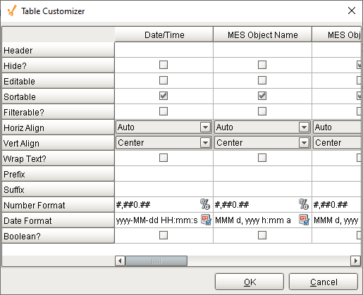
Table Customizer
Table Customizer manages the data entered into the MES Changelog Viewer. It will allow you to modify the data which is stored inside the MES Changelog Viewer. Thus the formatting and alignments are made easy.
Column Configuration
Header - Provide a custom name to the column header.
Hide? - Hides the column.
Editable - Allows the editing of the cell pertaining to the column.
Sortable - Allows the user to sort the table according to the selected column.
Filterable? - To make a column filter the data on user's demand.
Horiz Align - Aligns the contents of the column.
Vert Align - Aligns the contents of the column.
Wrap Text? - Data in the cell wraps to fit the column width. When you change the column width, data wrapping adjusts automatically.
Prefix - A custom text that proceeds the contents of each cell.
Suffix - A custom text that follows the contents of each cell.
Number Format - A format of the cell is the contents of the cell are number types.
Date Format - Used if the contents of the cell are date types.
Boolean? - Changes the contents of the cell to reflect a 'check box' look and feel.
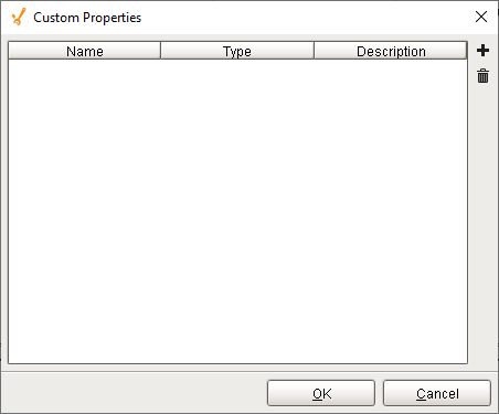
Custom Properties
The custom properties can be used to add user defined properties.
Component Functions
This component does not have component functions associated with it.
Scripting Functions
This component does not have scripting functions associated with it.
Component Objects
This component does not have objects associated with it.
Sepasoft MES Module Suite