Sepasoft MES Module Suite
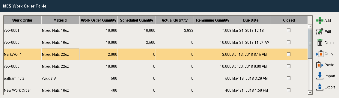
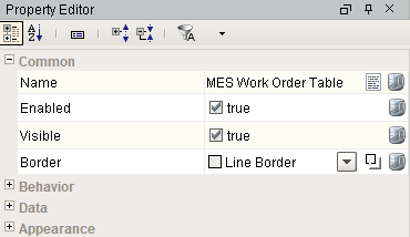
MES Work Order Table
A component that displays all the available work orders in a table and calculates the units produced, scheduled and remaining for each work order. All work orders are automatically displayed from the "WorkOrder" database table within the date range of From Date and To Date properties without the need for custom SQL statements or script.
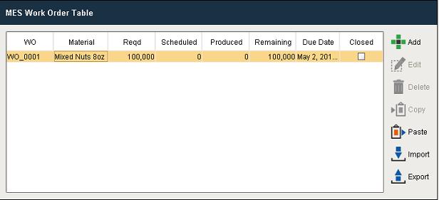
Work Order Table
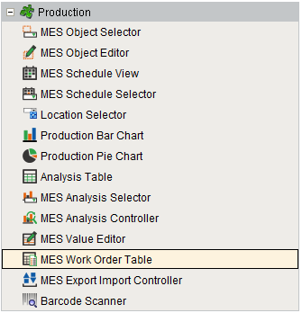
Component Palette

|
See Work Order Management page for various MES Work Order Table settings. |
Info

|
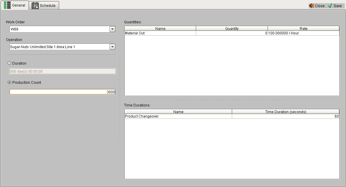
The materials actually do not need to be in the material root class, it is just that work orders will currently not appear in the table unless there exists a material property that references the Work Order material and there exists an equipment property with the same parent as the material property. Essentially what this means is that a Work Order will not appear unless there is a segment defined that refers to the Work Order material. If you create materials and work orders through scripting and set up operations for them using Track and Trace, you should see the work orders appear in the table. You should also be able to update the quantities and schedule runs just with Track and Trace. Non-OEE materials can be selected using Work Order component and the table will be updated such that the material/equipment property restrictions are not enforced unless the user is explicitly trying to filter on the equipment path. By default, the work order has a material set in order to be displayed in the table. This will be compatible with all types of filtering on the Work Order table except equipment path. Once you add in a non-blank "Equipment Path Filter", the work orders will only appear if there exists a segment which maps the Work Order material to a piece of equipment that matches the equipment path filter. |
Drag & Drop Scheduling
|
|
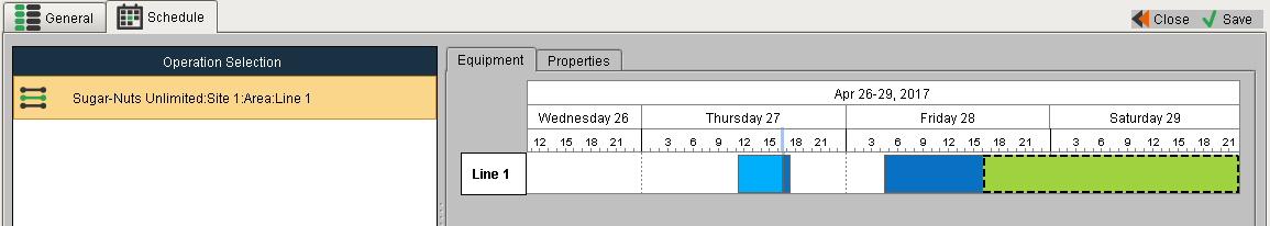
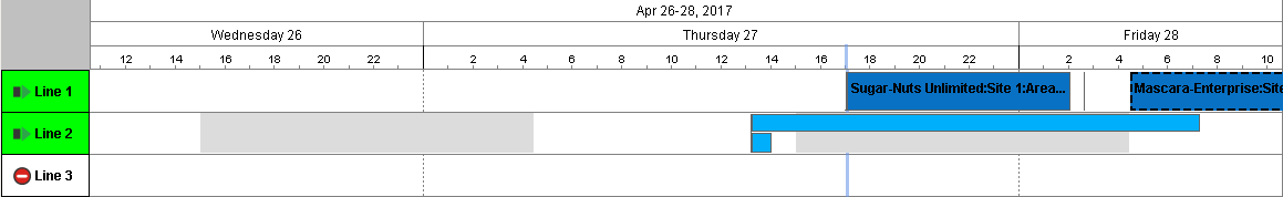
You can drag rows from a power table or this component to simplify work order scheduling. In order to perform drag and drop, you must enable the Row Dragging Enabled property of the power table.
|
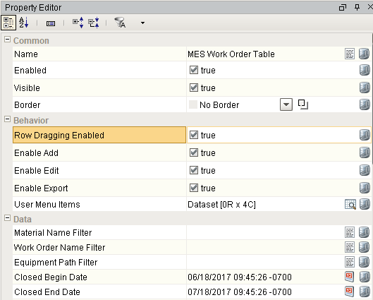
Component Properties
Properties are provided that can be set to affect the operation and look of the component. They can be set through the Property Editor in the Designer or through scripting.
Example
Code |
|
Behavior
| Name | Scripting | Property Type | Description |
|---|---|---|---|
| User Menu Items | userMenuItems | Dataset | Dataset that stores user menu items. |
| Enable Add | EnableAdd | boolean | If true, allows the user to add work orders. |
| Enable Edit | EnableEdit | boolean | If true, allows the user edit work orders. |
| Enable Export | EnableExport | boolean | If true, allows the user export work orders |
| Row Dragging Enabled | rowDragEnabled | boolean | If true, allows a row to dragged from this component to others. |
Data
| Name | Scripting | Property Type | Description | ||||||
|---|---|---|---|---|---|---|---|---|---|
| Material Name Filter | materialNameFilter | String | Material name filter, that can include * and ? wildcard characters, to filter the work orders by. | ||||||
| Work Order Name Filter | workOrderNameFilter | String | Work order name filter, that can include * and ? wildcard characters, to filter the work orders by. | ||||||
| Equipment Path Filter | equipmentPathFilter | String | Equipment path filter, that can include * and ? wildcard characters, to filter the work orders by. | ||||||
| Closed Start Date | closedStartDate | Date | Start date to get work orders for if Show Closed Work Order property is true. | ||||||
| Closed End Date | closedEndDate | Date | End date to get work orders for if Show Closed Work Order property is true. | ||||||
| Creation Begin Date | creationBeginDate | Date | Specify date(s) to filter out work orders created outside of a range. The dates are inclusive i.e., work orders that match either date are be shown in the work order table. The dates are independently optional. If either one is not provided, the filtering for it is ignored. Included in Sepasoft Versions:
| ||||||
| Creation End Date | creationEndDate | Date | |||||||
| Show Closed Work Order | showClosedWorkOrder | boolean | If true, show closed work orders. | ||||||
| Column Attribute Data | columnAttributesData | Dataset | Dataset describing the data attributes. | ||||||
| Data | data | Dataset | Data for this table. | ||||||
| Selected Row | selectedRow | int | Index of the first selected row, or -1 if none. |
Appearance
| Name | Scripting | Property Type | Description |
|---|---|---|---|
| Font | font | Font | Font of text of this component. |
| Foreground Color | foreground Color | Color | Foreground color of the component. |
| Background Color | backgroundColor | Color | Background color of the component. |
| Title Font | titleFont | Font | Font to use for the title. |
| Title Foreground Color | titleForeground | Color | Foreground color of the title bar. |
| Title Background Color | titleBackground | Color | Background color of the title bar. |
| Header Font | headerFont | Font | Font to use for the table header. |
| Header Background Color | headerBackground | Color | Background color of the table header. |
| Table Background Color | tableBackground | Color | Background color of the table body. |
| Header Foreground Color | headerForeground | Color | Foreground color of the table header. |
| Row Font | rowFont | Font | Font to use for the elements in the row. |
| Row Foreground Color | rowForeground | Color | Foreground color of rows in the table. |
| Row Background Color | rowBackground | Color | Background color of rows in the table. |
| Row Selection Foreground Color | selectionForeground | Color | Foreground color of a selected row in the table. |
| Row Selection Background Color | selectionBackground | Color | Background color of a selected row in the table. |
| Auto Row Height Enabled | autoRowHeightEnabled | boolean | If true, the row height of the table will be adjusted automatically. |
| Row Height | rowHeight | int | Height of each row of the table. |
| Grid Line Color | gridColor | Color | Color of grid lines in the table. |
| Show Horizontal Grid Lines | showHorizontalLines | boolean | Determines whether horizontal grid lines are shown in the table. |
| Show Vertical Grid Lines | showVerticalLines | boolean | Determines whether vertical grid lines are shown in the table. |
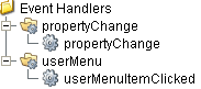
Event Handlers
Event handlers provide the ability to add custom script when a user interacts with a component such as by selecting a menu item or when a component property changes.
propertyChange
propertyChange
Fires whenever a bindable property of the source component changes. This works for standard and custom (dynamic) properties.
| Property | Description |
|---|---|
| .source | The component that fired this event. |
| .newValue | The new value that this property changed to. |
| .oldValue | The value that this property was before it changed. Note that not all components include an accurate oldValue in their events. |
| .propertyName | The name of the property that changed. NOTE: Remember to always filter out these events for the property that you are looking for! Components often have many properties that change. |
userMenu
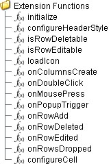
Extension Functions
initialize
- Description
Called when the window containing this table is opened, or the template containing it is loaded. Provides a chance to initialize the table further, for example, selecting a specific row.
- Parameters
self - A reference to the component that is invoking this function.
- Return
Nothing
- Scope
Client
configureHeaderStyle
- Description
Provides a chance to configure the style of each column header. Return a dictionary of name-value pairs with the desired attributes. Available attributes include: 'font', 'foreground', 'background', 'border', 'toolTipText'.
- Parameters
self - A reference to the component that is invoking this function.
colIndex - The index of the column in the underlying dataset.
colName - Name of the column in the underlying dataset.
- Return
Nothing
- Scope
Client
Code Example
Code |
|
isRowEditable
- Description
Returns a boolean that determines whether or not the current row is editable.
- Parameters
self - A reference to the component that is invoking this function.
mesWorkOrder - The MESWorkOrder object itself.
- Return
True
- Scope
Client
isRowDeletable
- Description
Returns a boolean that determines whether or not the current row is deletable.
- Parameters
self - A reference to the component that is invoking this function.
mesWorkOrder - The MESWorkOrder object itself.
- Return
True
- Scope
Client
onRowEdited
- Description
Called when the user has edited a row in the table.
- Parameters
self - A reference to the component that is invoking this function.
mesWorkOrder - The MESWorkOrder object itself.
- Return
None
- Scope
Client
onRowDeleted
- Description
Called when the user has deleted a row in the table.
- Parameters
self - A reference to the component that is invoking this function.
mesWorkOrder - The MESWorkOrder object itself.
- Return
None
- Scope
Client
onColumnsCreate
- Description
Called when columns are created in the table. Provides a chance to add custom columns to the table.
- Parameters
self - A reference to the component that is invoking this function.
- Return
Returns a dictionary of custom column name-type pairs.
- Scope
Client
onRowAdd
- Description
Called when a row is added in the table. Provides a chance to insert values to custom columns in the table.
- Parameters
self - A reference to the component that is invoking this function.
mesWorkOrder - The MESWorkOrder object itself.
- Return
Returns a dictionary of custom column name-value pairs.
- Scope
Client
onMousePress
- Description
Called when the user clicks on a table cell.
- Parameters
self - A reference to the component that is invoking this function.
rowIndex - Index of the row, starting at 0, relative to the underlying dataset.
colIndex - Index of the column starting at 0, relative to the underlying dataset.
colName - Name of the column in the underlying dataset.
value - The value at the location clicked on.
event - The MouseEvent object that caused this press event.
- Return
Nothing
- Scope
Client
onDoubleClick
- Description
Called when the user double-clicks on a table cell.
- Parameters
self - A reference to the component that is invoking this function.
rowIndex - Index of the row, starting at 0, relative to the underlying dataset.
colIndex - Index of the column starting at 0, relative to the underlying dataset.
colName - Name of the column in the underlying dataset.
value - The value at the location clicked on.
event - The MouseEvent object that caused this double-click event.
- Return
Nothing
- Scope
Client
onPopupTrigger
- Description
Called when the user right-clicks on a table cell. This would be the appropriate time to create and display a popup menu.
- Parameters
self - A reference to the component that is invoking this function.
rowIndex - Index of the row, starting at 0, relative to the underlying dataset.
colIndex - Index of the column starting at 0, relative to the underlying dataset.
colName - Name of the column in the underlying dataset.
value - The value at the location clicked on.
event - The MouseEvent object that caused this popup trigger event.
- Return
Nothing
- Scope
Client
onRowsDropped
Description
Called when the user has dropped rows on this table. Note that the rows may have come from this table or another table. The source table must have dragging enabled.
- Parameters
self - A reference to the component that is invoking this function.
sourceTable - A reference to the table that the rows were dragged from. Will be equal to 'self' if the rows were dragged and dropped in the same table.
rows - An array of the row indices that were dragged, in the order they were selected.
rowData - A dataset containing the rows that were dragged.
dropIndexLocation - Row index where the rows were dropped.
- Return
Nothing
- Scope
Client
Code Example
Code |
|
configureCell
- Description
Provides a chance to configure the contents of each cell. Returns a dictionary of name-value pairs with the desired attributes. Available attributes include 'background', 'border', 'font', 'foreground', 'horizontalAlignment', 'iconPath', 'text', 'toolTipText' and 'verticalAlignment'.
You may also specify the attribute 'rendered' which is expected to be a javax.swing.JComponent that will be used to render the cell.
- Parameters
self - A reference to the component that is invoking this function.
value - The value in the dataset at this cell.
textValue - The text the table expects to display at this cell (may be overridden by including 'text' attribute in returned dictionary).
selected - A boolean indicating whether this cell is currently selected.
rowIndex - The index of the row in the underlying dataset.
colIndex - The index of the column in the underlying dataset.
colName - Name of the column in the underlying dataset.
rowView - The index of the row, as it appears in the table view (affected by sorting).
colView - The index of the column, as it appears in the table view (affected by column re-arranging and hiding).
- Return
Nothing
- Scope
Client
Code Example
Code |
|
Custom Methods
Custom methods allow you to add your own component functions to a component that can be called through scripting. This is a useful and clean method of re-using script that is specific to the component (say you want to update a visual aspect of the component in the same way whether a user clicks on the component or a window property value changes). See Component Custom Methods in the Ignition Help Manual for more information.
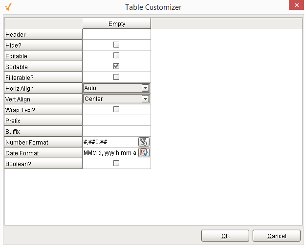
Table Customizer
Table Customizer manages the data entered into the MES Work Order Table. It will allow you to modify the data which is stored inside the MES Work Order Table. Thus the formatting and alignments are made easy.
Column Configuration
Header - Provide a custom name to the column header.
Hide - Hides the column.
Editable - Allows the editing of the cell pertaining to the column.
Sortable - To make a column filter the data on user's demand.
Sortable - Allows the user to sort the table according to the selected column.
Horiz Align - Aligns the contents of the column.
Vert Align - Aligns the contents of the column.
Wrap Text - Data in the cell wraps to fit the column width. When you change the column width, data wrapping adjusts automatically.
Prefix - A custom text that proceeds the contents of each cell.
Suffix - A custom text that follows the contents of each cell.
Number Format - A format of the cell is the contents of the cell are number types.
Date Format - Used if the contents of the cell are date types.
Changes the contents of the cell to reflect a 'check box' look and feel.
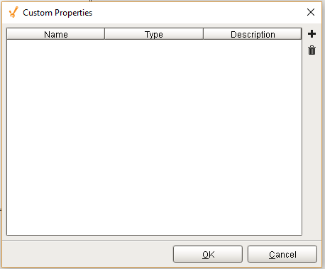
Custom Properties
The custom properties can be used to add user defined properties.
Component Functions
This component does not have functions
Component Objects
WorkOrderUserMenu
Work Order User Menu Event
Description
This object is used with userMenuItemClicked event handler for MES Work Order Table component.
Methods:
getMenuItemName()
Description
Returns the name of the selected menu item.
Syntax
getMenuItemName()
- Parameters
None
- Returns
String itemName - The name of the selected menu item.
getWorkOrder()
Description
Return the MESWorkOrder object.
Syntax
getWorkOrder()
- Parameters
None
- Returns
MES Work Order - The work order associated with this event.
Sepasoft MES Module Suite