Sepasoft MES Module Suite
Multiple Recipe Editor Table | Vision
A component that is added to manage multiple recipes by an item/equipment in the Production Equipment Model, Recipe Name, Recipe State, and Recipe Group.
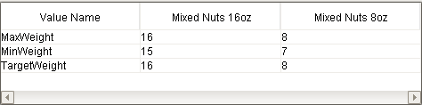
Multiple Recipe Editor Table

|
If you right-click on the table's body, the context menu will be shown.
|
Tip

|
You can drag and drop selected recipe names from the Recipe Selector List or the Power Table components to the Multiple Recipe Editor Table component. Then the selected recipe names will be added to the Recipe Name Filter property, and the Recipe State Filter and the Recipe Group Filter properties will be cleared. |
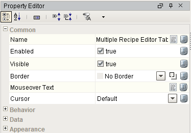
Component Properties
Properties are provided that can be set to affect the operation and look of the component. They can be set through the Property Editor in the Designer or through scripting.
Example
Python |
event.source.parent.getComponent('Multiple Recipe Editor Table').showMasterRecipes = True |
Behavior
| Name | Scripting | Property Type | Description |
|---|---|---|---|
| Require Note | requireNote | boolean | If true, a user must enter a note when any receipe are changed. |
| Read Only | readOnly | boolean | If true, recipes are displays but editing is disabled. |
| Auto-Resize Mode | autoResizeMode | boolean | The table resizes its columns automatically. |
| Auto-Resize Mode | autoResizeMode | int | The table resizes its columns automatically. |
| Freeze First Column | freezeFirstColumn | boolean | If set to True, the first column will be frozen. |
Data
| Name | Scripting | Property Type | Description |
|---|---|---|---|
| Item Path | itemPath | String | Item path in the Production Equipment Model of recipes to view. |
| Recipe Name Filter | recipeNameFilter | String | Recipe name filter of comma separated values, including * and ? wildcard characters, to filter results by recipe name(s). No recipes will be returned, if this field is blank. Use an '*' to return all the recipes. |
| Recipe State Filter | recipeStateFilter | String | Recipe state filter, including * and ? wildcard characters, to filter results by recipe state. |
| Recipe Group Filter | recipeGroupFilter | String | Recipe group filter, including * and ? wildcard characters, to filter results by recipe group. |
| Recipe Value Name Filter | recipeValueNameFilter | String | Recipe value name filter, including * and ? wildcard characters, to filter results by recipe value name. |
| Show Master Recipes | showMasterRecipes | boolean | If true, show master recipes. |
Appearance
| Name | Scripting | Property Type | Description |
|---|---|---|---|
| Frozen Column Width | frozenColumnWidth | int | Frozen column width in the table. |
| Selection Foreground | selectionForeground | Color | Foreground color of selected cells. |
| Wrap Header Text | wrapHeaderText | boolean | If set to True, the table header text will be wrapped at word boundaries (whitespace) if they are too long to fit within the allocated width. |
| Recipe Display Format | recipeDisplayFormat | String | Format for the recipe display for recipe headers. You can use the reserved words: {RecipeName}, {State}, {Group}. |
| Selection Background | selectionBackground | Color | Background color of selected cells. |
| Grid Line Color | gridColor | Color | Grid line color of the table. |
| Show Horizontal Grid Lines | showHorizontalLines | boolean | If true, show horizontal grid lines. |
| Show Vertical Grid Lines | showVerticalLines | boolean | If true, show vertical grid lines. |
| Show Table Header | headerVisible | boolean | If true, show the table header. |
| Row Height | rowHeight | int | Row height in the table. |
| String Value Display Icon Path | stringValueDisplayIconPath | String | Relative path of an icon image appearing for string value display. |
| String Value Edit Icon Path | stringValueEditIconPath | String | Relative path of an icon image appearing for string value edit. |
| Slide Font | slideFont | Font | Font to use for the slide. |
| Slide Foreground Color | slideForeground | Color | Foreground color of the slide. |
| Slide Background Color | slideBackground | Color | Background color of the slide. |
| Slide Type | slideType | int | The slide type. |
| Slide Direction | slideDirection | int | The slide direction. |
| Maximum Slide Position | maximumSlidePosition | float | Maximum position to open the slide. |
| Minimum Slide Position | minimumSlidePosition | float | Minimum position to open the slide. |
| Initial Slide Position | initialSlidePosition | float | Initial position to open the slide. |
| Show Slide Gripper | showSlideGripper | boolean | If true, show the slide gripper. |
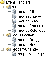
Event Handlers
Event handlers provide the ability to add custom script when a user interacts with a component such as by clicking a mouse.
mouse
mouseClicked
This event signifies a mouse click on the source component. A mouse click the combination of a mouse press and a mouse release, both of which must have occurred over the source component. Note that this event fires after the pressed and released events have fired.
| Property | Description |
|---|---|
| .source | The component that fired this event. |
| .button | The code for the button that caused this event to fire. |
| .clickCount | The number of mouse clicks associated with this event. |
| .x | The x-coordinate (with respect to the source component) of this mouse event. |
| .y | The y-coordinate (with respect to the source component) of this mouse event. |
| .popupTrigger | Returns True (1) if this mouse event is a popup trigger. What constitutes a popup trigger is operating system dependent, which is why this abstraction exists. |
| .altDown | True (1) if the Alt key was held down during this event, false (0) otherwise. |
| .controlDown | True (1) if the Ctrl key was held down during this event, false (0) otherwise. |
| .shiftDown | True (1) if the Shift key was held down during this event, false (0) otherwise. |
mouseEntered
This event fires when the mouse enters the space over the source component.
| Property | Description |
|---|---|
| .source | The component that fired this event. |
| .button | The code for the button that caused this event to fire. |
| .clickCount | The number of mouse clicks associated with this event. |
| .x | The x-coordinate (with respect to the source component) of this mouse event. |
| .y | The y-coordinate (with respect to the source component) of this mouse event. |
| .popupTrigger | Returns True (1) if this mouse event is a popup trigger. What constitutes a popup trigger is operating system dependent, which is why this abstraction exists. |
| .altDown | True (1) if the Alt key was held down during this event, false (0) otherwise. |
| .controlDown | True (1) if the Ctrl key was held down during this event, false (0) otherwise. |
| .shiftDown | True (1) if the Shift key was held down during this event, false (0) otherwise. |
mouseExited
This event fires when the mouse leaves the space over the source component.
| Property | Description |
|---|---|
| .source | The component that fired this event. |
| .button | The code for the button that caused this event to fire. |
| .clickCount | The number of mouse clicks associated with this event. |
| .x | The x-coordinate (with respect to the source component) of this mouse event. |
| .y | The y-coordinate (with respect to the source component) of this mouse event. |
| .popupTrigger | Returns True (1) if this mouse event is a popup trigger. What constitutes a popup trigger is operating system dependent, which is why this abstraction exists. |
| .altDown | True (1) if the Alt key was held down during this event, false (0) otherwise. |
| .controlDown | True (1) if the Ctrl key was held down during this event, false (0) otherwise. |
| .shiftDown | True (1) if the Shift key was held down during this event, false (0) otherwise. |
mousePressed
This event fires when a mouse button is pressed down on the source component.
| Property | Description |
|---|---|
| .source | The component that fired this event. |
| .button | The code for the button that caused this event to fire. |
| .clickCount | The number of mouse clicks associated with this event. |
| .x | The x-coordinate (with respect to the source component) of this mouse event. |
| .y | The y-coordinate (with respect to the source component) of this mouse event. |
| .popupTrigger | Returns True (1) if this mouse event is a popup trigger. What constitutes a popup trigger is operating system dependent, which is why this abstraction exists. |
| .altDown | True (1) if the Alt key was held down during this event, false (0) otherwise. |
| .controlDown | True (1) if the Ctrl key was held down during this event, false (0) otherwise. |
| .shiftDown | True (1) if the Shift key was held down during this event, false (0) otherwise. |
mouseReleased
This event fires when a mouse button is released, if that mouse button's press happened over this component.
| Property | Description |
|---|---|
| .source | The component that fired this event. |
| .button | The code for the button that caused this event to fire. |
| .clickCount | The number of mouse clicks associated with this event. |
| .x | The x-coordinate (with respect to the source component) of this mouse event. |
| .y | The y-coordinate (with respect to the source component) of this mouse event. |
| .popupTrigger | Returns True (1) if this mouse event is a popup trigger. What constitutes a popup trigger is operating system dependent, which is why this abstraction exists. |
| .altDown | True (1) if the Alt key was held down during this event, false (0) otherwise. |
| .controlDown | True (1) if the Ctrl key was held down during this event, false (0) otherwise. |
| .shiftDown | True (1) if the Shift key was held down during this event, false (0) otherwise. |
mouseMotion
mouseDragged
Fires when the mouse moves over a component after a button has been pushed.
| Property | Description |
|---|---|
| .source | The component that fired this event. |
| .button | The code for the button that caused this event to fire. |
| .clickCount | The number of mouse clicks associated with this event. |
| .x | The x-coordinate (with respect to the source component) of this mouse event. |
| .y | The y-coordinate (with respect to the source component) of this mouse event. |
| .popupTrigger | Returns True (1) if this mouse event is a popup trigger. What constitutes a popup trigger is operating system dependent, which is why this abstraction exists. |
| .altDown | True (1) if the Alt key was held down during this event, false (0) otherwise. |
| .controlDown | True (1) if the Ctrl key was held down during this event, false (0) otherwise. |
| .shiftDown | True (1) if the Shift key was held down during this event, false (0) otherwise. |
mouseMoved
Fires when the mouse moves over a component, but no buttons are pushed.
| Property | Description |
|---|---|
| .source | The component that fired this event. |
| .button | The code for the button that caused this event to fire. |
| .clickCount | The number of mouse clicks associated with this event. |
| .x | The x-coordinate (with respect to the source component) of this mouse event. |
| .y | The y-coordinate (with respect to the source component) of this mouse event. |
| .popupTrigger | Returns True (1) if this mouse event is a popup trigger. What constitutes a popup trigger is operating system dependent, which is why this abstraction exists. |
| .altDown | True (1) if the Alt key was held down during this event, false (0) otherwise. |
| .controlDown | True (1) if the Ctrl key was held down during this event, false (0) otherwise. |
| .shiftDown | True (1) if the Shift key was held down during this event, false (0) otherwise. |
propertyChange
propertyChange
Fires whenever a bindable property of the source component changes. This works for standard and custom (dynamic) properties.
| Property | Description |
|---|---|
| .source | The component that fired this event. |
| .newValue | The new value that this property changed to. |
| .oldValue | The value that this property was before it changed. Note that not all components include an accurate oldValue in their events. |
| .propertyName | The name of the property that changed. NOTE: Remember to always filter out these events for the property that you are looking for! Components often have many properties that change. |
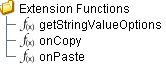
Extension Functions
getStringValueOptions
- Description
Get the options for the string values of the recipe.
- Parameters
itemPath - The item path.
recipeName - The recipe name.
valueName - The recipe value name.
- Returns
List of string values.
- Scope
Client
onCopy
- Description
Called when copying a recipe data from a column.
- Parameters
itemPath - The copied item path.
recipeName - The copied recipe name.
recipeState - The recipe state.
recipeGroup - The recipe group.
recipeValues - The recipe values.
- Returns
Nothing
- Scope
Client
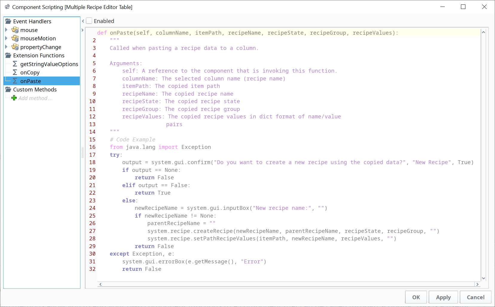
onPaste
- Description
Called when pasting recipe data to a column.
- Parameters
columnName - The selected column name (recipe name).
itemPath - The copied item path.
recipeName - The copied recipe name.
recipeState - The recipe state name.
recipeGroup - The recipe group name.
recipeValues - The recipe values.
- Returns
boolean - True if a recipe name is provided by the user, else False.
- Scope
Client
A handler script is now provided by default, to assist in handling the creation of a new Recipe via a pop-up dialog box. Also, this function now cleanly returns either True or False, instead of void.
- Responding YES with text for the new Recipe name creates a new Recipe with the provided name. An Except pathway is provided in case the Recipe name provided is not allowed or if no name text is provided.
- Responding NO, continues the paste, but does not create a new Recipe.
Custom Methods
Custom methods allow you to add your own component functions to a component that can be called through scripting. This is a useful and clean method of re-using script that is specific to the component (say you want to update a visual aspect of the component in the same way whether a user clicks on the component or a window property value changes).
Customizers
This component does not have any custom properties.
Component Functions
This component does not have functions associated with it.
Sepasoft MES Module Suite