Sepasoft MES Module Suite
Pie Chart

A component that displays a pie chart with drill down capabilities. This extends from the Pie Chart Component that comes with Ignition.
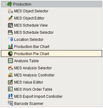
Component Palette
Features
The Drill Down Options property allows custom menu items to be added. When the user clicks on a segment of the pie chart, the drill down menu will appear. When an item in the drill down menu is clicked on, the drillDown event is fired. Script in the drillDown event is responsible for updating the Data property to change the results shown in the pie chart. The drill down menu information is set through the Drill Down Options property. The Drill Down Options can be populated from the Analysis Controller, Analysis Selector, SQL Query, scripting, or it can be manually defined in the designer.
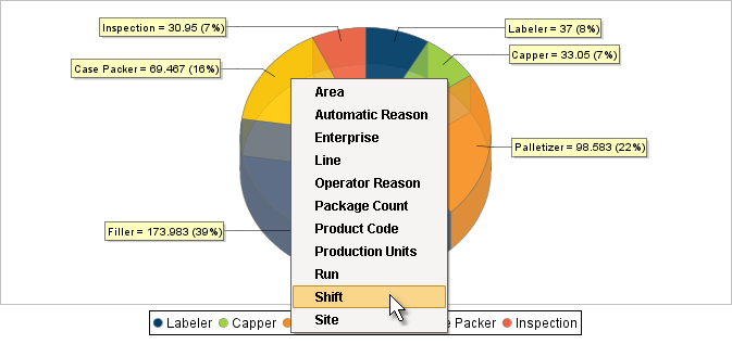
Production Pie Chart
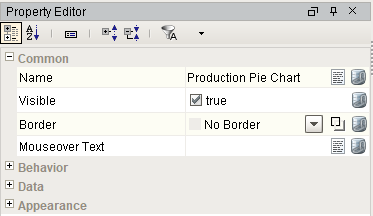
Component Properties
Properties are provided that can be set to affect the operation and look of the component. They can be set through the Property Editor in the Designer or through scripting.
Example
Python |
event.source.parent.getComponent('Production Pie Chart').selectionEnabled = True |
Behavior
| Name | Scripting | Property Type | Description |
|---|---|---|---|
| Tooltips? | tooltips | Boolean | Should tooltips be displayed when the mouse hovers over sections? |
| Selection Enabled? | selectionEnabled | Boolean | If true, the user will be able to select wedges on the chart. The selected wedge will be highlighted, and the selectedData property will reflect it. |
Data
| Name | Scripting | Property Type | Description |
|---|---|---|---|
| Data | data | Dataset | Data driving the chart. |
| Drill Down Options | drillDownOptions | Dataset | Dataset with drill down options. |
| Previous Drill Down Enabled | previousDrillDownEnabled | boolean | If true, show previous in drill down menu. |
| Extract Order | extractOrder | int | Controls whether a pie plot views columns as pies or rows. 0 = By Column |
| Data Quality | dataQuality | int | The data quality code for any tag bindings on this component. |
Appearance
| Name | Scripting | Property Type | Description |
|---|---|---|---|
| Chart Title | title | String | An optional title that will appear at the top of the chart. |
| Plot Background | plotBackground | Color | Background color for all plots, unless they override it. |
| Plot Border Color | plotBorderColor | Color | Border color for the chart. |
| Shadow Color | shadowColor | Color | Shadow color for the chart. |
| Section Colors | sectionColors | Color[] | Colors to use for the pie wedge fills. |
| Outline Colors | outlineColors | Color[] | Colors to use for the pie wedge outlines. |
| Outline Stroke | outlineStroke | float | Width for the section outline stroke. |
| Legend? | legend | boolean | Set to True to display an item legend below the chart. |
| Labels? | labels | boolean | Set to True to display labels near sections. |
| Label Format | labelFormat | String | Formatting String. '{0}' is the wedge name, '{1}' is the value, '{2}' is the percent. |
| Tooltip Format | tooltipFormat | String | Formatting String. '{0}' is the wedge name, '{1}' is the value, '{2}' is the percent. |
| Legend Font | legendFont | Font | Font for legend items, if there is a legend. |
| Label Font | labelFont | Font | Font for labels items, if there are labels. |
| Starting Angle | startAngle | int | Start angle to draw the pie wedges. |
| Enforce Circularity? | circular | boolean | If true, the pie cannot be an oval, even if the overall chart is. |
| Radius Percent | radius | double | Adjusts the size of the pie chart's radius. |
| Inset Top | insetTop | double | Adjusts the plot border's top inset for the available drawing area. |
| Inset Left | insetLeft | double | Adjusts the plot border's left inset for the available drawing area. |
| Inset Bottom | insetBottom | double | Adjusts the plot border's bottom inset for the available drawing area. |
| Inset Right | insetRight | double | Adjusts the plot border's right inset for the available drawing area. |
| Style | style | int | Style of pie chart. 0 = Pie |
| 3D? | threeDimensional | boolean | Deprecated. Use Style property instead. |
| Foreground Transparency | foregroundAlpha | double | Transparency of the pie. |
| 3D Depth Factor | depthFactor | double | Depth of a 3D pie as a factor of the chart height. |
| Selection Highlight Color | selectionHighlightColor | Color | Color of the selection highlight. |
| Selection Highlight Width | selectionHighlightWidth | float | Line width of the selection highlight. |
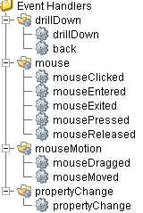
Event Handlers
Event handlers provide the ability to add custom script when a user interacts with a component such as by clicking a mouse, selecting a drill down menu or when a component property changes.
drillDown
drillDown
Is fired when drill down menu item is selected. Excludes the "Back" menu item.
| Property | Description |
|---|---|
| .source | The component that fired this event. |
| .drillDownName | Text of selected drill down option menu item. |
| .category | Value of first column for the selected row. |
back
| Property | Description |
|---|---|
| .source | The component that fired this event. |
| .drillDownName | Text of selected drill down option menu item. |
| .category | Value of first column for the selected row. |
Extension Functions
.configureChart()
Included in Sepasoft Versions:

|
Stable Release Versions: MES 3.81.1 SP9 and later |
configureChart()
- Description
Provides an opportunity to perform further chart configuration via scripting. Doesn't return anything.
- Parameters
Component chart-A JFreeChart object. Refer to the JFreeChart documentation for API details.
- Return
Nothing
- Scope
Client
Custom Methods
Custom methods allow you to add your own component functions to a component that can be called through scripting. This is a useful and clean method of re-using script that is specific to the component (say you want to update a visual aspect of the component in the same way whether a user clicks on the component or a window property value changes). See Component Custom Methods in the Ignition Help Manual for more information.
Customizers
This component does not have any custom properties.
Component Functions
This component does not have functions associated with it.
Sepasoft MES Module Suite