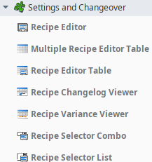
Sepasoft MES Module Suite
Settings & Changeover Recipe Editor | Vision
A component that is added to manage recipes in a tree view that provides on overview of inheritance and allows associating recipes across items in the Production Equipment Model.
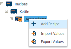
Allows for:
- Adding/Removing Recipes
- Importing/Exporting Values
- Selecting Production Items
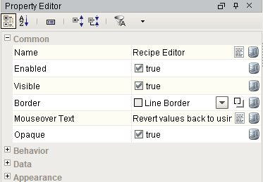
Component Properties
Properties are provided that can be set to affect the operation and look of the component. They can be set through the Property Editor in the Designer or through scripting.
Example
Python |
#Sample script to change the root Recipes node text to Spanish. Script from internalFrameActivated event on the window system.gui.getParentWindow(event).getComponentForPath('Root Container.Recipe TreeView').changeLocalizationString("node.recipes", "Receta") |
Behavior
| Name | Scripting | Property Type | Description |
|---|---|---|---|
| Enable Security Editing | enableSecurityEdit | boolean | Enables security to restrict recipe editing based on security levels. |
| Enable Recipe Editing | enableRecipeEdit | boolean | If true, allow the user to add, rename and remove recipes. |
| Enable Recipe State Creation | enableRecipeStateCreation | boolean | If true, allow the user to create recipe states. |
| Enable Recipe Group Creation | enableRecipeGroupCreation | boolean | If true, allow the user to create recipe groups. |
| Require Note | requireNote | boolean | If true, notes are required when editing. |
| Read Only | readOnly | boolean | If true, then user cannot select or cancel recipes. |
| User Menu Items | userMenuItems | Dataset | Dataset that stores user menu items. |
Data
| Name | Scripting | Property Type | Description |
|---|---|---|---|
| Item Path Filter | itemPathFilter | String | Optional production item path filter to limit recipe values shown. ? and * can be used as wildcards |
| Recipe Name Filter | recipeNameFilter | String | Optional recipe name filter to limit recipe values shown. ? and * can be used as wildcards |
| Recipe Value Name Filter | recipeValueNameFilter | String | Optional recipe value name filter to limit recipe values shown. ? and * can be used as wildcards |
|
Recipe State Filter |
recipeStateFilter | String | Optional recipe state name filter to limit recipe values shown. ? and * can be used as wildcards |
| Recipe Group Filter | recipeGroupFilter | String | Optional recipe group name filter to limit recipe values shown. ? and * can be used as wildcards |
| Show Item Defaults | showItemDefaults | boolean |
If true, show default values for production items. Note: This must be set to True in order to access the recipe Security Settings. |
| Show Item Children | showItemChildren | boolean | If true, show production item children. |
| Show Sub Recipes | showSubRecipes | boolean | If true, show sub recipe values for production items. |
| Show Recipes | showRecipes | boolean | If true, show recipes. |
| Show Master Recipes | showMasterRecipes | boolean | If true, show master recipes. |
| Show Descendants | showDescendants | boolean | If true, show recipe descendants. |
| Show Recipe Items | showRecipeItems | boolean | If true, show production items for recipes. |
| Show Values | showValues | boolean | If true, show recipe values. |
| Recipe Value Category | category | String | Category of recipe values to show. Where 1 is recipe values created by the recipe module, 2 is recipe values created by the OEE module and 3 is recipe values created by the SPC module. Use \"\" to include all categories. |
Appearance
| Name | Scripting | Property Type | Description |
|---|---|---|---|
| Recipe Display Format | recipeDisplayFormat | String | Format for the recipe display for recipe nodes. You can use the reserved words: {RecipeName}, {State}, {Group}. |
| Default Row Height | defaultRowHeight | int | Default row height of the value table. |
| Max Recipe Value Rows | maxRecipeValueRows | int | Maximum number of recipe values to show before scrolling. |
| Popup Panel Font | panelFont | Font | Font to use for the popup panel. |
| Value Table Font | valueTableFont | Font | Font to use for the value table. |
| Value Table Header Font | valueTableHeaderFont | Font | Font to use for the value table header. |
| Recipes Icon Path | recipesIconPath | String | Relative path of an icon image representing multiple recipes. |
| Recipe Icon Path | recipeIconPath | String | Relative path of an icon image representing a single recipe. |
| Recipe Descendants Icon Path | descendantsIconPath | String | Relative path of an icon image representing recipe descendants. |
| Default Values Icon Path | defaultValuesIconPath | String | Relative path of an icon image representing production item default values. |
| Sub Recipes Icon Path | subRecipesIconPath | String | Relative path of an icon image representing multiple sub recipes for a production item. |
| Sub Recipe Icon Path | subRecipeIconPath | String | Relative path of an icon image representing a single sub recipe for a production item. |
| Default SubRecipe Icon Path | defaultSubRecipeIconPath | String | Relative path of an icon image representing the default sub recipe for a production item. |
| Prod Item Icon Path | prodItemIconPath | String | Relative path of an icon image representing a production item. |
| Menu Add Icon Path | menuAddIconPath | String | Relative path of an icon image appearing for the add menu item. |
| Menu Edit Icon Path | menuEditIconPath | String | Relative path of an icon image appearing for the edit menu item. |
| Menu Rename Icon Path | menuRenameIconPath | String | Relative path of an icon image appearing for the rename menu item. |
| Menu Delete Icon Path | menuDeleteIconPath | String | Relative path of an icon image appearing for the delete menu item. |
| Menu Revert Icon Path | menuRevertIconPath | String | Relative path of an icon image appearing for the revert menu item. |
| Menu Security Icon Path | menuSecurityIconPath | String | Relative path of an icon image appearing for the security menu item. |
| Menu Select Items Icon Path | menuSelectItemIconPath | String | Relative path of an icon image appearing for the select items menu item. |
| Note Panel Icon Path | notePanelIconPath | String | Relative path of an icon image appearing on the note panel. |
| Security Panel Icon Path | securityPanelIconPath | String | Relative path of an icon image appearing on the security panel. |
| Item Select Panel Icon Path | itemSelectPanelIconPath | String | Relative path of an icon image appearing on the production item select panel. |
| Note Background Color | noteBackgroundColor | Color | Background color of the note panel. |
| Security Background Color | securityBackgroundColor | Color | Background color of the security panel. |
| Item Selector Background Color | itemSelectorBackgroundColor | Color | Background color of the select production item panel. |
| Menu Import Icon Path | menuImportIconPath | String | Relative path of an icon image appearing for the import menu item. |
| Menu Export Icon Path | menuExportIconPath | String | Relative path of an icon image appearing for the export menu item. |
| Add Panel Icon Path | addPanelIconPath | String | Relative path of an icon image appearing on the recipe add panel. |
| Edit Panel Icon Path | editPanelIconPath | String | Relative path of an icon image appearing on the recipe edit panel. |
| Export Panel Icon Path | exportPanelIconPath | String | Relative path of an icon image appearing on the export panel. |
| String Editor Icon Path | stringEditorIconPath | String | Relative path of an icon image appearing for string editor on the recipe value table. |
| Add Background Color | addBackgroundColor | Color | Background color of the recipe add panel. |
| Edit Background Color | editBackgroundColor | Color | Background color of the recipe edit panel. |
| Export Background Color | exportBackgroundColor | Color | Background color of the export panel. |
| String Editor Background Color | stringEditorBackgroundColor | Color | Background color of the string editor panel. |
| String Editor Slide Direction | stringEditorSlideDirection | int | Slide direction of the string editor panel. |
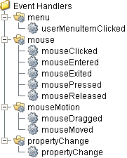
Event Handlers
Event handlers provide the ability to add custom script when a user interacts with a component such as by clicking a mouse, selecting a menu item or when a component property changes.
menu
userMenuItenClicked
This event fires when the menu item is clicked, or if the user selects the menu item using the keyboard and presses the Enter key. It can also occur if an access key or shortcut key is pressed that is associated with the MenuItem.
| Property | Description |
|---|---|
| .source | The component that fired this event. |
| .menuItemName | Name of the user menu item that triggered the event. |
mouse
mouseClicked
This event signifies a mouse click on the source component. A mouse click the combination of a mouse press and a mouse release, both of which must have occurred over the source component. Note that this event fires after the pressed and released events have fired.
| Property | Description |
|---|---|
| .source | The component that fired this event. |
| .button | The code for the button that caused this event to fire. |
| .clickCount | The number of mouse clicks associated with this event. |
| .x | The x-coordinate (with respect to the source component) of this mouse event. |
| .y | The y-coordinate (with respect to the source component) of this mouse event. |
| .popupTrigger | Returns True (1) if this mouse event is a popup trigger. What constitutes a popup trigger is operating system dependent, which is why this abstraction exists. |
| .altDown | True (1) if the Alt key was held down during this event, false (0) otherwise. |
| .controlDown | True (1) if the Ctrl key was held down during this event, false (0) otherwise. |
| .shiftDown | True (1) if the Shift key was held down during this event, false (0) otherwise. |
mouseEntered
This event fires when the mouse enters the space over the source component.
| Property | Description |
|---|---|
| .source | The component that fired this event. |
| .button | The code for the button that caused this event to fire. |
| .clickCount | The number of mouse clicks associated with this event. |
| .x | The x-coordinate (with respect to the source component) of this mouse event. |
| .y | The y-coordinate (with respect to the source component) of this mouse event. |
| .popupTrigger | Returns True (1) if this mouse event is a popup trigger. What constitutes a popup trigger is operating system dependent, which is why this abstraction exists. |
| .altDown | True (1) if the Alt key was held down during this event, false (0) otherwise. |
| .controlDown | True (1) if the Ctrl key was held down during this event, false (0) otherwise. |
| .shiftDown | True (1) if the Shift key was held down during this event, false (0) otherwise. |
mouseExited
This event fires when the mouse leaves the space over the source component.
| Property | Description |
|---|---|
| .source | The component that fired this event. |
| .button | The code for the button that caused this event to fire. |
| .clickCount | The number of mouse clicks associated with this event. |
| .x | The x-coordinate (with respect to the source component) of this mouse event. |
| .y | The y-coordinate (with respect to the source component) of this mouse event. |
| .popupTrigger | Returns True (1) if this mouse event is a popup trigger. What constitutes a popup trigger is operating system dependent, which is why this abstraction exists. |
| .altDown | True (1) if the Alt key was held down during this event, false (0) otherwise. |
| .controlDown | True (1) if the Ctrl key was held down during this event, false (0) otherwise. |
| .shiftDown | True (1) if the Shift key was held down during this event, false (0) otherwise. |
mousePressed
This event fires when a mouse button is pressed down on the source component.
| Property | Description |
|---|---|
| .source | The component that fired this event. |
| .button | The code for the button that caused this event to fire. |
| .clickCount | The number of mouse clicks associated with this event. |
| .x | The x-coordinate (with respect to the source component) of this mouse event. |
| .y | The y-coordinate (with respect to the source component) of this mouse event. |
| .popupTrigger | Returns True (1) if this mouse event is a popup trigger. What constitutes a popup trigger is operating system dependent, which is why this abstraction exists. |
| .altDown | True (1) if the Alt key was held down during this event, false (0) otherwise. |
| .controlDown | True (1) if the Ctrl key was held down during this event, false (0) otherwise. |
| .shiftDown | True (1) if the Shift key was held down during this event, false (0) otherwise. |
mouseReleased
This event fires when a mouse button is released, if that mouse button's press happened over this component.
| Property | Description |
|---|---|
| .source | The component that fired this event. |
| .button | The code for the button that caused this event to fire. |
| .clickCount | The number of mouse clicks associated with this event. |
| .x | The x-coordinate (with respect to the source component) of this mouse event. |
| .y | The y-coordinate (with respect to the source component) of this mouse event. |
| .popupTrigger | Returns True (1) if this mouse event is a popup trigger. What constitutes a popup trigger is operating system dependent, which is why this abstraction exists. |
| .altDown | True (1) if the Alt key was held down during this event, false (0) otherwise. |
| .controlDown | True (1) if the Ctrl key was held down during this event, false (0) otherwise. |
| .shiftDown | True (1) if the Shift key was held down during this event, false (0) otherwise. |
mouseMotion
mouseDragged
Fires when the mouse moves over a component after a button has been pushed.
| Property | Description |
|---|---|
| .source | The component that fired this event. |
| .button | The code for the button that caused this event to fire. |
| .clickCount | The number of mouse clicks associated with this event. |
| .x | The x-coordinate (with respect to the source component) of this mouse event. |
| .y | The y-coordinate (with respect to the source component) of this mouse event. |
| .popupTrigger | Returns True (1) if this mouse event is a popup trigger. What constitutes a popup trigger is operating system dependent, which is why this abstraction exists. |
| .altDown | True (1) if the Alt key was held down during this event, false (0) otherwise. |
| .controlDown | True (1) if the Ctrl key was held down during this event, false (0) otherwise. |
| .shiftDown | True (1) if the Shift key was held down during this event, false (0) otherwise. |
mouseMoved
Fires when the mouse moves over a component, but no buttons are pushed.
| Property | Description |
|---|---|
| .source | The component that fired this event. |
| .button | The code for the button that caused this event to fire. |
| .clickCount | The number of mouse clicks associated with this event. |
| .x | The x-coordinate (with respect to the source component) of this mouse event. |
| .y | The y-coordinate (with respect to the source component) of this mouse event. |
| .popupTrigger | Returns True (1) if this mouse event is a popup trigger. What constitutes a popup trigger is operating system dependent, which is why this abstraction exists. |
| .altDown | True (1) if the Alt key was held down during this event, false (0) otherwise. |
| .controlDown | True (1) if the Ctrl key was held down during this event, false (0) otherwise. |
| .shiftDown | True (1) if the Shift key was held down during this event, false (0) otherwise. |
propertyChange
propertyChange
Fires whenever a bindable property of the source component changes. This works for standard and custom (dynamic) properties.
| Property | Description |
|---|---|
| .source | The component that fired this event. |
| .newValue | The new value that this property changed to. |
| .oldValue | The value that this property was before it changed. Note that not all components include an accurate oldValue in their events. |
| .propertyName | The name of the property that changed. NOTE: Remember to always filter out these events for the property that you are looking for! Components often have many properties that change. |
Extension Functions
getStringValueOptions
- Description
Get the options for the string values of the recipe.
- Parameters
itemPath - The item path.
recipeName - The recipe name.
valueName - The recipe value name.
- Returns
List of string values.
- Scope
Client
Custom Methods
Custom methods allow you to add your own component functions to a component that can be called through scripting. This is a useful and clean method of re-using script that is specific to the component (say you want to update a visual aspect of the component in the same way whether a user clicks on the component or a window property value changes). See Component Custom Methods in the Ignition Help Manual for more information.
Customizers
This component does not have any custom properties.
Component Functions
This component provide the following functions that can be called on it. If this component has been dropped onto the windows root container, the path and an example call would be event.source.parent.getComponent('Recipe Editor').changeLocalizationString(key, displayText).
changeLocalizationString(key, displayText)
- Description
Any of the text that is displayed in the recipe editor change be changed. For example, displaying Recipes for the root recipe node can be replaced with Products. This can be done for any static text in the recipe editor including menu items.
Parameters
String key - The key to the string value to change.
Recipe Editor component keys:
node.recipes
node.default.values
node.subrecipes
node.subrecipes.default
node.descendants
node.subrecipes.default
menu.recipe.add
menu.recipe.delete
menu.recipe.rename
menu.value.revert
menu.recipe.revertvalues
menu.value.read
menu.recipe.setvalues
menu.value.security
menu.recipe.selectitems
menu.subrecipe.add
menu.subrecipe.delete
menu.subrecipe.rename
menu.recipe.import
menu.recipe.export
panel.item.select.inst
panel.security.inst
panel.note.inst
panel.cancel.desc
panel.ok.desc
String displayText - The new text to replace the existing display text.
Return
Nothing
Scope
Client
Code Examples
Python |
#Sample script to change the root Recipes node text to Spanish. Script from internalFrameActivated event on the window system.gui.getParentWindow(event).getComponentForPath('Root Container.Recipe TreeView').changeLocalizationString("node.recipes", "Receta") |
Sepasoft MES Module Suite