Sepasoft MES Module Suite
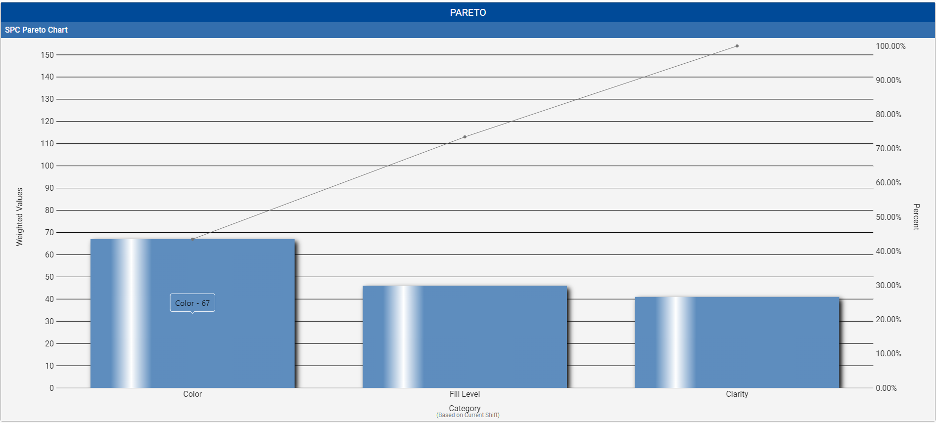
A Pareto Chart is a graph that indicates the frequency of defects, as well as their cumulative impact. Pareto Charts are useful to find the defects to prioritize in order to observe the greatest overall improvement.
Table Chart Scroll Locking
 |
This feature is available in versions: MES 3.81.11 SP7 and later MES 4.83.0 RC2 and later |
State | Detailed Description |
Locked | UI: The lock icon in the taskbar appears closed and filled. Behavior: The chart view is locked to the right, automatically jumping to the end of the table whenever new data is received. Tooltip: Hovering over the icon displays the text: "Allow Free Scrolling". |
Free Scrolling | UI: The lock icon in the taskbar appears open and unfilled. Behavior: The chart maintains its current scroll position, even when new data is received. Tooltip: Hovering over the icon displays the text: "Lock Scrolling". |
Included in Sepasoft Versions:

|
MES 3.81.7 RC1 and later |
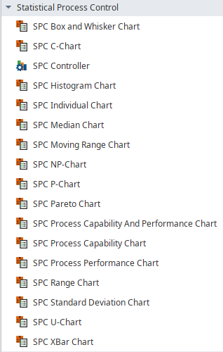
Ignition Designer
Perspective Component Palette
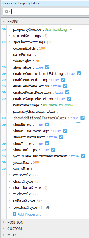
SPC Perspective Chart Dataset Properties
These properties are available in the Ignition Properties Palette for SPC Charts.
| Property Source | |
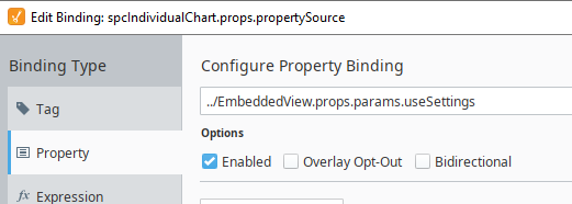
Sets the datasource mode. Toggle two options: Use_stored_settings | Use_binding Included in Sepasoft Versions:
Use_stored_settings: Sets the chart to receive data from Stored Settings. To use this, enter property values under storedSettings, see below.
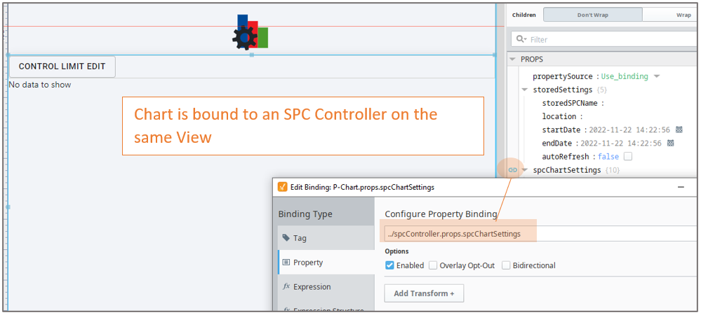
Use_binding: Sets the chart to receive data from an SPC Controller. To use this, bind to an SPC Controller under spcChartSettings, see below. When clicking the binding icon on the left side of the propertySource, the Configure Property Binding dialog appears.
|
||||||||||||||||||||||||||||||||||||||||
| Stored Settings | storedSettings |
Set property values here when propertySource is set to Use_stored_settings |
||||||||||||||||||||||||||||||||||||||||
|
|
|
|||||||||||||||||||||||||||||||||||||||||
| SPC Chart Settings |
spcChartSettings
Set property values here when propertySource is set to Use_Binding
Bind to the SPC Controller |
|||||||||||||||||||||||||||||||||||||||||
|
|
|
|||||||||||||||||||||||||||||||||||||||||
|
|
settings
|
|||||||||||||||||||||||||||||||||||||||||
|
|
histogram
|
|||||||||||||||||||||||||||||||||||||||||
|
|
dynamic When using an SPC Controller to populate a Perspective SPC Chart, these dynamic filters can be used to filter the data for display in a chart.
|
|||||||||||||||||||||||||||||||||||||||||
|
|
spcResults SPC Results including data, measurement count, messages and calculated value information. definitionUUI
measurementCount
spcData: dataset - The SPC data.
|
|
||||||||||||||||||||||||||||||||||||||||
| showTable | Boolean | Enable to display the data table. The table is updated as new data comes in. Table Chart Scroll LockingThe table chart scroll locking feature provides a user-controlled mechanism to either automatically navigate to the most recent data upon its arrival or maintain the current scroll position. The scroll lock feature operates in two distinct modes, each with specific UI indicators and behavioral responses to new data.
| ||||||||||||||||||||||||||||||||||||||||


Pareto Chart Specific Properties
| Scripting Reference | |||||
|---|---|---|---|---|---|
| xAxisVerticalTickLabels | Boolean | Enables labels on the vertical tick marks on the x-axis. | |||
| vertical | Boolean | Sets the orientation of the chart. When set to True, the chart displays with vertical bars. | |||
| categoryAxisTitle | String | Adds a title to the category axis. | |||
| frequencyAxisTitle | String | Adds a title to the frequency axis. | |||
| percentAxisTitle | String | Adds a title to the percentage axis. | |||
| showAccumulationLine | Boolean | ||||
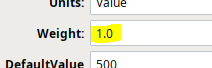
| showWeightedValues | Boolean | When set to True, the count values are adjusted by the weight value in Sample Definition > Attribute settings.
| |||
| maxBarCount | Integer | Limits the number of bars on the chart. | |||
| weightAxisTitle | String | Title to show when displaying weighted values for the frequency axis. | |||
| axisStyle | |||||
| axisTitleColor | Color picker | Color for both axis titles. | |||
| axisTitleFont | String | Font family for both axis titles | |||
| chartStyle | chartBackground | String | Color of the background of the chart. | ||
| horzGridLineColor | Color, picker available | Color of the horizontal grid line. | |||
| showHorizontalGridLines | Boolean | If true, show horizontal grid lines on charts. | |||
| chartDataStyle | |||||
| accumulationLineColor | Color picker | Color for accumulation. | |||
| barColor | Color picker | Color for bars. | |||
| barSpacing | Integer | Spacing between bars as a percentage of the bar width. | |||
| gradient | Boolean | When True, painted with a gradient shine | |||
| shadow | Boolean | When True, painted with drop shadow. | |||
| tickStyle | |||||
| tickLabelColor | Color picker | Sets the color for the tick style. | |||
| tickLabelFont | String | Sets the font family for the tick labels. | |||
| noDataStyle | |||||
| noDataForeground | Color picker | ||||
| noDataFont | Sets the font family for the no data message | ||||
Meta Properties in the Perspective Property Editor
Name Scripting Reference | Data Type | Description | ||
|---|---|---|---|---|
| name | String | Name of the component. Used in scripting and component tree paths by name, such as during Property Binding. | ||
| visible | Boolean | Whether or not this component should display. | ||
| tooltip | ||||
enable | Boolean | Whether the tooltip on hover | ||
width | Integer | The height of the table rows. | ||
text | String | The scroll bar x position. | ||
| style | Boolean | Toggle to show or hide the sample data table. | ||
| delay | Boolean | Image icon to show to edit control limits. | ||
| sustain | Integer | Time, in milliseconds, to display tooltip before removing it. A value of 0 results in the tooltip displaying until the mouse exits the components. | ||
| location | Boolean | The location where the tooltip displays. | ||
| tail | Boolean | Enables a decorative triangle on the tooltip that points to the tooltip owner. Ignored when location uses a value of 'mouse'. | ||
Event Handlers
Event handlers provide the ability to add custom script when a user interacts with a component.
- .beforeUpdate()

- .afterUpdate()
Refer to the Ignition User Manual for details on using the available event handlers:
Extension Functions
Functions implemented
- .update()
- .refreshInfo()
Component Functions
Example of the component on the page root container:
event.source.parent.getComponent('Box and Whisker Chart').showSetLimitPanel (True).
showSetLimitPanel
- Description
Causes the calculate and set control limit dialog to be shown.
- Parameters
Boolean - True/False
- Return
Nothing
- Scope
Client
Sepasoft MES Module Suite