Sepasoft MES Module Suite
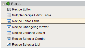
Recipe Editor Table | Vision
A component that is added to Ignition windows to manage a single recipe. This is just one method of managing recipes and for more information on the other methods see the Using the Recipe Editor | Vision section.
To use the recipe table you must supply an item path and recipe name then the table will populate with the related values.
It has the capability for end users to do the following recipe related tasks:
- View the current tag values related to this recipe and equipment path. This can be set to update at a specific interval.
- Manually adjust the recipe value before writing it down to the tags.
- Update the selected recipe with the current live values.
Component Palette
Table Columns
The table coulmns displayed can be customized by using the standard Ignition table customizer available by right clicking on the table component in the designer. The available fields are:
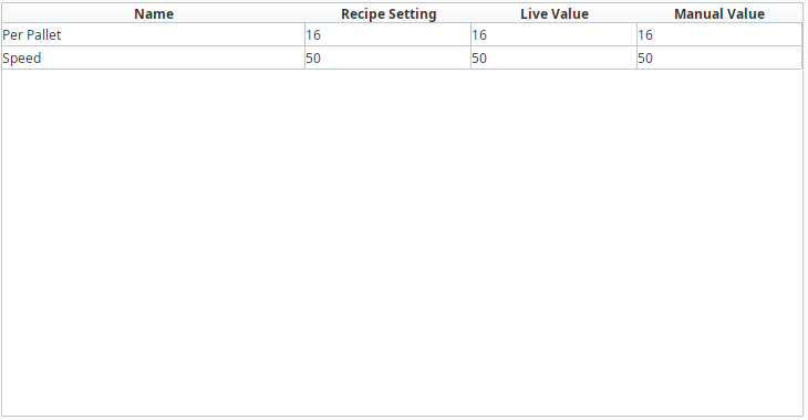
- Name
The recipe value name
- Recipe Setting
The set value assigned in the recipe
- Live Value
The current live tag value referenced by this recipe value
- Manual Value
A value that is manually set by the user. You must call a method of the component in order to have this value affect the recipe or the tag value.
- Description
The description of this recipe value
- Units
The units of this recipe value
- Assigned By
The assigned by name of this recipe value
- Format
The format of this recipe value
- dataType
The data type of this recipe value
- tagPath
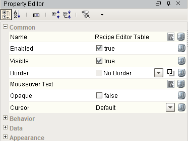
Component Properties
Properties are provided that can be set to affect the operation and look of the component. They can be set through the Property Editor in the Designer or through scripting.
Example
Code |
|
Behavior
| Name | Scripting | Property Type | Description |
|---|---|---|---|
| Row Selection Allowed | rowSelectionAllowed | boolean | This flag is used in conjunction with the Column Selection Allowed flag to determine whether not whole-rows, whole-columns, or both (single-cells) are selectable. |
| Resizing Allowed | resizingAllowed | boolean | Whether or not the user is allowed to resize table headers or not. |
Data
| Name | Scripting | Property Type | Description |
|---|---|---|---|
| Item Path | itemPath | String | Item path of the Recipe to view. |
| Recipe Name | recipeName | String | Name of the Recipe to view. |
| Recipe Value Name Filter | recipeValueNameFilter | String | Optional recipe value name filter to limit recipe values shown. |
| Data | data | Dataset | Data for the table. |
| Live Update Interval | liveValueUpdateInterval | int | Interval in seconds to update the live vale. values less than 1 will not update the live values. |
| Column Attributes Data | columnAttributesData | Dataset | Dataset describing the column attributes. |
| Selected Row | selectedRow | int | Index of the first selected row, or -1 if none. |
Appearance
| Name | Scripting | Property Type | Description |
|---|---|---|---|
| Header Font | headerFont | Font | Font designated for the table header. |
| Header Foreground Color | headerForeground | Color | Foreground color of the table's header. |
| Header Visible | headerVisible | boolean | Whether or not the table header is visible. |
| Initial Slide Position | initialSlidePosition | float | Initial position to open the slide. |
| Maximum Slide Position | maximumSlidePosition | float | Maximum position to open the slide. |
| Minimum Slide Position | minimumSlidePosition | float | Minimum position to open the slide. |
| Row Height | rowHeight | int | Height of each row, in pixels. |
| Odd Row Background | oddBackground | Color | Color which odd rows will be colored if background mode is 'Alternating'. |
| Selection Background | selectionBackground | Color | Background color of a selected cell. |
| Selection Foreground | selectionForeground | Color | Foreground color of a selected cell. |
| Show Horizontal Grid Lines? | showHorizontalLines | boolean | Displays horizontal gridlines making it easier to read. |
| Show Slide Gripper | showSlideGripper | boolean | True to show the slide gripper or false to hide it. |
| Show Vertical Grid Lines? | showVerticalLines | boolean | Displays vertical gridlines making it easier to read. |
| Grid Line Color | gridColor | Color | Color used to draw grid lines. |
| Slide Font | slideFont | Font | Font designated for the slide. |
| Slide Foreground Color | slideForeground | Color | Foreground color of the slide. |
| Slide Background Color | slideBackground | Color | Background color of the slide. |
| Slide Direction | slideDirection | int | Direction of the slide panel to open it. Options: Left, Right, Top, Bottom. |
| Slide Type | slideType | int | Type of the slide panel to open it. Options: Over, Out. |
| String Value Display Icon Path | stringValueDisplayIconPath | String | Relative path of an icon image appearing for string value display. |
| String Value Edit Icon Path | stringValueEditIconPath | String | Relative path of an icon image appearing for string value edit. |
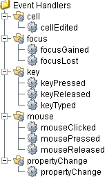
Event Handlers
Event handlers provide the ability to add custom script when a user interacts with a component.
cell
cellEdited
This event occurs when a component that can receive input, such as a text box, receives the input focus. This usually occurs when a user clicks on the component or tabs over to it.
| Property | Description |
|---|---|
| .source | The component that fired this event. |
| .oldValue | The old value in the cell that changed. |
| .newValue | The new value in the cell that changed. |
| .row | The row of the dataset this cell represents. |
| .column | The column of the dataset this cell represents. |
focus
focusGained
This event occurs when a component that can receive input, such as a text box, receives the input focus. This usually occurs when a user clicks on the component or tabs over to it.
| Property | Description |
|---|---|
| .source | The component that fired this event. |
| .oppositeComponent | The other component involved in this focus change. That is, the component that lost focus in order for this one to gain it, or vice versa. |
focusLost
This event occurs when a component that had the input focus lost it to another component.
| Property | Description |
|---|---|
| .source | The component that fired this event. |
| .oppositeComponent | The other component involved in this focus change. That is, the component that lost focus in order for this one to gain it, or vice versa. |
key
keyPressed
An integer that indicates whether the state was changed to "Selected" (on) or "Deselected" (off). Compare this to the event object's constants to determine what the new state is.
| Property | Description |
|---|---|
| .source | The component that fired this event. |
| .keyCode | The key code for this event. Used with the keyPressed and keyReleased events. See below for the key code constants. |
| .keyChar | The character that was typed. Used with the keyTyped event. |
| .keyLocation | Returns the location of the key that originated this key event. Some keys occur more than once on a keyboard, e.g. the left and right shift keys. Additionally, some keys occur on the numeric keypad. This provides a way of distinguishing such keys. See the KEY_LOCATION constants in the documentation. The keyTyped event always has a location of KEY_LOCATION_UNKNOWN. |
| .altDown | True (1) if the Alt key was held down during this event, false (0) otherwise. |
| .controlDown | True (1) if the Ctrl key was held down during this event, false (0) otherwise. |
| .shiftDown | True (1) if the Shift key was held down during this event, false (0) otherwise. |
keyReleased
Fires when a key is released and the source component has the input focus. Works for all characters, including non-printable ones, such as SHIFT and F3.
| Property | Description |
|---|---|
| .source | The component that fired this event. |
| .keyCode | The key code for this event. Used with the keyPressed and keyReleased events. See below for the key code constants. |
| .keyChar | The character that was typed. Used with the keyTyped event. |
| .keyLocation | Returns the location of the key that originated this key event. Some keys occur more than once on a keyboard, e.g. the left and right shift keys. Additionally, some keys occur on the numeric keypad. This provides a way of distinguishing such keys. See the KEY_LOCATION constants in the documentation. The keyTyped event always has a location of KEY_LOCATION_UNKNOWN. |
| .altDown | True (1) if the Alt key was held down during this event, false (0) otherwise. |
| .controlDown | True (1) if the Ctrl key was held down during this event, false (0) otherwise. |
| .shiftDown | True (1) if the Shift key was held down during this event, false (0) otherwise. |
keyTyped
Fires whenever a bindable property of the source component changes. This works for standard and custom (dynamic) properties.
| Property | Description |
|---|---|
| .source | The component that fired this event. |
| .keyCode | The key code for this event. Used with the keyPressed and keyReleased events. See below for the key code constants. |
| .keyChar | The character that was typed. Used with the keyTyped event. |
| .keyLocation | Returns the location of the key that originated this key event. Some keys occur more than once on a keyboard, e.g. the left and right shift keys. Additionally, some keys occur on the numeric keypad. This provides a way of distinguishing such keys. See the KEY_LOCATION constants in the documentation. The keyTyped event always has a location of KEY_LOCATION_UNKNOWN. |
| .altDown | True (1) if the Alt key was held down during this event, false (0) otherwise. |
| .controlDown | True (1) if the Ctrl key was held down during this event, false (0) otherwise. |
| .shiftDown | True (1) if the Shift key was held down during this event, false (0) otherwise. |
mouse
mouseClicked
This event signifies a mouse click on the source component. A mouse click the combination of a mouse press and a mouse release, both of which must have occurred over the source component. Note that this event fires after the pressed and released events have fired.
| Property | Description |
|---|---|
| .source | The component that fired this event. |
| .button | The code for the button that caused this event to fire. |
| .clickCount | The number of mouse clicks associated with this event. |
| .x | The x-coordinate (with respect to the source component) of this mouse event. |
| .y | The y-coordinate (with respect to the source component) of this mouse event. |
| .popupTrigger | Returns True (1) if this mouse event is a popup trigger. What constitutes a popup trigger is operating system dependent, which is why this abstraction exists. |
| .altDown | True (1) if the Alt key was held down during this event, false (0) otherwise. |
| .controlDown | True (1) if the Ctrl key was held down during this event, false (0) otherwise. |
| .shiftDown | True (1) if the Shift key was held down during this event, false (0) otherwise. |
mouseEntered
This event fires when the mouse enters the space over the source component.
| Property | Description |
|---|---|
| .source | The component that fired this event. |
| .button | The code for the button that caused this event to fire. |
| .clickCount | The number of mouse clicks associated with this event. |
| .x | The x-coordinate (with respect to the source component) of this mouse event. |
| .y | The y-coordinate (with respect to the source component) of this mouse event. |
| .popupTrigger | Returns True (1) if this mouse event is a popup trigger. What constitutes a popup trigger is operating system dependent, which is why this abstraction exists. |
| .altDown | True (1) if the Alt key was held down during this event, false (0) otherwise. |
| .controlDown | True (1) if the Ctrl key was held down during this event, false (0) otherwise. |
| .shiftDown | True (1) if the Shift key was held down during this event, false (0) otherwise. |
mouseExited
This event fires when the mouse leaves the space over the source component.
| Property | Description |
|---|---|
| .source | The component that fired this event. |
| .button | The code for the button that caused this event to fire. |
| .clickCount | The number of mouse clicks associated with this event. |
| .x | The x-coordinate (with respect to the source component) of this mouse event. |
| .y | The y-coordinate (with respect to the source component) of this mouse event. |
| .popupTrigger | Returns True (1) if this mouse event is a popup trigger. What constitutes a popup trigger is operating system dependent, which is why this abstraction exists. |
| .altDown | True (1) if the Alt key was held down during this event, false (0) otherwise. |
| .controlDown | True (1) if the Ctrl key was held down during this event, false (0) otherwise. |
| .shiftDown | True (1) if the Shift key was held down during this event, false (0) otherwise. |
mousePressed
This event fires when a mouse button is pressed down on the source component.
| Property | Description |
|---|---|
| .source | The component that fired this event. |
| .button | The code for the button that caused this event to fire. |
| .clickCount | The number of mouse clicks associated with this event. |
| .x | The x-coordinate (with respect to the source component) of this mouse event. |
| .y | The y-coordinate (with respect to the source component) of this mouse event. |
| .popupTrigger | Returns True (1) if this mouse event is a popup trigger. What constitutes a popup trigger is operating system dependent, which is why this abstraction exists. |
| .altDown | True (1) if the Alt key was held down during this event, false (0) otherwise. |
| .controlDown | True (1) if the Ctrl key was held down during this event, false (0) otherwise. |
| .shiftDown | True (1) if the Shift key was held down during this event, false (0) otherwise. |
mouseReleased
This event fires when a mouse button is released, if that mouse button's press happened over this component.
| Property | Description |
|---|---|
| .source | The component that fired this event. |
| .button | The code for the button that caused this event to fire. |
| .clickCount | The number of mouse clicks associated with this event. |
| .x | The x-coordinate (with respect to the source component) of this mouse event. |
| .y | The y-coordinate (with respect to the source component) of this mouse event. |
| .popupTrigger | Returns True (1) if this mouse event is a popup trigger. What constitutes a popup trigger is operating system dependent, which is why this abstraction exists. |
| .altDown | True (1) if the Alt key was held down during this event, false (0) otherwise. |
| .controlDown | True (1) if the Ctrl key was held down during this event, false (0) otherwise. |
| .shiftDown | True (1) if the Shift key was held down during this event, false (0) otherwise. |
propertyChange
propertyChange
Fires whenever a bindable property of the source component changes. This works for standard and custom (dynamic) properties.
| Property | Description |
|---|---|
| .source | The component that fired this event. |
| .newValue | The new value that this property changed to. |
| .oldValue | The value that this property was before it changed. Note that not all components include an accurate oldValue in their events. |
| .propertyName | The name of the property that changed. NOTE: remember to always filter out these events for the property that you are looking for! Components often have many properties that change. |
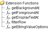
Extension Functions
getBackgroundAt
- Description
Called for each cell, returns the appropriate background color. Do not block, sleep, or execute any I/O; called on painting thread.
- Parameters
self - A reference to the component that is invoking this function.
row - The row index of the cell.
col - The column index of the cell.
isSelected - A boolean representing if this cell is currently selected.
value - The value in the table's dataset at index [row, col].
defaultColor - The color the table would have chosen if this function was not implemented.
- Return
Default color
- Scope
Client
getForegroundAt
- Description
Called for each cell, returns the appropriate foreground (text) color. Do not block, sleep, or execute any I/O; called on painting thread.
- Parameters
self - A reference to the component that is invoking this function.
row - The row index of the cell.
col - The column index of the cell.
isSelected - A boolean representing if this cell is currently selected.
value - The value in the table's dataset at index [row, col].
defaultColor - The color the table would have chosen if this function was not implemented.
- Return
Default color
- Scope
Client
getDisplayTextAt
- Description
Called for each cell, returns a String which will be used as the text of the cell. Do not block, sleep, or execute any I/O; called on painting thread.
- Parameters
self - A reference to the component that is invoking this function.
row - The row index of the cell.
col - The column index of the cell.
isSelected - A boolean representing if this cell is currently selected.
value - The value in the table's dataset at index [row, col].
defaultText - The string the table would have chosen if this function was not implemented.
- Return
Default text
- Scope
Client
filterRow
- Description
Called for each cell, returns a Boolean indicating if this row is to be filtered from view. Do not block, sleep, or execute any I/O; called on painting thread.
- Parameters
self - A reference to the component that is invoking this function.
row - The row index in the dataset.
unfilteredData - The dataset before filtering.
- Return
Boolean
- Scope
Client
getStringValueOptions
- Description
Get the options for the string values of the recipe.
- Parameters
itemPath - The item path.
recipeName - The recipe name.
valueName - The recipe value name.
- Returns
List of string values.
- Scope
Client
Custom Methods
Custom methods allow you to add your own component functions to a component that can be called through scripting. This is a useful and clean method of re-using script that is specific to the component (say you want to update a visual aspect of the component in the same way whether a user clicks on the component or a window property value changes). See Component Custom Methods in the Ignition Help Manual for more information.
Customizers
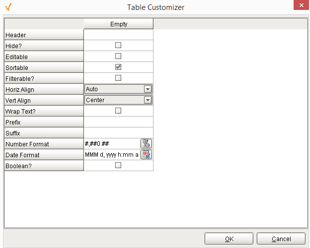
Table Customizer
Table Customizer manages the data entered into the Recipe Editor Table. It will allow you to modify the data which is stored inside the Recipe Editor Table. Thus the formatting and alignments are made easy.
Column Configuration
Header - Provide a custom name to the column header.
Hide? - Hides the column.
Editable - Allows the editing of the cell pertaining to the column.
Sortable - To make a column filter the data on user's demand.
Sortable - Allows the user to sort the table according to the selected column.
Horiz Align - Aligns the contents of the column.
Vert Align - Aligns the contents of the column.
Wrap Text? - Data in the cell wraps to fit the column width. When you change the column width, data wrapping adjusts automatically.
Prefix - A custom text that proceeds the contents of each cell.
Suffix - A custom text that follows the contents of each cell.
Number Format - A format of the cell is the contents of the cell are number types.
Date Format - Used if the contents of the cell are date types.
Boolean? - Changes the contents of the cell to reflect a 'check box' look and feel.
Component Functions
This component provide the following functions that can be called on it. If this component has been dropped onto the windows root container, the path and an example call would be event.source.parent.getComponent('Recipe Editor Table').activeRecipe().
activateRecipe()
- Description
This script will activate the current recipe name on the selected item path using the Manual Values entered in the table.
- Parameters
None
- Return
A String representing any error that was encountered. The string will be blank if the recipe was successfully activated.
- Scope
Client
cancelRecipe()
- Description
This script will end the currently active recipe on the selected item (equipment) path.
- Parameters
None
- Return
A String representing any error that was encountered. The string will be blank if the recipe was successfully activated.
- Scope
Client
Python |
|
reset()
- Description
This script will reset the manual values to the recipe settings value.
- Parameters
None
- Return
None
- Scope
Client
saveRecipe()
- Description
This script updates the settings for the recipe with the current live recipe values.
- Parameters
None
- Return
A String representing any error that was encountered. The string will be blank if the recipe was successfully activated.
- Scope
Client
updateLiveValues()
- Description
This script updates the live values of the recipe referenced tags in the table.
- Parameters
None
- Return
A String representing any error that was encountered. The string will be blank if the recipe was successfully activated.
- Scope
Client
Sepasoft MES Module Suite