Sepasoft MES Module Suite
MES Schedule View
You can schedule production and view progress with the MES Schedule View component.
- automatically schedule production from work orders or any operation (operations configured using the MES Object Editor).
The MES Schedule View component is included in the Production Module.
Splitting a ScheduleRight clicking on a scheduled entry provides the option to Split Schedule. This separates the operation from its parent operation allowing independent schedules. This option is available to routes with more than one operation and are in the Pending Execution state. Reschedule RemainingRight clicking on a scheduled entry provides the option to Reschedule Remaining for operations that prematurely ended. This enables the operation to be quickly rescheduled. This option is available to any operation that is in the Completed Execution state. |
Begin Operation Automatically

|
To begin operation automatically based on the schedule, ensure a Trigger Operation Begin Property is configured with Auto set to True and the Mode set to "Schedule (time)". Then, the schedule entry will automatically start the appropriate response objects based on the schedule. |
Dragging Operations
|
|
When an operation is dragged and dropped onto an existing scheduled operation, the MES Schedule View component will move the dropped operation forward in time to begin immediately after the end of the existing scheduled operation. The time gap between the two operations will be one second. |
Dragging Routed Operations
|
|
When a Route encounters an existing scheduling obstacle after being dragged, it will reschedule each affected level in that Route forward in time to the first suitable open time slot, making sure to maintain the proper operations sequence. |
Mode/State Icons
The icons displayed next to the equipment names are equipment mode/state icons.
| Icon | Equipment Mode |
|---|---|
|
|
Changeover |
|
|
Maintenance |
|
|
Other |


| Icon | Equipment State |
|---|---|
|
|
Blocked |
|
|
Disabled |
|
|
Idle |
|
|
Planned Downtime |
|
|
Run |
|
|
Starved |
|
|
Unplanned Downtime |


Drag and Drop Scheduling
You can drag rows from a power table or the MES Work Order Table to this component to simplify work order scheduling.
| Step | Description | |
|---|---|---|
| 1 | Set the Row Dragging Enabled property of the MES Work Order Table to True in the designer. | |
| 2 | Select the desired row in the Work Order or power table and drag it onto the equipment item you wish to schedule it for on the MES Schedule View component. In this example Line 1 production item is configured for Cane Sugar. A scheduling window will appear as shown below. | |
| 3 | Provide the duration or the production count of the schedule. Select the Schedule tab to view the new schedule. Click Save. | |
| 4 | The schedule entry you just created will be displayed as shown. | |
Custom Menu Items
The User Menu Items property allows custom menu items to be added. These menu options become available in the client allowing users to right-click on schedule entries displayed in the Schedule view component. Custom script can then be added to the userMenuItemClicked event handler to add functionality to this component.
| Step | Description | |||
|---|---|---|---|---|
| 1 |
Click the icon on the User Menu Items property and add your custom menu items. See the User Menu Item property for help on the dataset columns. | 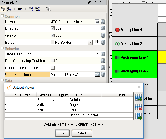 | ||
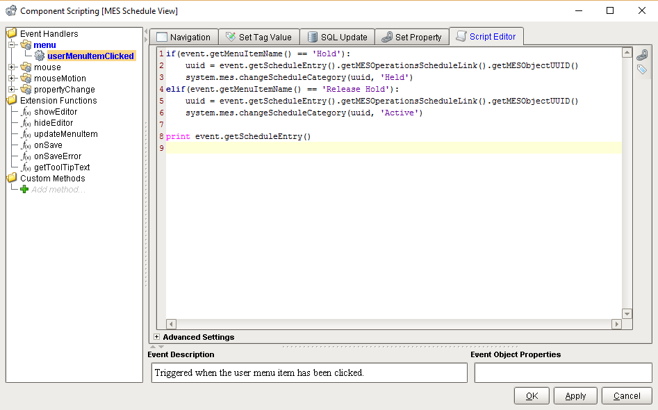
| 2 | Add your custom script to the userMenuItemItemClicked event handler. The following script changes the category of the operations schedule when the user selects one of the user menu items. The event.getMenuItemName() returns the MenuName for the user menu item selected by the user. It can be used in the script to handle each user menu item differently. event.getScheduleEntry() returns the schedule entry object that the user clicked on when selecting the user menu item. The script shown in the image handles two different user menu items: Hold and Release Hold.
|  | ||
| 3 | When a user now clicks on a schedule entry, the following menu items appear. |

Component Properties
Properties are provided that can be set to affect the operation and look of the component. They can be set through the Property Editor in the Designer or through scripting.
Example
Python |
settings.setBackground('ORANGE') #settings.setBackground('#345a2f') |
Properties are detailed below under the dropdown content areas:
Common
| Name | Scripting | Property Type | Description |
|---|---|---|---|
| Name | name | String | Name of the component. |
| Enabled | componentEnabled | boolean | If true, component is enabled. |
| Visible | visible | boolean | If true, component is visible. |
| Border | border | border | Type of border around the component. |
Behavior
Dataset that stores user menu items.
| Column | Description |
|---|---|
| EntryName | Provides a method to only show the user menu items for schedule entry that match the pattern entered. The * and ? characters can be used in the pattern. Examples: 'Operation *', 'Packing * Schedule'. |
| ScheduleCategory | Category of the operations schedule object. It is used in the userMenuItemClicked event to identify which category the selected user menu item belongs to. |
| MenuName | Text to appear when the user menu item is shown. It is also used in the userMenuItemClicked event to identify which user menu item the user selected. |
| MenuIcon | Can be set to a path of an image to display in the user menu item or left blank. |
Data
 | Multiple filters can be used, and the components will only show equipment that matches all the combined filters. |
|
|
If no filters are selected, the MES Schedule View component will attempt to gather data for and show ALL equipment, which can inadvertently cause system performance degradation in large factory settings with lots of equipment. Therefore, if there are more than 10 applicable equipment items, an error will be thrown. More than 10 applicable equipment items can be shown only if one or more of the equipment-related filters is utilized. |
| Name | Scripting | Property Type | Description | ||
|---|---|---|---|---|---|
| Start Date | startDate | DateTime | Beginning of the time range to display. | ||
| End Date | endDate | DateTime | End of the time range to display. | ||
| Lookback Hours | lookbackHours | Integer | Number of hours to look back from the analysis begin date to consider for downtime cause.
| ||
| Read Only | readOnly | Boolean | If true, the schedule will not allow creating or editing schedules. This does not affect user-defined menu items. | ||
| Show Categories | showCategories | String | Schedule categories to display in the schedule. If blank, then an exception will be thrown and this property will revert to its previous value. There can be user defined categories, but Active is reserved. Custom categories are also acceptable. This property also accepts a comma-separated list of category names. The Edit Category (see below) must be present in the list for this property. | ||
| Edit Category | editCategory | String | Schedule category that can be edited within the schedule component. If blank, then an exception will be thrown and this property will revert to its previous value. Active is for 'currently active' (this is the default setting). Actual is reserved and will throw an exception. Custom categories are also acceptable. The entry in this property must be also be present in Show Categories (see above). New schedule items made will be assigned this category. | ||
| Show Equipment Path | showEquipmentPath | Boolean | If true, it will show equipment names with equipment paths. | ||
| Excluded Equipment Path | excludedEquipmentPath | Boolean | Beginning part of a path to exclude from the displayed equipment paths. | ||
| Equipment Class Name Filter | equipmentClassNameFilter | String | Filter value, including * and ? wildcard characters, to filter results by an equipment class. | ||
| Equipment Name Filter | equipmentNameFilter | String | Filter value, including * and ? wildcard characters, to filter results by an equipment name. | ||
| Equipment Path Filter | equipmentPathFilter | String | Filter value, including * and ? wildcard characters, to filter results by an equipment path. OR Multiple equipment paths can be included in a comma separated list. These paths can't use wildcard characters. | ||
| Include MES Lines | includeMESLines | Boolean | If true, including MES line objects. | ||
| Include MES Storage Units | includeMESStorageUnits | Boolean | If true, including MES storage unit objects. | ||
| Line Order | lineOrder | Integer | Changes the order in which the Lines are displayed from top to bottom. Enter:
|
Appearance
| Name | Scripting | Property Type | Description | |||||||||||||||||||
| Schedule Background | scheduleBackground | Color | Background color of the schedule area. | |||||||||||||||||||
| Restriction Background | restrictionBackground | Color | Background color of restricted (not available) times. | |||||||||||||||||||
| Line Color | lineColor | Color | Color of lines in the schedule view. | |||||||||||||||||||
| Now Line Color | nowLineColor | Color | Color of line indicating the current date and time. | |||||||||||||||||||
| Item Height | itemHeight | int | Equipment item row height. | |||||||||||||||||||
| Item Font | itemFont | Font | Font to use for equipment item names. | |||||||||||||||||||
| Active Item Background | activeItemBackground | Color | Background color of equipment items that are active. | |||||||||||||||||||
| Active Item Foreground | activeItemForeground | Color | Foreground color of equipment items that are active. | |||||||||||||||||||
| Active Item Status Icon Path | activeItemStatusIconPath | String | Path to an Ignition image to use for equipment items that are active. | |||||||||||||||||||
| Inactive Item Background | inactiveItemBackground | Color | Background color of equipment items that are inactive. | |||||||||||||||||||
| Inactive Item Foreground | inactiveItemForeground | Color | Foreground color of equipment items that are inactive. | |||||||||||||||||||
| Inactive Item Status Icon Path | inactiveItemStatusIconPath | String | Path to an Ignition image to use for equipment items that are inactive. | |||||||||||||||||||
| Show Progress Bar | showProgressBar | boolean | If set to true show the progress bar for schedule entries. The percent complete value must also greater than 0 for the bar to be displayed for a schedule entry. | |||||||||||||||||||
| Progress Background | progressBackground | Color | Background color of schedule entry progress boxes. | |||||||||||||||||||
| Progress Border Color | progressBorderColor | Color | Border color of schedule entry progress boxes. | |||||||||||||||||||
| Progress Fill Color | progressFillColor | Color | Fill color of schedule entry progress boxes. | |||||||||||||||||||
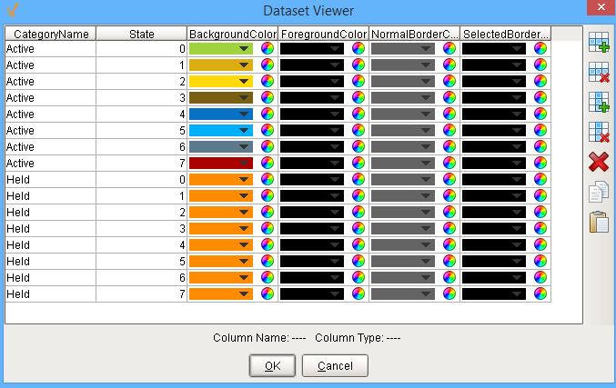
| Entry Configuration | entryConfiguration | Dataset | Dataset that stores entry appearance configuration. For each value you enter, a state is created. For example, you can see below that there are 16 values in the Dataset Viewer which corresponds to the 16 category and state combinations on the Schedule View component. Each state belongs to a category, the categories inbuilt on Ignition are Active and Actual. The Active includes the schedule that is currently active and the Actual includes those which have completed. You can add your own categories, 'Held' is added in the given example. Color of the entry is determined by BackgroundColor. ForegroundColor will decide the color of the text. NormalBorderColor is the boundary color for an unselected state. Color for the border of selected state is given by the SelectedBorderColor.
|
Along with the component properties, custom properties can also be added to this component. See Component Customizers in the Ignition Help Manual for more information.
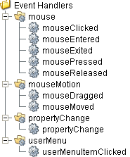
Event Handlers
Event handlers provide the ability to add custom script when a user interacts with a component such as by clicking a mouse, selecting a menu item or when a component property changes.
menu
userMenuItemClicked
When the user right clicks on the schedule component, a popup menu is displayed. Custom user menu items can be added to this popup menu by adding rows to the User Menu Items dataset. The UserMenuItemClicked event is fired when the menu item is clicked, or if the user selects the menu item using the keyboard and presses the Enter key. It can also occur if an access key or shortcut key is pressed that is associated with the MenuItem. To see the various methods associated with this event see MESScheduleEntry.
|
Property |
Description |
|---|---|
|
.source |
The component that fired this event. |
|
.getMenuItemName() |
Returns the name of the selected menu item. |
|
.getScheduleEntry() |
Returns the MESScheduleEntry object containing details about the schedule category, begin, actual begin and end, state, etc. |
Tip
|
|
See the Feature section for this component on how to create custom menu items. |
mouse
mouseClicked
This event signifies a mouse click on the source component. A mouse click the combination of a mouse press and a mouse release, both of which must have occurred over the source component. Note that this event fires after the pressed and released events have fired.
|
Property |
Description |
|---|---|
|
.source |
The component that fired this event. |
|
.button |
The code for the button that caused this event to fire. |
|
.clickCount |
The number of mouse clicks associated with this event. |
|
.x |
The x-coordinate (with respect to the source component) of this mouse event. |
|
.y |
The y-coordinate (with respect to the source component) of this mouse event. |
|
.popupTrigger |
Returns True (1) if this mouse event is a popup trigger. What constitutes a popup trigger is operating system dependent, which is why this abstraction exists. |
|
.altDown |
True (1) if the Alt key was held down during this event, false (0) otherwise. |
|
.controlDown |
True (1) if the Ctrl key was held down during this event, false (0) otherwise. |
|
.shiftDown |
True (1) if the Shift key was held down during this event, false (0) otherwise. |
mouseEntered
This event fires when the mouse enters the space over the source component.
|
Property |
Description |
|---|---|
|
.source |
The component that fired this event. |
|
.button |
The code for the button that caused this event to fire. |
|
.clickCount |
The number of mouse clicks associated with this event. |
|
.x |
The x-coordinate (with respect to the source component) of this mouse event. |
|
.y |
The y-coordinate (with respect to the source component) of this mouse event. |
|
.popupTrigger |
Returns True (1) if this mouse event is a popup trigger. What constitutes a popup trigger is operating system dependent, which is why this abstraction exists. |
|
.altDown |
True (1) if the Alt key was held down during this event, false (0) otherwise. |
|
.controlDown |
True (1) if the Ctrl key was held down during this event, false (0) otherwise. |
|
.shiftDown |
True (1) if the Shift key was held down during this event, false (0) otherwise. |
mouseExited
This event fires when the mouse leaves the space over the source component.
|
Property |
Description |
|---|---|
|
.source |
The component that fired this event. |
|
.button |
The code for the button that caused this event to fire. |
|
.clickCount |
The number of mouse clicks associated with this event. |
|
.x |
The x-coordinate (with respect to the source component) of this mouse event. |
|
.y |
The y-coordinate (with respect to the source component) of this mouse event. |
|
.popupTrigger |
Returns True (1) if this mouse event is a popup trigger. What constitutes a popup trigger is operating system dependent, which is why this abstraction exists. |
|
.altDown |
True (1) if the Alt key was held down during this event, false (0) otherwise. |
|
.controlDown |
True (1) if the Ctrl key was held down during this event, false (0) otherwise. |
|
.shiftDown |
True (1) if the Shift key was held down during this event, false (0) otherwise. |
mousePressed
This event fires when a mouse button is pressed down on the source component.
|
Property |
Description |
|---|---|
|
.source |
The component that fired this event. |
|
.button |
The code for the button that caused this event to fire. |
|
.clickCount |
The number of mouse clicks associated with this event. |
|
.x |
The x-coordinate (with respect to the source component) of this mouse event. |
|
.y |
The y-coordinate (with respect to the source component) of this mouse event. |
|
.popupTrigger |
Returns True (1) if this mouse event is a popup trigger. What constitutes a popup trigger is operating system dependent, which is why this abstraction exists. |
|
.altDown |
True (1) if the Alt key was held down during this event, false (0) otherwise. |
|
.controlDown |
True (1) if the Ctrl key was held down during this event, false (0) otherwise. |
|
.shiftDown |
True (1) if the Shift key was held down during this event, false (0) otherwise. |
mouseReleased
This event fires when a mouse button is released, if that mouse button's press happened over this component.
|
Property |
Description |
|---|---|
|
.source |
The component that fired this event. |
|
.button |
The code for the button that caused this event to fire. |
|
.clickCount |
The number of mouse clicks associated with this event. |
|
.x |
The x-coordinate (with respect to the source component) of this mouse event. |
|
.y |
The y-coordinate (with respect to the source component) of this mouse event. |
|
.popupTrigger |
Returns True (1) if this mouse event is a popup trigger. What constitutes a popup trigger is operating system dependent, which is why this abstraction exists. |
|
.altDown |
True (1) if the Alt key was held down during this event, false (0) otherwise. |
|
.controlDown |
True (1) if the Ctrl key was held down during this event, false (0) otherwise. |
|
.shiftDown |
True (1) if the Shift key was held down during this event, false (0) otherwise. |
mouseMotion
mouseDragged
Fires when the mouse moves over a component after a button has been pushed.
| Property | Description |
|---|---|
| .source | The component that fired this event. |
| .button | The code for the button that caused this event to fire. |
| .clickCount | The number of mouse clicks associated with this event. |
| .x | The x-coordinate (with respect to the source component) of this mouse event. |
| .y | The y-coordinate (with respect to the source component) of this mouse event. |
| .popupTrigger | Returns True (1) if this mouse event is a popup trigger. What constitutes a popup trigger is operating system dependent, which is why this abstraction exists. |
| .altDown | True (1) if the Alt key was held down during this event, false (0) otherwise. |
| .controlDown | True (1) if the Ctrl key was held down during this event, false (0) otherwise. |
| .shiftDown | True (1) if the Shift key was held down during this event, false (0) otherwise. |
mouseMoved
Fires when the mouse moves over a component, but no buttons are pushed.
|
Property |
Description |
|---|---|
|
.source |
The component that fired this event. |
|
.button |
The code for the button that caused this event to fire. |
|
.clickCount |
The number of mouse clicks associated with this event. |
|
.x |
The x-coordinate (with respect to the source component) of this mouse event. |
|
.y |
The y-coordinate (with respect to the source component) of this mouse event. |
|
.popupTrigger |
Returns True (1) if this mouse event is a popup trigger. What constitutes a popup trigger is operating system dependent, which is why this abstraction exists. |
|
.altDown |
True (1) if the Alt key was held down during this event, false (0) otherwise. |
|
.controlDown |
True (1) if the Ctrl key was held down during this event, false (0) otherwise. |
|
.shiftDown |
True (1) if the Shift key was held down during this event, false (0) otherwise. |
propertyChange
propertyChange
Fires whenever a bindable property of the source component changes. This works for standard and custom properties of the component.
|
Property |
Description |
|---|---|
|
.source |
The component that fired this event. |
|
.newValue |
The new value that this property changed to. |
|
.oldValue |
The value that this property was before it changed. Note that not all components include an accurate oldValue in their events. |
|
.propertyName |
The name of the property that changed. NOTE: Remember to always filter out these events for the property that you are looking for! Components often have many properties that change. |
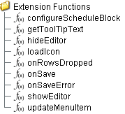
Extension Functions
Extension functions allow the operation of a component to be altered. Extension functions cannot be called, they are event driven.
configureScheduleBlock
-
Description
Called before displaying a schedule entry block. This can be used to change the appearance of a schedule entry block.
-
Parameters
self - A reference to the component that is invoking this function.
MESScheduleEntry - The MESScheduleEntry object associated with the schedule block being rendered. Nothing should be changed in the object. See MESScheduleEntry in the MES documentation for more information.
settings - The default display object that allows the default display settings that affect the appearance of the schedule entry to be altered.
-
Return
Nothing
-
Scope
Client
Example: Set Display Text to Production Order Name
Code |
|
showEditor
-
Description
Called before showing the editor panel. This can be used to add functionality preceding, or replace the functionality of, the built-in schedule entry editor panel. To prevent the built-in editor panel from appearing, return False.
-
Parameters
Info
For the four possible triggers (New entry, Edit, Reschedule Remaining, onRowsDropped) that cause showEditor() to execute, not every parameter will always have a value. The table below shows when a potential value could be expected, but it is still possible for that value to be null. When scripting, it is necessary to check the validity of any value before using it.
Parameter When: Menu -> New Entry When: Menu -> Edit When: Menu -> Reschedule Remaining When: onRowsDropped() scheduledItem value value value value mesObjectList null (always) null (always) value null (always) equipmentPath null (always) null (always) value value category null (always) null (always) value value dateTime value value value value workOrderLink value value value value quantity 0.0 (always) 0.0 (always) value value
self - A reference to the component that is invoking this function.
ScheduleItem scheduleItem - The ScheduleItem object contains information about the equipment being scheduled. It also includes schedule restrictions and current schedule entries for the equipment and time period specified by the component.
MESObjectList mesObjectList - The MESObjectList that contains references to all MES objects for the operations schedule.
EquipmentPath equipmentPath - The path for the equipment item that the user dropped on.
Category category - The schedule category that the user dropped on.
DateTime dateTime - The date and time at the point where the drop occurred.
WorkOrderLink workOrderLink - The MESObjectLink object for the work order.
Quantity quantity - The quantity of material to be produced.
-
Return
True
-
Scope
Client
hideEditor
-
Description
Called after hiding the editor panel. This can be used to add functionality following that of the built-in schedule entry editor panel.
-
Parameters
self - A reference to the component that is invoking this function.
scheduleItemLink - MES Object Link that contains a reference to the ScheduleItem object. Use mesObjectLink.getMESObject() to get the MES object itself.
-
Return
True
-
Scope
Client
updateMenuItem
-
Description
Before the popup menu appears, updateMenuItem is called for each menu item. This provides the opportunity to enable, disable or change the appearance of the default menu items.
-
Parameters
self - A reference to the component that is invoking this function.
menuItem - The menu item object that can be modified. The getText() and setVisible() methods can be used along with this object. See the example shown below for details.
MESScheduleEntry - The MESScheduleEntry object associated with the currently selected schedule entry.
-
Return
True
-
Scope
Client
Example: Disable menuItem
Code |
|
onSave
-
Description
Called before saving a new or modified schedule.
-
Parameters
self - A reference to the component that is invoking this function.
MES Object List - The MES Object List list that contains references to all MES objects for the operations schedule.
-
Return
True
-
Scope
Client
onSaveError
-
Description
Called if an error occurs while saving a new or modified schedule. Return true to cancel the changes and close the edit panel.
-
Parameters
self - A reference to the component that is invoking this function.
MES Object List - A list that contains references to all MES objects for the operations schedule.
errorMessage - The error message describing the error.
-
Return
False
-
Scope
Client
getToolTipText
-
Description
Called to get tool tip text for a restricted time, schedule entry, Ignition schedule or production schedule on the schedule view.
-
Parameters
self - A reference to the component that is invoking this function.
entryType - The type name as a string of the entryObject.
entryObject - Either a MESScheduleRestriction or a MESScheduleEntry object that the tool tip text is needed.
-
Return
Nothing
-
Scope
Client
onRowsDropped
-
Description
Called when the user has dropped rows from the Ignition power table component. The source table must have dragging enabled.
-
Parameters
self - A reference to the component that is invoking this function
sourceTable - A reference to the table that the rows were dragged from.
rows - An array of the row indices that were dragged, in the order they were selected.
rowData - A dataset containing the rows that were dragged.
equipmentPath - The path for the equipment item that the user dropped on.
category - The schedule category that the user dropped on.
dateTime - The date and time at the point where the drop occured.
-
Return
Nothing
-
Scope
Client
Code Example
Code |
|
Custom Methods
Custom methods allow you to add your own component functions to a component that can be called through scripting. This is a useful and clean method of re-using script that is specific to the component (say you want to update a visual aspect of the component in the same way whether a user clicks on the component or a window property value changes). See Component Custom Methods in the Ignition Help Manual for more information.
Customizers
This component does not have any custom properties.
Component Functions
This component provide the following functions that can be called on it. If this component has been dropped onto the windows root container, the path and an example call would be event.source.parent.getComponent('MES Schedule View').refresh().
getScheduleItem(index)
- Description
Gets the schedule item object for an equipment corresponding to the index of row specified.
- Parameters
int index - The integer that represents index of the row to return schedule item for.
- Return
Nothing
- Scope
Client
refresh()
- Description
It refreshes the data on the component.
- Parameters
None
- Return
Nothing
- Scope
Client
Component Objects
Objects that are used solely by this component are listed here.
Schedule Entry Item
getParent()
Description
Get the parent of the schedule item. See ScheduleItem for more details.
Syntax
getParent()
- Parameters
None
- Returns
ScheduleItem parent - The parent ScheduleItem object.
- Scope
All
setParent(parent)
Description
Set the parent of the schedule item. See ScheduleItem for more details.
Syntax
setParent(parent)
- Parameters
ScheduleItem parent - The ScheduleItem object to be set as the parent.
- Returns
Nothing
- Scope
All
getScheduleItem()
Description
Get the schedule entry object. See MES Schedule Entry object for more details.
Syntax
getScheduleItem()
- Parameters
None
- Returns
MES Schedule Entry scheduleEntry - The MES Schedule Entry object.
- Scope
All
Schedule Item
Description
This object is used with showEditor extension function of this component.
Object Functions
addScheduleEntry(scheduleEntry)
Description
Adds a schedule.
Syntax
addScheduleEntry(scheduleEntry)
- Parameters
MESScheduleEntry scheduleEntry - The schedule to be added.
- Returns
ScheduleEntryItem item - The schedule object that is just added.
- Scope
All
changeScheduleEntryState(mesObjectList, state)
Description
Changes the state of schedule.
Syntax
changeScheduleEntryState(mesObjectList, state)
- Parameters
MESObjectList mesObjectList - The list of schedule for which state is to be changed.
int state - The new state.
- Returns
Nothing
- Scope
All
getScheduleEntry(time)
Description
Gets the schedule entry object.
Syntax
getScheduleEntry(time)
- Parameters
Date time - Time scheduled for the entry.
- Returns
ScheduleEntryItem scheduleEntry - The schedule entry object.
- Scope
All
getScheduleEntry(time, category)
Description
Gets the schedule entry object.
Syntax
getScheduleEntry(time, category)
- Parameters
Date time - Time scheduled for the entry.
String category - Category that the schedule to return belongs to.
- Returns
ScheduleEntryItem scheduleEntry - The schedule entry object.
- Scope
All
getScheduleEntry(operationsRequestUUID)
Description
Gets the schedule entry object.
Syntax
getScheduleEntry(operationsRequestUUID)
- Parameters
String operationsRequestUUID - The unique identifier representing the operations request.
- Returns
ScheduleEntryItem scheduleEntry - The schedule entry object.
- Scope
All
getScheduleEntryItem(operationsRequestUUID)
Description
Gets the schedule entry item object.
Syntax
getScheduleEntryItem(operationsRequestUUID)
- Parameters
String operationsRequestUUID - The unique identifier representing the operations request.
- Returns
ScheduleEntryItem scheduleEntryItem - The schedule entry item object.
- Scope
All
getScheduleEntryList()
Description
Gets a list of schedule entry item objects.
Syntax
getScheduleEntryList()
- Parameters
None
- Returns
List<ScheduleEntryItem> scheduleEntryList - The list of schedule entry item objects.
- Scope
All
Schedule State Settings
The configureScheduleBlock extension function of this component has a settings parameter which can be used to change the default display settings and appearance of the schedule entry. This object holds information about the display settings of the schedule view component.

|
This object is one of the few objects that is not derived from the MESAbstractObject and therefore does not inherit its functions or properties. |
getBackground()
Description
Get the background color of the MES Schedule View component.
Syntax
getBackground()
- Parameters
None
- Returns
Color background - The background color of MES Schedule View component.
- Scope
All
getDisplayText()
Description
Get the text displayed in the MES Schedule View component.
Syntax
getDisplayText()
- Parameters
None
- Returns
String displayText - The displayed text.
- Scope
All
getForeground()
Description
Get the foreground color of the MES Schedule View component.
Syntax
getForeground()
- Parameters
None
- Returns
Color foreground - The foreground color of MES Schedule View component.
- Scope
All
getNormalBorderColor()
Description
Get the normal border color of the MES Schedule View component.
Syntax
getNormalBorderColor()
- Parameters
None
- Returns
Color normalBorderColor - The normal border color of MES Schedule View component.
- Scope
All
getSelectedBorderColor()
Description
Get the border color that is selected by the user.
Syntax
getSelectedBorderColor()
- Parameters
None
- Returns
Color selectedBorderColor - The selected border color of MES Schedule View component.
- Scope
All
setBackground(bgColor)
Description
Set the background color of the MES Schedule View component.
Syntax
setBackground(bgColor)
- Parameters
Color background - The background color to set for.
- Returns
Nothing
- Scope
All
setBackground(color)
Description
Set color of the MES Schedule View component.
Syntax
setBackground(color)
- Parameters
String color - The string value that represents a color to set the background to.
- Returns
Nothing
- Scope
All
Code |
|
setDisplayText(displayText)
Description
Set the display text in the MES Schedule View component.
Syntax
setDisplayText(displayText)
- Parameters
String displayText - The text to be displayed.
- Returns
Nothing
- Scope
All
setForeground(foreground)
Description
Set the foreground color for the MES Schedule View component.
Syntax
setForeground(foreground)
- Parameters
Color foreground - The foreground color of MES Schedule View component.
- Returns
Nothing
- Scope
All
setForeground(color)
Description
Set the foreground color of MES Schedule View component.
Syntax
setForeground(color)
- Parameters
String color - The string value that represents a color to set for. Example: BLUE
- Returns
Nothing
- Scope
All
setNormalBorderColor(normalBorderColor)
Description
Set the normal border color for MES Schedule View component.
Syntax
setNormalBorderColor(normalBorderColor)
- Parameters
Color normalBorderColor - The normal border color to set for MES Schedule View component.
- Returns
Nothing
- Scope
All
setNormalBorderColor(color)
Description
Set the color for normal border.
Syntax
setNormalBorderColor(color)
- Parameters
String color - The string value that represents a color to set for. Example: BLUE
- Returns
Nothing
- Scope
All
setSelectedBorderColor(selectedBorderColor)
Description
Set the color for selected border. This is the color displayed when user select the MES Schedule View component.
Syntax
setSelectedBorderColor(selectedBorderColor)
- Parameters
Color selectedBorderColor - The selected border color to set for MES Schedule View component.
- Returns
Nothing
- Scope
All
setSelectedBorderColor(color)
Description
Set the color for selected border. This is the color displayed when user select the MES Schedule View component.
Syntax
setSelectedBorderColor(color)
- Parameters
String color - The string value that represents a color to set for. Example: BLUE
- Returns
Nothing
- Scope
All
Sepasoft MES Module Suite