Sepasoft MES Module Suite
MES Analysis Table
Analysis Table displays tabular data with drilldown capabilities. This extends from the Table Component.
To set up drilldown, see: Setting Up Analysis Drilldown Functionality.
When the user clicks on a row in the table, the drilldown menu appears. When an item in the drill down menu is clicked, the drillDown event is fired. Script in the drillDown event is responsible for updating the Data property to change the results shown in the table. The drill down menu information is set through the Drill Down Options property.
The Drill Down Options can be populated from these components:
- MES Analysis Controller
- MES Analysis Selector
- SQL Query
- Scripting
- Or manually defined in Ignition Designer.
Component Properties
Properties are provided that can be set to affect the operation and look of the component. They can be set through the Perspective Property Editor in the Designer or through scripting. Note that the section prefix is included before the property name (props, position, custom or meta).
Example
Python |
self.getSibling("mesAnalysisTable").props.previousDrilldownEnabled = True |
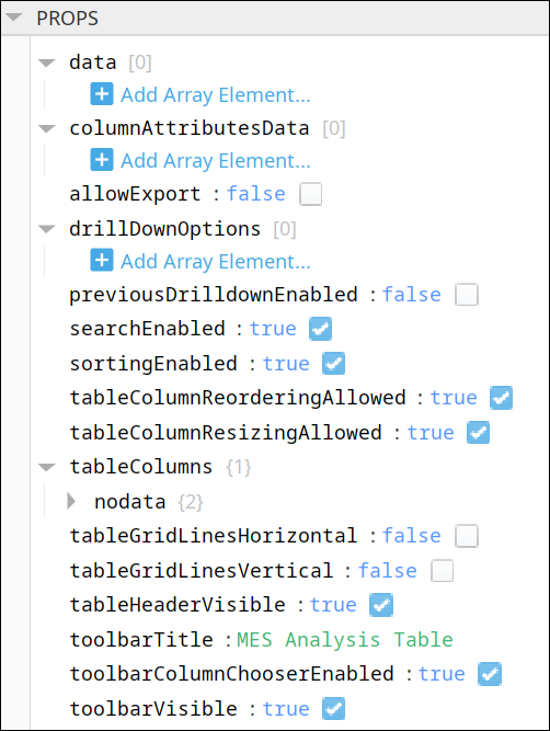
PROPS
Component Properties
| Name | Scripting | Property Type | Description |
|---|---|---|---|
| Data | data | Dataset | Dataset that contain the analysis results. |
| Column Attributes Data | columnAttributesData | Dataset | Dataset describing the column attributes. |
| Allow Export | allowExport | Boolean | If true, allow export of table data. |
| Drill Down Options | drillDownOptions | Dataset | Dataset containing drill down options. |
| Previous Drill Down Enabled | previousDrillDownEnabled | Boolean | If true, then enables the previous drill down settings that can be gone back to. |
| Search Enabled | searchEnabled | Boolean | If true, allow searching on column values. |
| Sorting Enabled | sortingEnabled | Boolean | If true, allow column sorting. |
| Table Column Reordering Allowed | tableColumnReorderingAllowed | Boolean | If true, allow table column reordering. |
| Table Column Resizing Allowed | tableColumnResizingAllowed | Boolean | If true, allow table column resizing. |
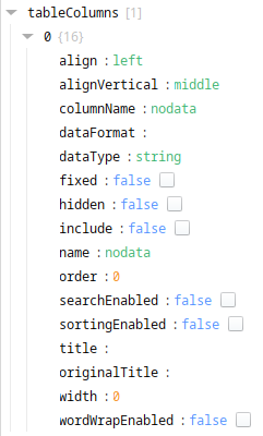
| Table Columns | tableColumns | Provides formatting and customization for each column.
| |
| Table Grid Lines - Horizontal | tableGridLinesHorizontal | Boolean | If true, display horizontal lines on table. |
| Table Grid Lines - Vertical | tableGridLinesVertical | Boolean | If true, display vertical lines on table. |
| Table Header Visible | tableHeaderVisible | Boolean | If true, show the table header. |
| Toolbar Title | toolbarTitle | String | Title to appear on the component. |
| Toolbar Column Chooser Enabled | toolbarColumnChooserEnabled | Boolean | If true, show the column chooser in the toolbar. |
| Toolbar Visible | toolbarVisible | Boolean | If true, show the table toolbar. |
There are also numerous styling properties available:
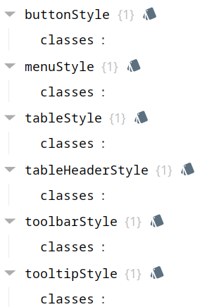
Each property above can be edited for text, background, margins and padding, border, shape, as well as opacity, cursor and overflow characteristics:
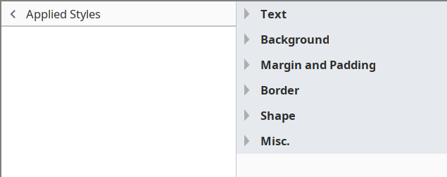
Ignition Style Editor

|
Refer to the Ignition 8 docs page Style Reference for information on modifying the properties listed below. |
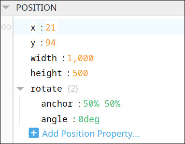
POSITION
Position Properties
The component position properties aren't usually changed by users during runtime, but they can be written and read in the same manner as other properties, if ever needed. Refer to Ignition Perspective Component Properties for details on POSITION properties.
New user-defined position properties can be created in this section.
User-defined Properties
|
|
Best practice: If user-defined properties are required, create them in the CUSTOM section instead of here. |
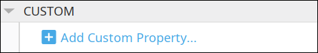
CUSTOM
Custom Properties
New user-defined custom properties can be created in this section.
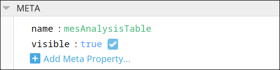
META
Meta Properties
This section contains the name and visibility properties for the component.
New user-defined meta properties can be created in this section.
User-defined Properties
|
|
Best practice: If user-defined properties are required, create them in the CUSTOM section instead of here. |
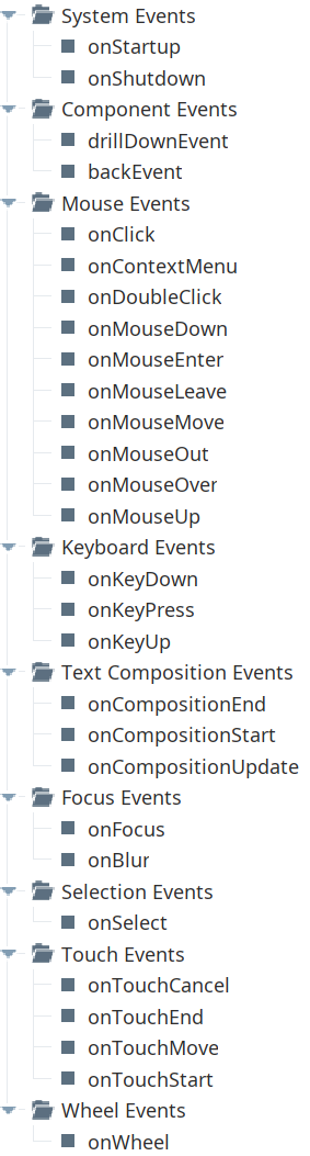
Event Handlers
Event handlers provide the ability to add custom script when a user interacts with a component.
Refer to the Ignition User Manual for details on using the available event handlers:
- Ignition: Component Events and Actions
- Ignition: Perspective Event Types Reference
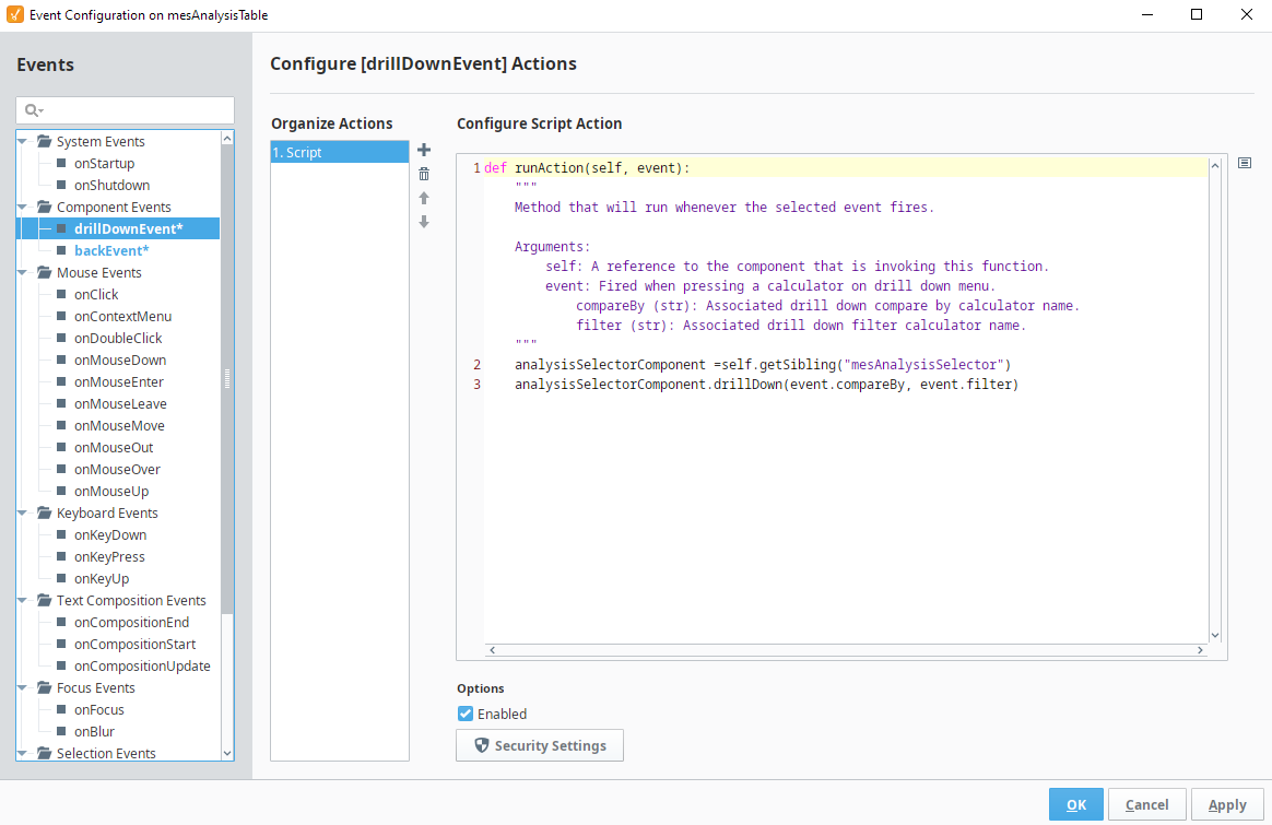
drillDownEvent
drillDownEvent Script
Python |
analysisSelectorComponent = self.getSibling("mesAnalysisSelector") analysisSelectorComponent.drillDown(event.compareBy, event.filter) |
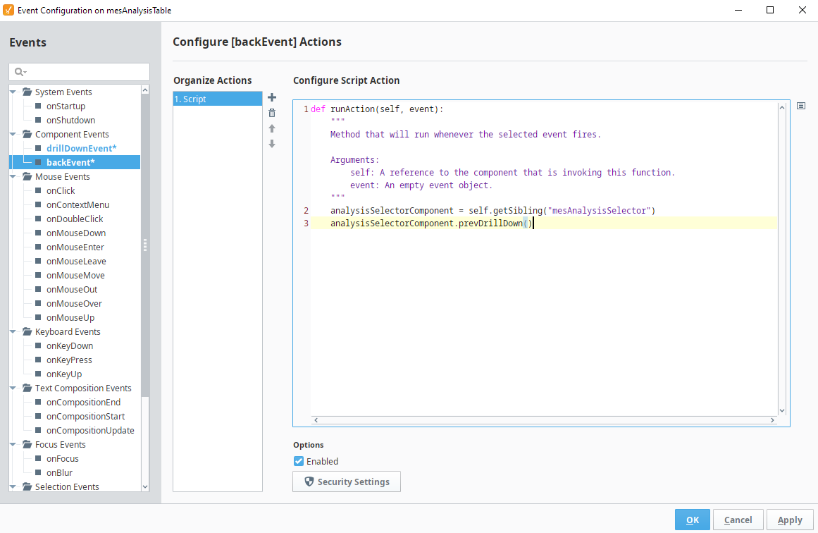
backEvent
back Event Script
Python |
analysisSelectorComponent = self.getSibling("mesAnalysisSelector") analysisSelectorComponent.prevDrillDown() |
Component Functions
This component has no Component Functions.
Sepasoft MES Module Suite